
2 Describing and Summarizing Data
Chris Bailey, PhD, CSCS, RSCC
This chapter will discuss ways in which we can summarize and describe our data. This is often done with descriptive statistics, where we describe the central tendency of the data as well as it's variability. Whether or not you know it, you probably have used descriptive statistics and summary statistics before. More than likely you have calculated the average, or mean, along with a standard deviation. If not, you have probably seen data represented as some value plus or minus another value, which is usually the standard deviation.
Chapter Learning Objectives
- Define and discuss types of data
- Discuss measures of central tendency in data
- Discuss measures of variation in data
- Create data visualizations that accurately portray data distributions
- Visualize and Understand normal and non-normal data distributions
- Create and Utilize standardized scores and understand their usefulness
Describing Data
Using descriptive statistics to describe our data, we can explain and provide a quick summary of our data. We can do this in several ways. First, assuming multiple trials of a test were completed, we can produce a quantitative summary of the the individual subject’s performance by reporting the average or highest score achieved. Consider an example where you are doing some sprint testing and every athlete completes 2 trials. Should you report the average of the two trials or just the peak value? The answer likely depends on the specific situation.
We can also describe the characteristics of the performance of every subject in our sample by reporting the score that all the other scores are centered around and how much the scores vary around this number. For example, we might be tracking steps as a measure of physical activity and the average number of steps taken in our sample was 980. That would be the center of our data. If the standard deviation is 39 steps, then we know that our data do not vary too much. If our standard deviation was 856, then we would know that our data varies quite a bit more since the standard deviation is nearly the same size as the average. We will dive deeper into this concept later in this chapter.
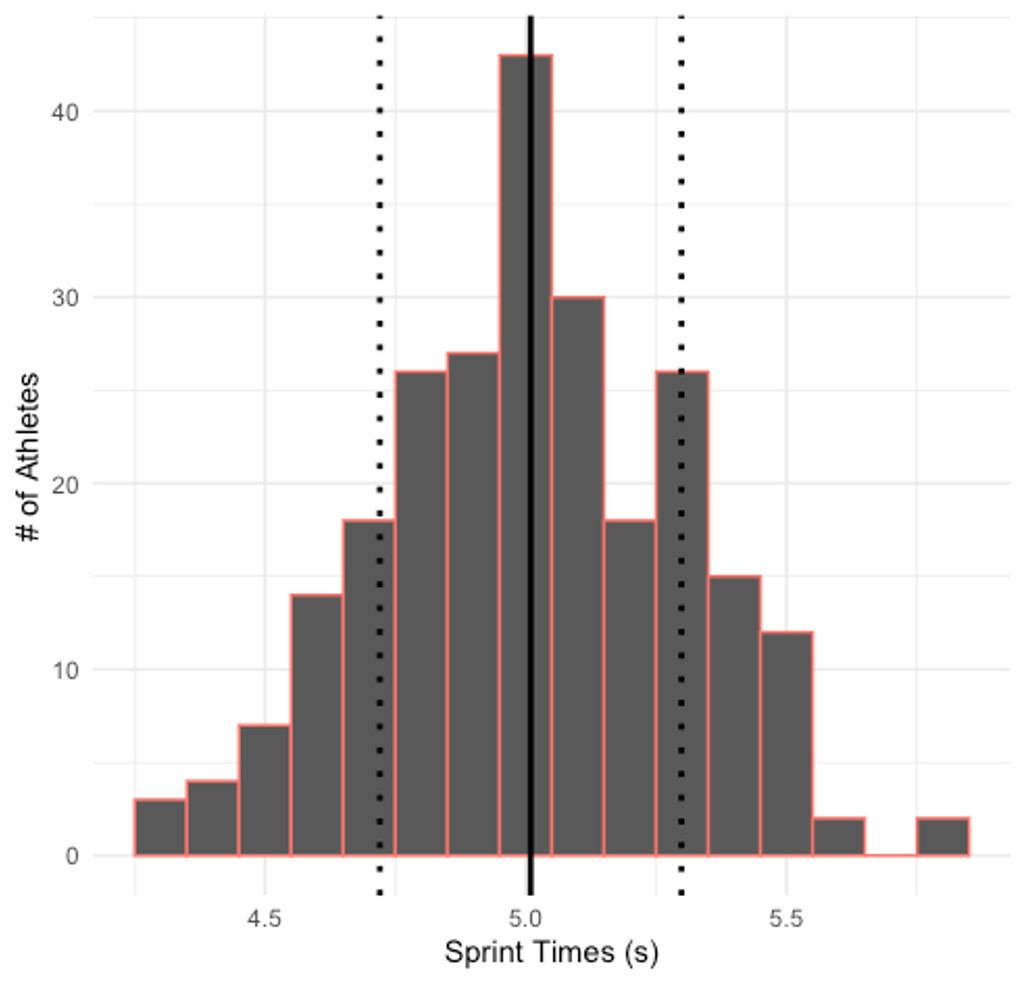
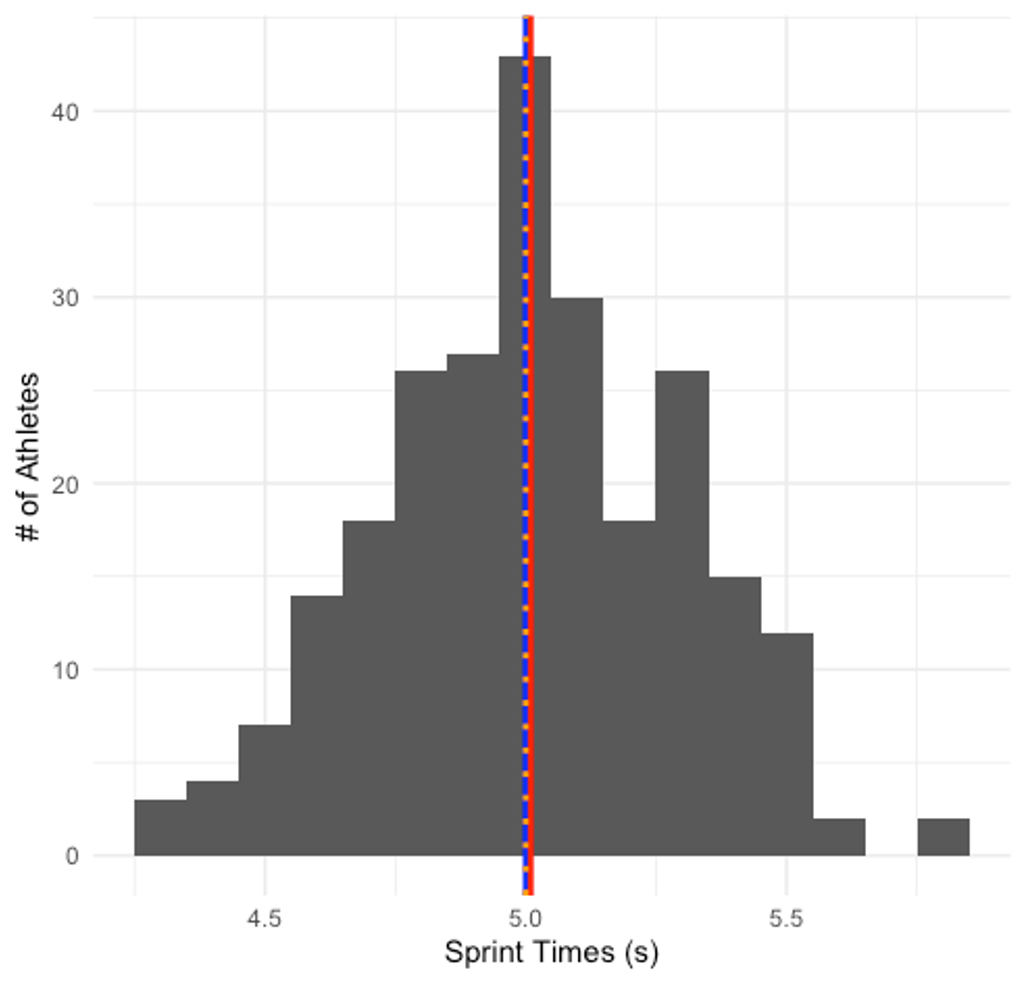
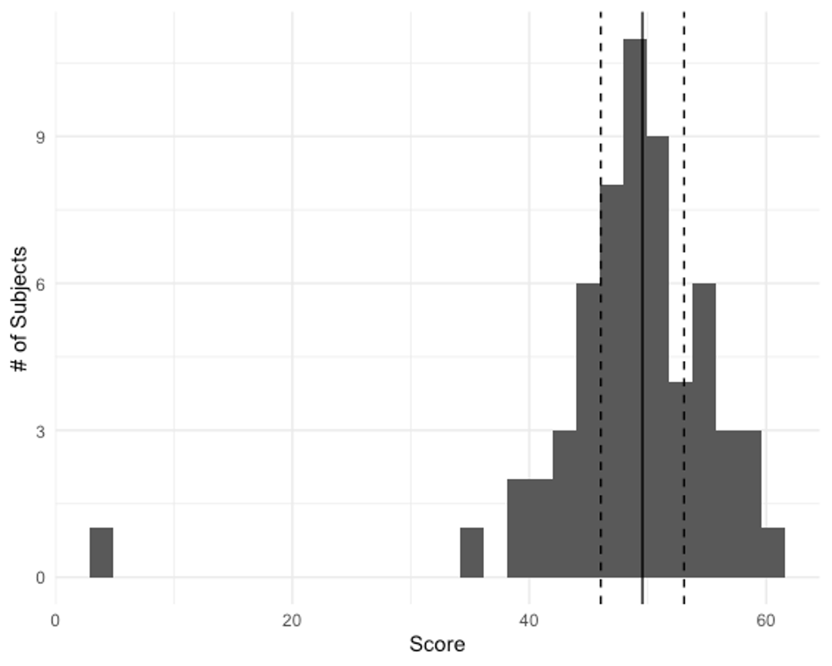
Finally, we can describe how the data are distributed. If all the distribution is plotted, like the example 40-yard dash sprint data shown in the figure above, we can describe its shape. While it isn’t perfect, this is mostly symmetrical and not skewed to one side or the other. Notice the black line in the middle of the plot depicting the average of the data and the two dotted lines on either side depicting one standard deviation above and below the average. Most of the data fall within this range.
Types of Data
Even if all of our data is numerical or represented by a number, they are not equivalent and should not be treated as so. Some types of quantitative data can be mathematically manipulated with the results creating new variables and values, while this is not possible with others. In this section of the chapter we will discuss the 3 main types of data nominal, ordinal, and scale as well as some examples of each.
Nominal
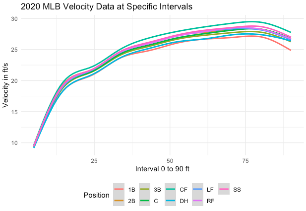
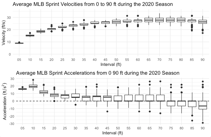
Nominal data are categorical. These categories are not concerned with size or order. Think about the example in the plot above in Figure 2.2. This shows sprint velocities of Major League Baseball players from the 2020 season at multiple intervals when running from home to first base (5 to 90 feet). It is further broken down by position, which is a “nominal” variable. When your subjects are members of a specific group, position in this case, we might like to see if any aspects of their performance may change related to that. For example, in the plot we can see that catchers, first basemen, and designated hitters are generally the slowest at each interval, while outfielders and short stops are generally the fastest.
Nominal variables may not always be clearly named depending on the software program you are working with. Sometimes it may be best to code groups by a number. For example, in a supplement study, we might code our control group as 0, our placebo group as 1, and our group that actually gets the supplement as 2. These values don’t mean anything mathematically, but only imply membership in a specific group.
Ordinal
Ordinal variables are also categorical in nature, but here the order is important here. Think about the college football ranking system. Teams in the top 25 are assigned a ranking. From this data we know that the number 1 ranked team is supposed to be better than the number 7 ranked team. What ordinal data do not tell us is how far apart they are or how much better are they. This might be evident when you watch a National Championship game where the top two ranked teams are playing, and the game isn’t very close with the #1 team wiping the floor with the #2 team. The ranking in this case was correct. It may just be that the #1 team is far better than all other teams.
Scale (Continuous)
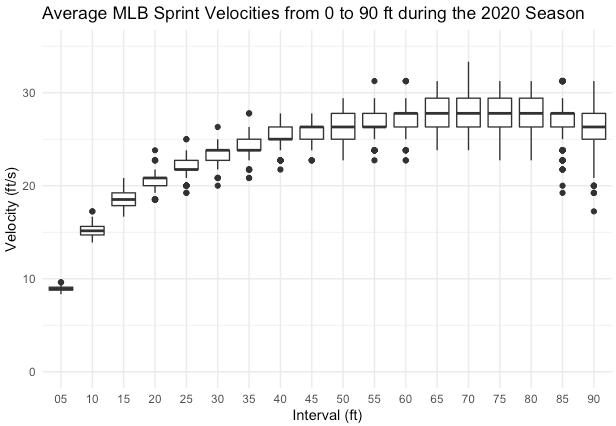
Data represented as numbers that can be mathematically manipulated and the results still be meaningful are called scale or continuous data. Each value is important and the distance between values also means something, unlike ordinal data. Let’s revisit our MLB sprint velocity data again. What was not described before was how the data were collected. Sprint velocities weren’t actually measured. What was measured was the time it took each player to reach specific distances on the base path from home to first base. Velocity is measured as displacement divided by time, so the velocity was calculated at each distance interval and the averages are now plotted in Figure 2.3 below. Since we began with continuous data and mathematically altered it, this is still considered continuous data. Actually, the fact that the data were mathematically manipulated and the results are still meaningful, is part of the definition of continuous data.
Scale or Continuous data can be classified as either interval or ratio.
Interval Data
With interval data, the point where zero lies is somewhat arbitrarily chosen. Zero in the case of temperature described with Celsius or Fahrenheit, represents a specific value and not the absence of the trait. As you likely know, we can have temperatures colder than 0 when described with Celsius or Fahrenheit. As another example of interval data, we will take a look at the baseball data again. This time, let’s focus on acceleration which is visible in the bottom plot in Figure 2.4 below. Acceleration is the rate of change of velocity. If you haven’t taken biomechanics or physics, this may be a difficult concept to grasp. When we are increasing our velocity, we will have a positive acceleration. This can be seen in the first 40-45 feet shown in the plots. You can see that the velocity is continually increasing (seen in the top plot of the figure), and the acceleration is positive. But what happens after this? Looking at the velocity, there are a few intervals where the velocity is somewhat constant. If velocity is constant, it isn’t changing. So, acceleration must be zero. This can also be seen below. What happens later when the runner nears first base? The velocity begins to decrease, so the acceleration becomes negative. We often call this deceleration. With acceleration, the value can be positive, 0, or negative, and the data still describes the trait of acceleration. So it is described as interval data.
Ratio Data
The second type of scale or continuous data is ratio. It is similar to interval, except there is an absolute zero point that does indicate the absence of the trait. Consider if you lost so much weight that you disappeared. You can’t weigh 0, as you wouldn’t exist if you did, which makes this is ratio data. That isn’t the most realistic example, so let’s consider body composition. Imagine that you are a bodybuilder, or a figure competitor and you want to lose body fat so that you place higher at a competition. Could you lose so much adipose tissue that your value becomes negative? No. That would be an instrument error if so. If you are working with continuous data and negative values are not possible, then you must be working with ratio data.
Methods of Describing Data
A common way of reporting data is a frequency distribution. A frequency distribution plot was included earlier in this chapter depicting some 40-yard dash sprint data, but this could also be represented as a table as shown below in Table 2.1.
| Time(s) | Count | Percent | Cumulative % |
|---|---|---|---|
| #Total | 247 | 100 | |
| 4.3 | 3 | 1.21 | 1.21 |
| 4.4 | 4 | 1.62 | 2.83 |
| 4.5 | 7 | 2.83 | 5.67 |
| 4.6 | 14 | 5.67 | 11.34 |
| 4.7 | 18 | 7.29 | 18.62 |
| 4.8 | 26 | 10.53 | 29.15 |
| 4.9 | 27 | 10.93 | 40.08 |
| 5 | 43 | 17.41 | 57.49 |
| 5.1 | 30 | 12.15 | 69.64 |
| 5.2 | 18 | 7.29 | 76.92 |
| 5.3 | 26 | 10.53 | 87.45 |
| 5.4 | 15 | 6.07 | 93.52 |
| 5.5 | 12 | 4.86 | 98.38 |
| 5.6 | 2 | 0.81 | 99.19 |
| 5.8 | 2 | 0.81 | 100 |
This table shows the individual times recorded in the first column which range from 4.3 to 5.8 seconds. The second column displays the count, or the number of athletes that recorded each individual time with the total number of athletes, 247, at the bottom. The third column displays the corresponding percent of athletes that recorded that time. Here we see that only 1.21 % of athletes ran the 40-yd dash in 4.3 seconds. This makes sense as this is a very fast time. We can compare that to running it in 5 seconds (closer to the average) where 17.41% ran the 40-yd dash. Finally, we see the cumulative percentage for each time that demonstrates a running total starting with the fastest time. Here we should see that all of the times add up to 100%. From this data we can also say that some specific percentage ran the 40-yd dash a specific time or faster. For example, from the data provided we can say that 57.49 % of athletes ran the 40-yd dash in 5 seconds or faster. Speaking of cumulative percentages, you may have seen them before, but they were likely called percentiles. We saw these in the previous table, and they were discussed these in the last chapter. Time-based percentiles could be found here by subtracting a specific time's cumulative percentage from 100. For example, those who ran the fastest time, 4.3 seconds, represent a mere 1.21 % of the population. This can be represented as a percentile, by subtracting 1.21 from 100 to find 98.79. If we round that to the nearest whole number, we could say that running the 40 yard dash in 4.3 seconds puts an athlete in the 99th percentile (of our sample of 247).
Measures of Central Tendency
Measures of central tendency are used quite often and provide a good representation of the middle part of the data distribution. It does this by providing an individual value which is used to represent all scores. You have likely done this before with the average value of some data. This is also called the mean. We might also use the median or mode depending on the circumstances. Each of these have value, but are not appropriate in all situations.
Mean
The mean is the most widely used central tendency measurement. It is often called the average.[1][2] It can be found by adding all the scores together and then dividing by the number of observations or scores.
The mean is the most stable and reliable central tendency measure. It will probably be the best option for most situations. That being said, it may not work well in skewed data sets as each numerical value will influence this measure. Consider an example where you are tracking resting heart rates. Your data come from a wide range of people, from senior citizens to elite level cyclists. What is your mean if you have a data set that includes values of 66, 59, 61, 65, 70, 33, and 68? The mean is 60.29. Do you think this is a good representation of the data? It probably isn’t since most of the values are higher than that. It is simply being influenced by our extremely low value of 33, that likely comes from the elite cyclist. When outlier values are present, the mean may not be the best central tendency measure. Another potential issue is that the mean may not be a real value in your data set. Let’s consider an example of college football coach salaries. Your data includes values of $240,000, $430,000, $6,100,000, $189,000, $225,000, $315,000, and $365,000. Our mean is again influenced by an outlier. The mean salary is $1,123,429. This is again a bad representation of the center of our data as it is much higher than most of our values, but now it also represents an empty space between most of our data and the one outlier. These are specific issues that generally go away when we increase the size of our sample, or the number of observations in our data. When working with small data sets, this might be a concern.
Median
The median represents the middle value in a dataset. If you order all of your values, you can then take the one in the middle and that will be the median. This should divide your data distribution in half, which means this score represents the 50th percentile. A benefit of using the median is that it is not negatively impacted by outliers or skewed data like the mean is. A disadvantage of the median is that it is only concerned with the middle value and it does not take any other values into account. This means that it may not be the best choice for very broad data distributions.
Mode
The mode is the most frequently observed value in your dataset. This is the only method that will work with nominal data, such as categorical data classifying individuals. For example, rookie, novice, intermediate, experienced, veteran, etc. It is the most unstable measure as it can fluctuate greatly, especially in small datasets. Another issue arises when two categories show up the same amount of times meaning that there could be more than one mode.
Check for Understanding
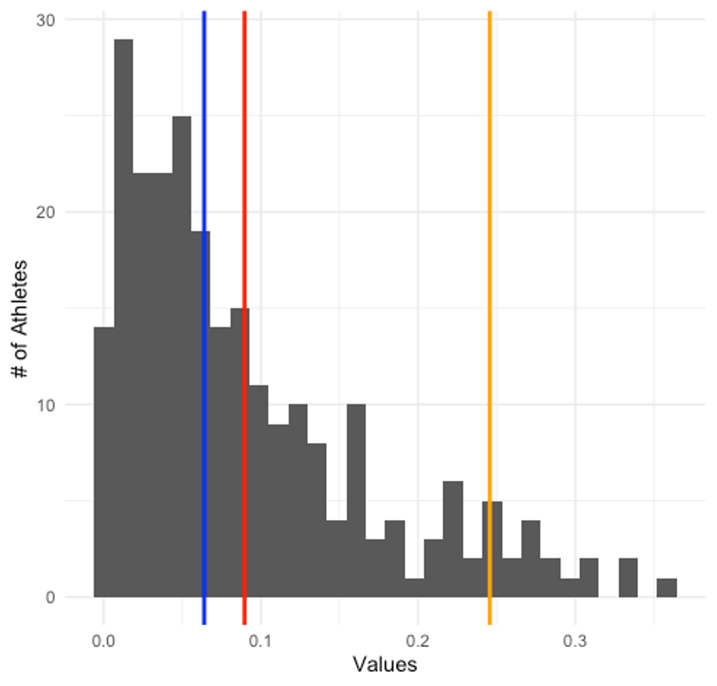
Figure 2.5 shows the mean, median, and mode indicated by lines that are color coded. The mean is red, median, is blue, and the mode is gold. As you can see all 3 are in the same position in this scenario. So which measure of central tendency should you choose?
While all 3 values are nearly identical and each could work in this case, the mean is the most stable and reliable central tendency measure. This makes it the safest bet. Want to give it another try with the plot below (Figure 2.6)? Again, the mean, median, and mode are represented by a color matching line on the plot. Which is most appropriate now?
Now there is clearly a difference based on your choice. While it may not look like a huge difference between the mean and median, the mean is being skewed by some of the values on the right side of the plot, which moves the mean further in that direction. The median is not negatively impacted by this, so it is the best choice. One more example. You can probably guess where this is going, but please do consider it carefully. This data includes athletes by year, where freshmen are year 1, sophomores are year 2, etc. Which measure is most appropriate in Figure 2.7 below?
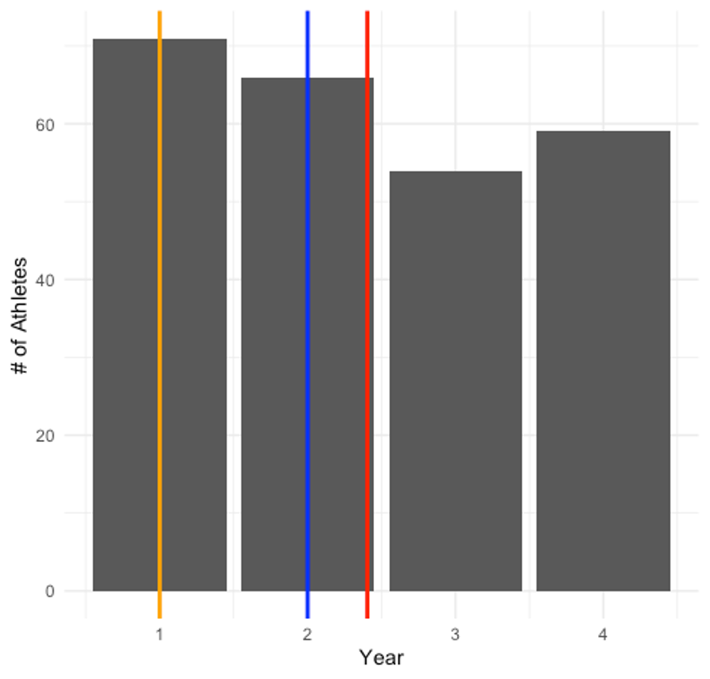
Year 1 students (where the mode is) represents the largest share of the data with a little over 70 athletes, making it the best choice. Year 2 (where the median is) only represents roughly 63 students. The mean actually suggests you go with year 2.9, which doesn’t exist in the data, so the mode is the best choice here.
Calculating Measures of Central Tendency
Options for calculating central tendency measures are provided for both MS Excel and JASP. Throughout this text, links will be provided to the same datasets used in demonstration. If you would like to follow along with the steps outlined below, please download the 2020 MLB Sprint Splits dataset in .csv format by following this link.
Calculating the Mean, Median and Mode in MS Excel
In MS Excel, you can create custom mathematical equations to produce values and you can also use its built-in functions. Fortunately, the mean, median, and mode are all built-in functions. There are 343 rows in the example dataset. Can you imagine manually typing in the equation to find the mean? Recall that the mean is the sum of all values divided by the number of values. So the formula for a variable in the G columnn would look something like = (G2 + G3 + G4 + G5 + G6 + ... G344)/343. That would take a long time to type in. So these functions are very helpful when we are working with larger datasets.
The first step to doing any of these calculations is to find the spot where you want to display the information. This often happens in the rows beneath all of your data, which means you need to scroll to the bottom.[3] Another option is to place all of your summary data on a separate tab in Excel. For this example, the summary statistics will just be placed below the data. Another good idea is to label the values based on what they are, which can be done by simply typing in the word (mean, median, or mode) next to the place where you will place the values. Finally, you will need to re-save this file as a traditional .xlsx file if you want to see the function you used. Otherwise, only the values will be saved under the .csv format.
Calculating the mean
MS Excel refers to the mean as the average, so you will see that term in the functions. In order to calculate the mean, the Excel function follows the format of =average(first value:final value). Whenever you use an equals sign first in a cell, it is telling excel to calculate something. So this is telling Excel to calculate the average of the first value through the final value, but we still need to tell Excel where the first and final values are. If we are calculating the average age in the dataset, we will use column G. The first value is found at G2 because G1 is a variable heading. The final value is at G344. So our function should look something like =AVERAGE(G2:G344). This should give us a value of 28.402332.
Calculating the median
The built-in function for the median follows the same format, but we need to tell it to calculate the median instead of the mean or average. This means we will use the format below and give us a value of 28.
=MEDIAN(G2:G344)
Calculating the mode
The mode function in Excel is similar, but there are two versions of the mode function. This is because we might have more than one mode in a specific dataset and Excel is letting us pick how we want to deal with that. If we only expect one mode or we are willing to take only the highest value of the modes in one variable, we will use =MODE.SNGL(first value:final value). If we want to see all the modes, we will use =MODE.MULT(first value:final value). The results from the age column are shown below.
One mode:
=MODE.SNGL(G2:G344)
=27
Multiple modes:
=MODE.MULT(G2:G344)
=26 and 27
Worried you might not remember the function formats?
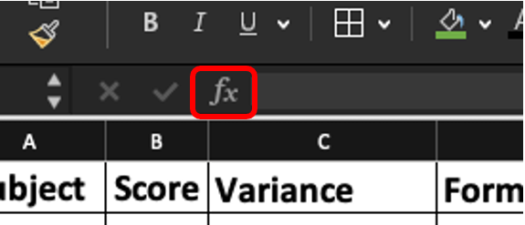
If you are worried you might not remember all of the MS Excel built-in function formats, that is with good reason. There are many more functions that you could use and many follow different rules. The good thing is that there is a short-cut that also provides you with instructions. If you click the ƒx button, a search window will pop up on the right side of your screen and you can search for the function you are looking for. Step by step instructions on how to use it will also be provided along with ways to highlight your input data.
Calculating the Mean, Median and Mode in JASP
JASP does many of these calculations in a single step, while others can be completed by simply clicking a checkbox. But first, the data needs to be pulled into JASP in the .csv format. When you first open JASP, you should see a link to "open a data file and take JASP for a spin" link. Once you click it, you route the program to wherever you have the file saved on your computer to open it.
Check your data types
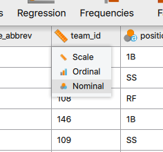
Before doing any analyses in JASP, you should make sure that all of your data are identified correctly as either scale, ordinal, or nominal. JASP guesses at this when it imports the data and does a decent job, but it can make mistakes, so you should verify this on your own. If you find a variable that was incorrectly identified, you simply need to click the icon and click the appropriate option in the drop-down menu.
Here we see that the team ID was labeled as a scale variable because consists of numerical values, but those are actually codes for specific teams, which should be a nominal variable. Why is this important? This will change which types of analyses you can do later on. Specific statistical tests were designed for certain types of data and if your data are mislabeled, JASP may not let you run the test.
Now that we've corrected our data types, we can begin calculating some summary descriptive statistics in JASP. First you must click on the "Descriptives" tab.
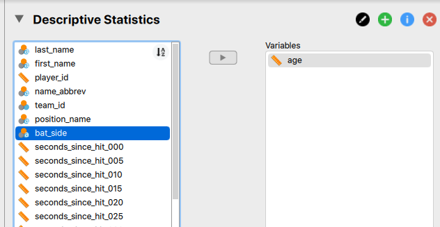
Now you need to select the variable or variables you'd like to calculate these for. You then click on the arrow to move them over to the variables box. You are not limited to completing these one at a time, so you can highlight multiple variables to move over or you can move variables over one by one.
You should now already see some of your values calculated in a table to the right in the "Results" window of your JASP console. The results have been included in Table 2.2 below.
| age | |||
|---|---|---|---|
| Valid | 343 | ||
| Missing | 0 | ||
| Mean | 28.402 | ||
| Std. Deviation | 3.640 | ||
| Minimum | 20.000 | ||
| Maximum | 40.000 | ||
As you can see, the mean is already calculated for us along with some other variables by default. If you'd like to add more, click on the "Statistics" drop-down below the variable selection area. Then you simply check the boxes you would like to see. The median and mode are now checked and the results are now shown in Table 2.3 below.
| age | |
| Valid | 343 |
| Missing | 0 |
| Mean | 28.402 |
| Median | 28.000 |
| Mode | 26.000ᵃ |
| Std. Deviation | 3.640 |
| Minimum | 20.000 |
| Maximum | 40.000 |
| ᵃ More than one mode exists, only the first is reported |
If you would have selected more variables besides age, they would show up as additional columns in the table. Also, note that more than one mode exists. When issues like this arise in JASP, they are often indicated by a symbol and described in a footnote.
Measures of Variation
Another way we might describe data is how much it varies. Is it broadly distributed or is it mostly centered around one value? There are several ways we can describe this and, similar to measures of central tendency, their appropriateness will depend on the situation. The most common methods are the range, variance, and standard deviation.
Range
The range is the easiest measure of variance to calculate. You simply subtract your lowest score from your highest score. This is also the least stable measure of variability. The reason why is actually depicted on your screen below. Since it only depends on two values, it may not be the best representation of how the data actually vary. The maximum value in the data set is 60 and the low value is 3, so the range would be 57. But you should quickly notice that 3 is an outlier that only appears one time and this drastically increases the range.
Another common iteration of the range is the interquartile range or IQR. The IQR is calculated by first dividing the data into 4 quartiles and then the IQR is found by subtracting the lower quartile from the 3rd quartile. This represents the middle 50% of the data. The range should only be reported alongside the median.
Variance
A more frequently used method is the variance. It is the most stable variability measure. It quantifies the spread of scores in a dataset or sample of data by calculating the square of the average amount that scores deviate from the mean.
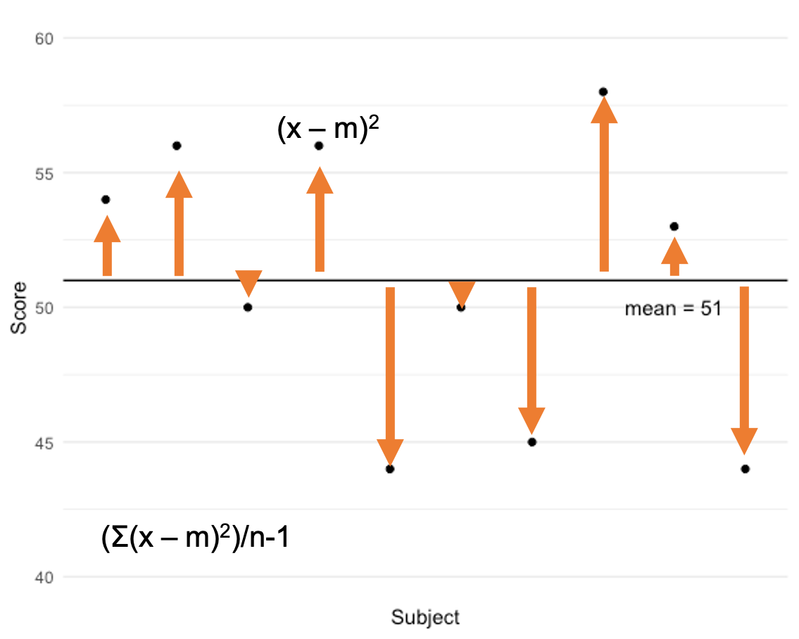
Take a look at the data on in the plot above. The mean score of the sample is 51 and it is displayed as a horizontal black line. Each data point is also plotted. You can see that some points deviate a small amount from the mean, while others are further away from it. You can also see that the data deviate on both sides of the mean, so when we quantify each data point’s deviation we will have positive and negative values. To quantify the variance, we must first quantify how much each point deviates from the mean. So we take our observed score (x) and subtract the mean. The 4th data point has a score of approximately 56. 56 minus the mean of 51 = 5. We then square that value and get 25. But that is only how much this particular score deviates. We need to get the average of all the deviations. So, we must do this for every data point, add those together and then divide by the number of data points in the sample minus 1.
Variance = (Σ(x-m)2)/n-1
There are only 10 data points in this dataset, so you might be able to do this by hand. It would become very tedious to this with larger datasets, especially if we wanted to do this on multiple variables. Fortunately, most statistical software has these formulas built in as functions.
Standard Deviation
The standard deviation is simply the square root of the variance. The standard deviation is likely the most common measure of variance that you will see. Unlike the variance measure, it is a linear measure of variability. The variance is exponential because everything is squared and since we are taking the square root, the standard deviation becomes linear. As an example, you can see what happens when the square root of exponential data are plotted in the figure below. As you can see, they become linear.
Again, we could calculate this by hand by calculating the square root of the variance, but letting statistical software do that for us is much faster.
Where does this variability in data come from?
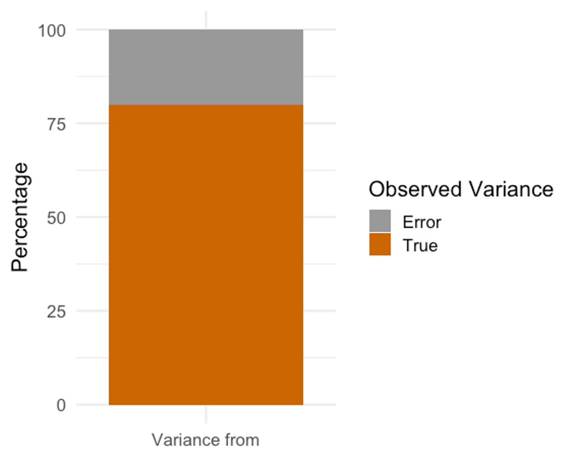
In theory, we would love to have data that are 100% accurate and the only variation occurring came from actual differences in performance on some assessment. In reality, that will never happen. Whenever we measure a variable, we will see variation between subjects and the mean score, and that variance will be made up of the amount that the score truly varies and some amount from error. So, we are actually measuring something called ”Observed Variance.” Observed variance is made up of the truth and some error. To make matters a little more complicated, the proportions of truth and error in the observed scores are specific to each individual. We must recognize this whenever we are looking at recorded values. The true score exists, but we will likely never be able to measure it without some amount of error.
Calculating Measures of Variation in MS Excel
Calculating the range in MS Excel
MS Excel does not have a built-in function for the range, but 2 other functions can be combined to produce this. Finding the maximum and minimum values, which Excel does have functions for will help out here and those can be included into a custom formula as seen below.
=max(G2:G344)-min(G2:G344)
This is essentially telling Excel to find both the maximum value and minimum value, and then to subtract the minimum value from the maximum. This should give us a range of 20 for the Age variable found in column G.
Calculating the variance in MS Excel
In Excel, there are several variance functions that will help, but you will likely only use a couple of them. Both are currently shown in the table displayed. Don’t forget that you can always look up these functions by clicking the insert function button to search for them.
| Variance | Function |
|---|---|
| 13.2470121 | =VAR.S(G2:G344) |
| 13.2083911 | =VAR.P(G2:G344) |
The difference in the 2 functions pictured is related to how the data were collected. If you are using a small sample to represent a much larger population, you will use the VAR.S function where S represents sample. With large populations, it is often unrealistic to test every individual, so we might test a smaller amount to estimate the values of the entire population. This is perfectly acceptable, but when this is done, there will always be some amount of error coming from sampling. As a result, the VAR.S function should yield a higher value than when calculating the variance of the entire population. When calculating the variance of the entire population, the VAR.P function should be used, where P represents population. Imagine you are the sport scientist working for Team USA Bobsled and Skeleton. You test all of 15 of your athletes. Is that a sample or the population? Here it would be the population because you are using the data specifically for Team USA Olympic level athletes and you tested all of them. If you only tested 5 of the 15, that would be a sample.
There is only a small difference in the values of the example with the Age data. That is because there is a decent amount of data with 343 athletes. If this were a small number of athletes, the resulting difference between using each of these functions would much greater because there is less statistical certainty with smaller datasets.
Calculating the standard deviation in MS Excel
Much like the variance, there are many choices for standard deviation modes in Excel. The differentiation between the sample and population are the same. If you are working with a sample of the population, you will choose the STDEV.S function. If you are working with the entire population, you will choose the STDEV.P function. Again, both can be observed below calculating the standard deviation of the Age column.
| Standard Deviation | Formula |
|---|---|
| 3.6396445 | =STDEV.S(G2:G344) |
| 3.63433502 | =STDEV.P(G2:G344) |
Similar to the variance calculations above, there is very little difference with larger datasets. Using the incorrect function likely won't result in any issues here, but it could with a smaller dataset when the differences are larger.
Calculating Measures of Variation in JASP
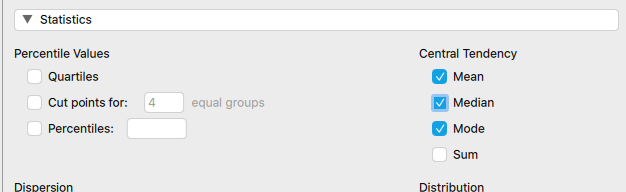
Calculating these values in JASP is very similar to calculating the measures of central tendency in JASP. In reality, you will likely do these at the same time. You simply need to check the boxes you want to see values for. One important note is that JASP uses the term "dispersion" for variation. Also, keep in mind that there are specific situations when different measures of variation are more appropriate than others. While many measures are selected here, only one central tendency measure would be accompanied by one variation measure in most situations.
| age | ||
|---|---|---|
| Valid | 343 | |
| Missing | 0 | |
| Mean | 28.402 | |
| Median | 28.000 | |
| Mode | ᵃ | 26.000 |
| Std. Deviation | 3.640 | |
| IQR | 5.000 | |
| Variance | 13.247 | |
| Range | 20.000 | |
| ᵃ More than one mode exists, only the first is reported | ||
Copying and Pasting or Using the Data Analysis Toolpak to calculate the Descriptive Statistics in Excel on more than one variable at a time
If you are reading the solutions in JASP as well as those in MS Excel you may have noticed that the JASP solutions are much quicker. While Excel has built-in functions for many of these measures, they only calculate them on one variable if using the methods described above. If you copy and paste the functions or highlight the cell they are in and drag the bottom right corner across all the columns you wish to see information for, you can retrieve the same summary information for each variable. Excel does this by assuming you'd like to progress parts of your formula each time it is pasted. This does not always work out well with more complicated formulas and may require some additional work, which will be demonstrated in later chapters.
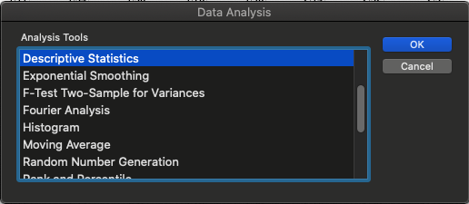
Another option that is similar to the JASP solutions shown above is by using the Data Analysis Toolpak. Instructions on how to enable this in your version of Excel were included in the technology section of Chapter 1. Running several calculations at the same time is possible in Excel without copying and pasting by clicking the Data Analysis icon in the Data tab of the ribbon.
Once clicked, the "Descriptive Statistics" option needs to be selected in order to complete the same calculations shown above.
The next window will show all the input options required. First is the input range. This can be manually typed in or it can be selected with the icon circled in red below. Once that is clicked, you will be able to highlight all the data you wish to calculate descriptive statistics for. Here you are not limited to one column or one variable. You can select as many as you wish as long as they are arranged next to each other. As you may notice by the values entered here the values begin with 1 and go to 344, which means the header row is included. This is strongly recommended so that your descriptives table also includes the variable name. If they are not included, the variables will be labeled as a column and a number (e.g. column 1, column 2, etc.). You must check the labels in the first row box for this to work. A common error here is that someone forgets to check this box, but includes the variable names in their selection and then Excel produces an error describing that "non-numeric" data were included. Which highlights one issue with MS Excel and that is that it does not know how to handle non-numeric data.
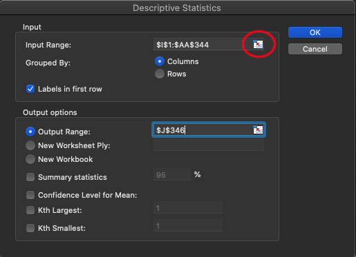
Next, the output options need to be selected. There are 3 location options here. First, you can select where you want the table to be produced by clicking the same icon as above and then clicking the specific location on your excel sheet. Keep in mind that this table could be very large, so make sure there is enough room for it if you select this option. The 2nd option is to create a new tab with your results (and you can name it)and the 3rd option is to create a new workbook entirely. Finally, you must select statistical option and "Summary Statistics" is what we are currently looking for. A sample of the first 2 variables chosen is displayed below in Table 2.7. This data included all of the split times for the base runners from home to first base. Seconds since hit 005 indicates the time it took an athlete to go from home to 5 feet. Seconds since hit 010 is the time from home to 10 feet. Here we can see many of the measures we solved for earlier produced rather quickly. Keep in mind that this is just 2 of the 18 variables, so this would likely look much busier in MS Excel.
| seconds_since_hit_005 | |
|---|---|
| Mean | 0.56148688 |
| Standard Error | 0.00074748 |
| Median | 0.56 |
| Mode | 0.56 |
| Standard Deviation | 0.0138435 |
| Sample Variance | 0.00019164 |
| Kurtosis | -0.1295509 |
| Skewness | -0.1557427 |
| Range | 0.08 |
| Minimum | 0.52 |
| Maximum | 0.6 |
| Sum | 192.59 |
| Count | 343 |
| seconds_since_hit_010 | |
| Mean | 0.88892128 |
| Standard Error | 0.00130018 |
| Median | 0.89 |
| Mode | 0.9 |
| Standard Deviation | 0.0240796 |
| Sample Variance | 0.00057983 |
| Kurtosis | -0.2810501 |
| Skewness | -0.0772752 |
| Range | 0.14 |
| Minimum | 0.81 |
| Maximum | 0.95 |
| Sum | 304.9 |
| Count | 343 |
Normal and Non-normal Data Distributions
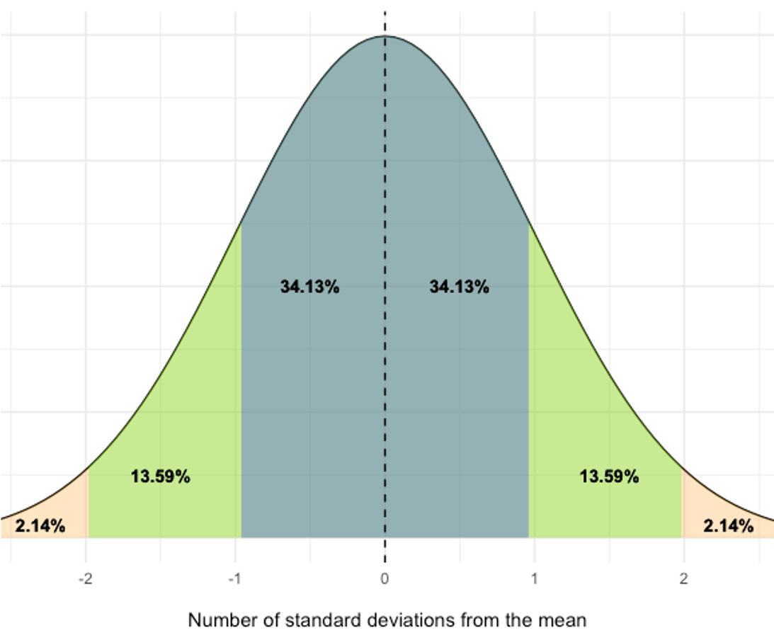
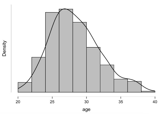
Understanding standard deviations is quite important and it can tell us quite a lot about a data distribution assuming it's normally distributed. A “normal” distribution is bell shaped and symmetrical like the one seen above. If we know the mean and the standard deviation, we can plot a curve of where all the data should be based on that information. Data that are within 1 standard deviation of the mean will account for 68.26% of our data. That includes 34.13% coming from 1 standard deviation above the mean and 34.13% coming from 1 standard deviation below it. You should be able to see this in the figure. If we look at all the data that lie within 2 standard deviations of the mean, that will account for 95.44% of our data. Again, this includes standard deviations above and below our mean. So, this adds 13.59% from the 2nd standard deviations above and below the mean to our previous data that was within 1 standard deviation. What about 3 standard deviations? Now we can account for 99.74% of our mean.
This should also tell you how rare or how common a value is in your dataset. Consider a sample with a mean of 25 and a standard deviation of 5. A value of 22 is pretty common because it is within 1 standard deviation of our mean. A value of 4 is rare as it is 4 standard deviations from the mean. A value of 4 would not be included in the previous 3 standard deviations that make up 99.74% of the data, so it is quite rare.
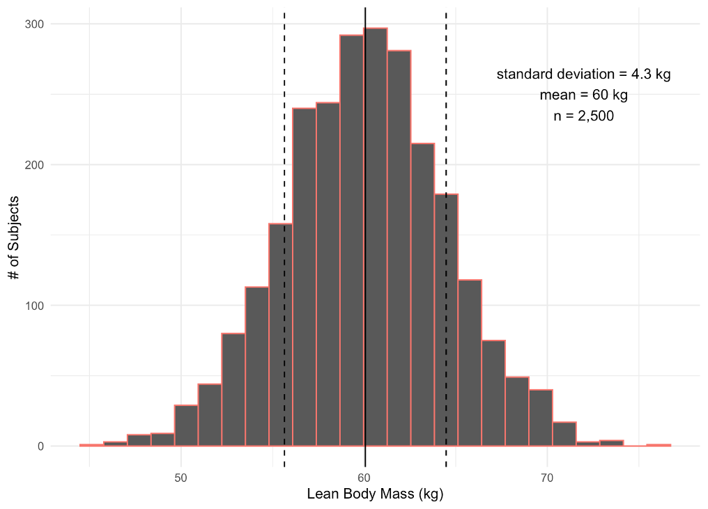
When visualizing our data for a specific variable or attribute, it is common to use a histogram. A histogram is a graph that includes columns that represent the frequency of each score that occurs in the data. You can see a histogram of lean body mass plotted here. It includes data from 2,500 subjects. The mean is represented by a solid line at 60 kg. If you look at the bar/column where the mean lies, you can see that there are approximately 475 subjects with a lean body mass near 60 kg. If we move away from the mean on the x axis, we can see dashed lines plotted that represent a standard deviation above and below the mean. So data here, which are within one standard deviation on either side of the mean, would range from 55.7 kg to 64.3 kg. You should notice that the majority of our subjects had lean body mass values in that range. If we move to the more extreme values on the x axis, you should notice that many fewer subjects recorded values there. For example, very few subjects had a lean body mass of 40 or 80 kg.
Evaluating data normality
Evaluating the normality of data should be accomplished statistically, but visual inspections may also occur. If we look a the traditional bell curve as demonstrated earlier, normally distributed data should follow the same pattern when represented with a histogram. They won't always be perfectly bell-shaped, but the should follow the trend. As an example, the lean body mass histogram above is from a normal distribution and follows the bell shape. Along with being bell-shaped, the distribution should also be fairly symmetrical as the data above are.
Skewness
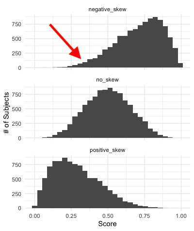
Data distributions that are not symmetrical might be skewed to one side or the other. If you look at the histogram in the middle, it is pretty much symmetrical and represents our normal distribution. This is not the case for our distributions plotted on the top and bottom. These data distributions are “skewed.” Skewness is a statistical term for the shape of a distribution. Skewness values can range from −1 to +1. A negative skew is seen in our top distribution and a positive skew is shown in the distribution on the right. The histogram in the middle represents no skew and would have a skewness value near 0. When quantifying the skew, the value will indicate the skewness direction with a negative symbol, or lack of a negative symbol if it is positive. But when the data are plotted like below, the skewness direction is indicated by the data distribution’s “tail.” The tail is the area where the data are thinning out (see arrow in negative example). So, in our negative skew example, the tail will be on the left side of the plot. The opposite is true of the positive skew example.
Kurtosis
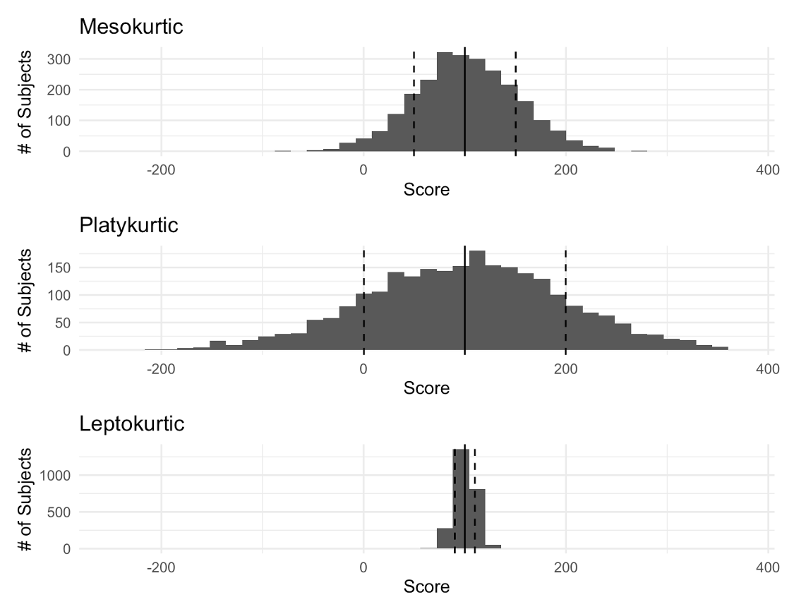
Another aspect of concern for data distribution shapes is how sharply the data are peaked. This concept is called kurtosis. Kurtosis is the peakedness of a curve. We have 3 main peak types and you can see each plotted here below. Mesokurtic, which we see first, represents our normal curve with average peak. If this value were quantified it would have a kurtosis value near 0. In the middle we have a platykurtic or flat curve that has a low peak. This would be quantified with a negative kurtosis value. Finally, we see a steep or leptokurtic curve on the bottom. This has a high peak and would have a positive kurtosis value. Notice that all three are symmetrical in this example, but they clearly differ in shape.
Other Statistical Evaluations of Normality
Evaluating normality visually and statistically with skewness and kurtosis values can be accomplished in MS Excel. If you are using MS Excel, this should be done. If you are using a program such as JASP, you may have other tests available such as the Shapiro-Wilk test. In terms of research, normality will need to be evaluated with something more than the options Excel provides and the Shapiro-Wilk test is a good option.
Calculating the Skewness and Kurtosis in MS Excel
Calculations for skewness and kurtosis shows there are some similarities to how the standard deviation and variance functions worked in Excel. But, these are also a little different. With skewness, the “.S” is not required when working with a sample, but the “.P” is required when working with the entire population. Again, you should notice that the value decreases when working with the full population. When skewness values are closer to 0 than it is to 1 (or -1) there isn’t a lot of skewness present.
=SKEW(G2:G344) or =SKEW.P(G2:G344)
The kurtosis formula does not account for differences in the sample and population, so there is only one option.
=KURT(G2:G344)
As you can see there are some small, but very specific, differences in funtions, so don’t forget that you can use the insert function button. Remembering all of these is not practical.
Good news if you were using the Descriptive Statistics output from the Data Analysis Toolpak earlier, both of these are already calculated by default.
Calculating the Skewness, Kurtosis, and Shapiro-Wilk in JASP
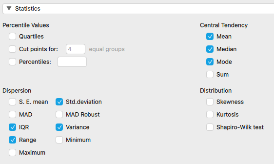
Calculating the skewness, kurtosis, and Shapiro-Wilk statistics are as simple as point and click in JASP and you may have already noticed the options in previous steps. You simply need to check off the options you want under the "Distribution" section, and they will be formatted into an table (as shown in Table 2.8 below).
| age | |||
|---|---|---|---|
| Valid | 343 | ||
| Missing | 0 | ||
| Mean | 28.402 | ||
| Std. Deviation | 3.640 | ||
| Skewness | 0.500 | ||
| Std. Error of Skewness | 0.132 | ||
| Kurtosis | 0.049 | ||
| Std. Error of Kurtosis | 0.263 | ||
| Shapiro-Wilk | 0.975 | ||
| P-value of Shapiro-Wilk | < .001</td> | ||
The next topic of discussion is the interpretation of the results from the Shapiro-Wilk test. This is accomplished with the help of the p-value, which can be seen in the table above. We will come back to p-values again later in this book, but briefly, this p-value represents the probability that we will be incorrect if we reject the null hypothesis that our data are normally distributed. If the p-value were 0.05, we would be saying there is a 5% chance our we would be incorrect in rejecting the assumption of normality. We arrive at this percentage by multiplying the p-value by 100. The p-value cutoff to reject the null hypothesis is usually 5%, so anything that is a p-value of 0.05 or less is considered statistically significant. The Shapiro-Wilk test makes the assumption is that the data are normally distributed. In the table above we have a p-value of < 0.001. This is less than the 0.05 cutoff, so the assumption that the data are normally distributed may be rejected. We can also multiply that value by 100 and say that there is less than a 1% chance we would be incorrect in saying that this data is not normally distributed.
You may be thinking “who cares if data are normally distributed?” Data normality actually dictates whether or not we can run certain statistical tests later on. We will discuss correlations, regression, t-tests, and ANOVAs later in this textbook, but none of those can be run on data that isn’t normally distributed. Given that the Age variable is not normally distributed (as shown above in the JASP example), we cannot use it in many of these statistical tests. This should likely be expected with our population, if we think about it. There generally are quite a lot more younger players in Major League Baseball than there are older ones as aging players who do not perform up to standard are often replaced by younger minor league players. This means we should expect a skewed distribution for this variable. This data can still be used in statistical analysis, but it will require tests that do not assume a normal distribution is present. These types of tests will be discussed later as well.
How to visualize data distributions with a histogram
Data distributions are often visualized with the histogram as described above. Visualizing data is very common, but not all data visualizations are created equally. If they are not created carefully, they could mislead viewers. The goal of any data visualization should be to clearly and concisely demonstrate a story from the data in graphical form. In order to do this for a data distribution, a special bar plot called a histogram is a common choice. Histograms traditionally have variable values on the x axis, the number of times that value appear on the y axis, and the data are represented by bars. Unlike other types of bar plots that often demonstrate discrete data, spaces between values are removed in a histogram to emphasize the continuous nature of values on the x axis.[4] The values on the x axis are grouped into ranges often called "bins." The number of bins a histogram contains is equal to its number of bars. For example, if you had some continuous data that ranged from 0 to 1,000, you likely would not 1,000 bars. What if you limited that to 20 bars? This could be accomplished by creating bin ranges of 50 (1,000/20 = 50). This would give us bins ranging from 0 to 49, 50 to 99, 100 to 149, and so on. The bar height would indicate how many values where within that range. Now lets imagine you only wanted 5 bins. This would mean that our range for each bin or bar would be 200 (1,000/5 = 200). Which do you think would be a better representation of the data distribution? The 5 bin option likely would be a poor choice. There could also be a scenario where too many bins are selected, which would make it harder to quickly glance at the graph and determine what is present. This should demonstrate the importance of understanding how to effectively visualize the data accurately in a manner that can be quickly viewed. One advancement on the histogram is to add a density curve, which is essentially a smoothed line of the distribution's shape. This may help viewer's quickly see the shape more quickly.
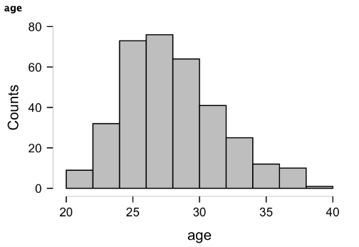
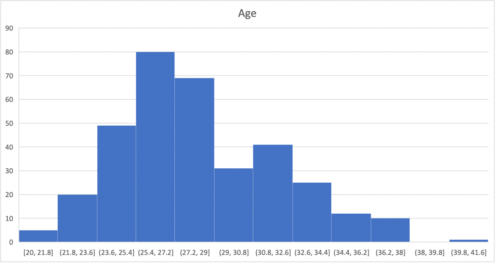
We've seen several histograms already in this chapter and nearly all statistical software programs have options for creating them. The histogram above was created in JASP on the same Age variable we've been working with throughout this chapter, but MS Excel has several options for creating histograms as well (an example of the same Age variable shown below). Most of the earlier histograms were created with R. Most statistical software programs will default to picking the number of bins for you and their ranges, which is nice for speed, but this could cause an issue if the wrong number of bins or range width is selected. You may notice a difference in the shape of the distributions above and below and that is due to different selections here. This should again highlight how data visualization design can alter the perception of the data. The histogram above has 10 bins by default, whereas the Excel option defaulted to 12 bins. If the options are changed to produce 10 bins, the shape is then identical to JASP option above. If too few or too many bins are created, this may alter the visual inspection of kurtosis by inflating or deflating it, further emphasizing the importance of both visual and statistical evaluation of normality.
Creating Histograms in MS Excel
The first step in creating a histogram in MS Excel is highlighting all of the data you'd like to include. More than likely, that means you will highlight the entire column. Next you click on the insert tab of the ribbon and then the "Statistical" plot drop-down arrow and histogram icon (screenshot shown below). The histogram will now be inserted, but customization is still required. If you'd like to add chart title and/or axis titles, you can do so by clicking on the "Chart Design" tab of the ribbon. Next click on "Add Chart Element" located to the left and select the element you would like to add. Options include chart title, axis titles, gridline customizations, data labels, and legends.
If the number of bins needs to be altered, this can be accomplished easily, but the directions differ depending on your operating system. If you are using a PC, you'll need to start by right-clicking on the x axis labels and then then selecting "Format data series." If you are using a Mac, you'll start by right-clicking on one of the bars and then selecting "Format data series." The rest of the steps are the same. After that step, a new window should pop-up on the right with a "bins" option that includes either a drop-down menu (Mac) or several options with selectable radio buttons (PC). To change it from automatic, select either by number of bins or by binwidth. If you specifically wanted a set number of bins, you would select the "Number of bins" option and then type in the desired number.
Creating Histograms in JASP
Creating a histogram in JASP is very similar to the other options shown early in this chapter. You must select the Descriptives tab, move your variable or variables over, and then check the "distribution plots" option under the "Plots" drop-down menu. If you select multiple variables, they will be laid out in a grid fashion in the results window. One quick note to keep in mind here is that if you also select the "Display density" option (example seen below), you will see the smoothed line (curve) of the data, but you will lose the counts portion of the y axis. If knowing the number occurring with each bin is important, you might want to forego this option. If you are only concerned with the overall shape and spread of the distribution, this may be acceptable. Ideally, the histogram would keep the counts on the y axis with the density overlaid or by using an alternate axis, but you do sacrifice some customization options when you go for some of the simpler point and click software options.
Standardized Scores
Many other types of data visualizations will be discussed throughout this textbook, but one that is fairly popular currently and particularly relevant to the concepts learned in this chapter is a radar plot which allows for comparisons of single subjects to others across many variables or attributes. That is what has been done below, where comparing Marvel’s superhero Thor to the average superhero across multiple performance variables[5]. This provides a nice summary of many variables all in one figure. We can see that Thor is stronger, faster, more durable, and has higher energy than the average superhero. But his intelligence is slightly lower than the average superhero.
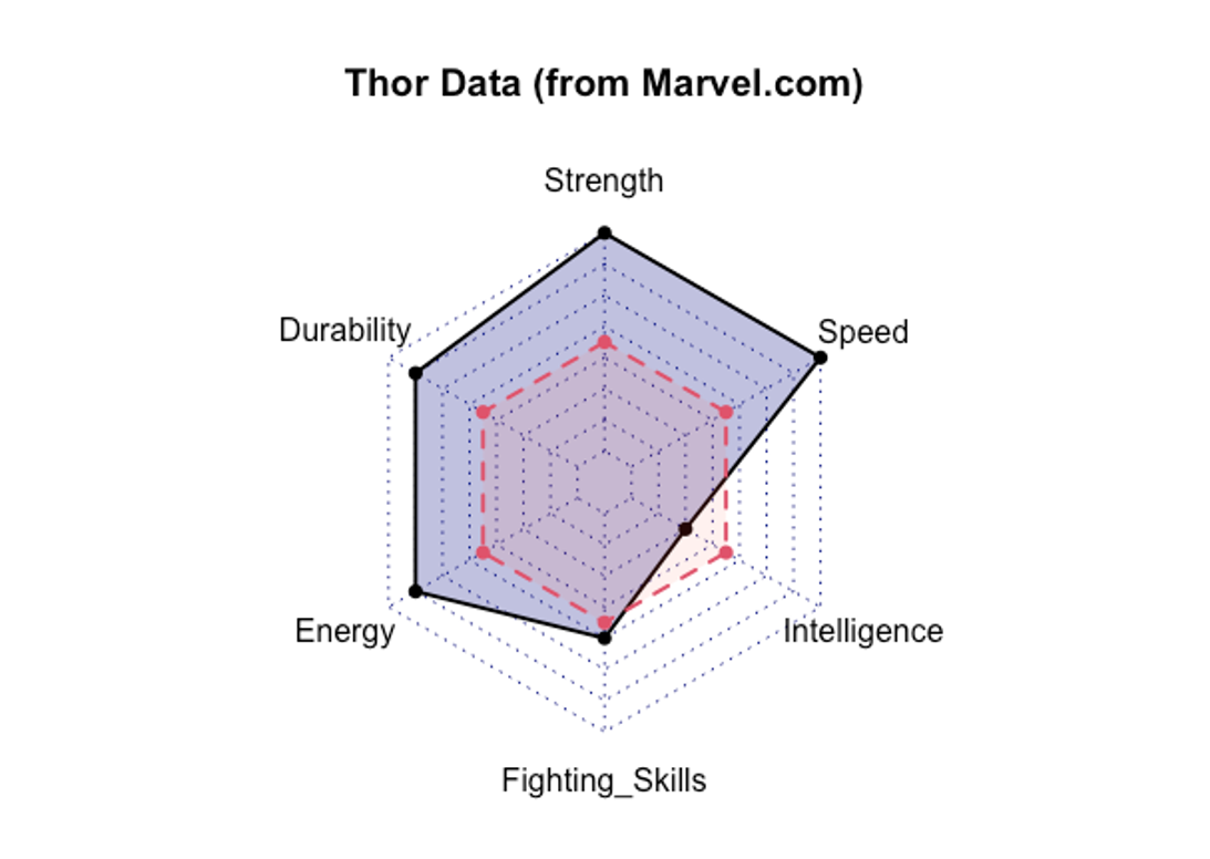
This may seem pretty simple and intuitive, but this becomes difficult with variables that are not measured on the same scale. Consider how each variable in the example above would be quantified. Perhaps strength is measured in possible pounds lifted from 0 to infinity, but speed is measured in time to travel between two points. As you might guess, faster superheroes have shorter times while stronger ones lift heavier weights. These are going in opposite directions, which could get confusing. Also, one variable’s axis might require different magnitudes than another. But, in this type of plot, they must all share the same axis. So how could we address this issue?
| Test | Measurement Unit |
|---|---|
| 40 yd dash time | seconds |
| 225 lb bench press for reps | # of repetitions |
| vertical jump | inches |
| broad jump | feet and inches |
| 20 yd shuttle | seconds |
| 3 cone drill | seconds |
| 60 yd shuttle | seconds |
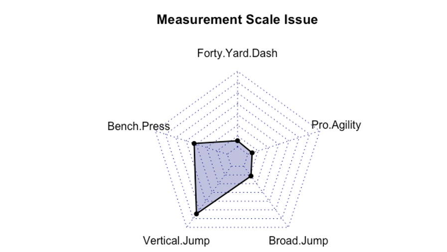
Let’s consider a more realistic example. You have likely heard of the NFL combine that happens every year where draft prospects are tested on several performance variables. A list of the tests along with their units of measure is provided in Table 2.9 above. Take a look at what happens when the variables share the same axis in the figure below. The vertical jump being measured in inches requires larger values that the 40 yd dash which is measured in seconds. The majority of athletes will have 40 yd dash times somewhere between 4.5 and 5.0 seconds, but it will be very hard to differentiate between them if the axes all share the same magnitudes. As you can see, different measurement scales mean different y axis values are needed.
Comparison of values across different measurement scales is possible through standardizing the scores. Standard scores are created by transforming the current scores around the mean of the current values along with the standard deviation. They can then be represented by how far they are above or below the mean and not in their previous unit of measure. This means that different variables can be compared meaningfully. The most common methods of this are the z-score and t-score.
Z-score
The most fundamental standard score is the z score. Z scores transform the mean to a value of 0 and the standard deviation to a value of 1. The z score is most appropriately used when you are working with the entire population in question or if your sample size is greater than or equal to 30. It can be found by subtracting the mean from your observed value and then dividing by the standard deviation.
$latex z = (x-m)/s$
x = observed score, m = mean, s = standard deviation
T-score
For samples smaller than 30, the T-score should be used. The T-score has a mean value of 50 and a standard deviation of 10. It can be found by subtracting the mean from the observed score, multiplying that by 10, then dividing by the standard deviation of the sample, and then adding 50.
$latex T = 50 + (10*(x-m)/s)$
x = observed score, m = mean, s = standard deviation
Or if a z-score was previously calculated, it can be found by multiplying that value by 10 and adding 50.
$latex T= 50 +10z$
The reason why T-scores are more appropriate for smaller samples comes from the standard deviation used in the calculation. The T-score assumes the standard deviation used is from the sample, unlike the z-score which assumes that the standard deviation represents the entire population[6]. If you don’t believe the standard deviation you are using is representative of the entire population, a T-score should be used instead.
z-Scores, T-scores, and the normal distribution
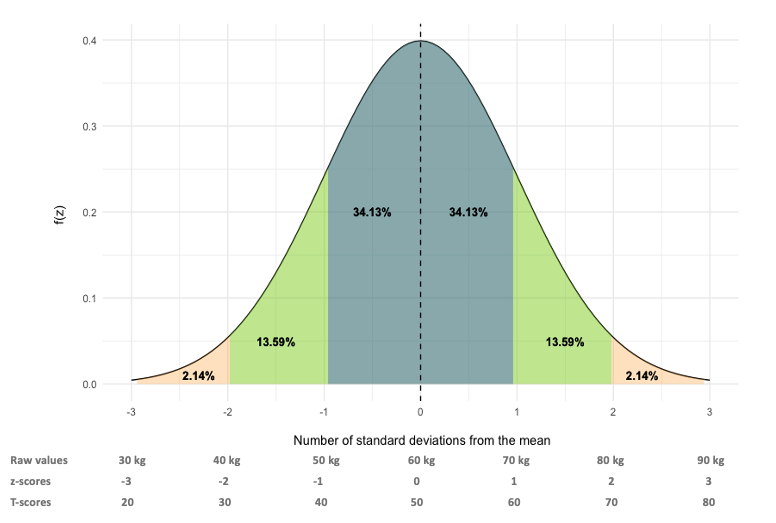
If body composition data are normally distributed with a mean of 60 kg, and a standard deviation of 10 kg, we can visualize how standard scores line up in the figure above. For the z score, the mean will become 0. How does this happen? Using the z-score formula, the mean is subtracted from the observed score (which is the mean in this case), leaving 0, which is then divided by the standard deviation of 10 kg. The result is 0. Moving up one standard deviation from this to 70 kg, the value becomes 1. Again, the mean is subtracted form the observed score (70 – 60), which leaves 10. This is divided by 10, leaving z-score of 1. So, what do you notice? The z-score cutoffs match the standard deviations. This is why the z score is considered the most fundamental standardized score. T-scores set the mean at 50 and the standard deviation at 10. Again, you can see how this works out with the normal distribution in the figure.
Practical Application
Consider another way that standardizing scores could be helpful. Imagine you are working for a fitness technology company that manufactures wearable activity and fitness trackers. Their device is worn on the wrist and collects quite a bit of data. It has sensors that help it detect cardiovascular variables such as heart rates, heart rate variability (HRV), duration of exercise spent at specific percentages of maximum heart rate, and calories burned. It tracks steps and with the help of GPS it can determine the distance covered and speeds during exercise. It also collects data on sleep duration and sleep quality. All of these variables contribute to overall fitness.

While some of their customers like to see all of this individual data, there are others that simply want a single measure that indicates their overall fitness level. The company wants you to use the data to create a custom metric, called the “Fitness Quotient” to solve this. They will then get a copyright on the FitQ, so that they are the only company that has it. They believe this will help them create brand loyalty as customers won’t want to switch to another brand if they don’t have this measure.
What can you do? Since you likely already have access to current customer data, you could create z-scores from these 10 variables. Based on research, you may think that some variables are bigger contributors to overall fitness than others, so you might want to multiply each by a coefficient. Obviously, it could also be complicated a bit more so that it would become a truly proprietary formula (that the company will likely patent), but using standardized scores is the basis of this type of solution.
Creating Standardized Scores in MS Excel
The built-in standardize function in Excel will create z-scores for individual values, but you must have already calculated the mean and standard deviation or you need to be comfortable with nesting functions within one another. The function format can be seen below (x = the observed score).
=STANDARDIZE(x, mean, standard deviation)
This will only create one z-score for the observed value included, so this will need to be copied and pasted for all necessary values. Keep in mind that Excel will progress the values for you, so make sure the function format remains correct.
MS Excel does not have a built-in function for T-scores. In order to create them in Excel, a custom equation will need to be created and either of the equations above may be used. Keep in mind that the equation should start with an equals sign so that Excel knows to calculate something. Also, make sure that the order of operations is expressed correctly in the equation and use parentheses where necessary. A quick way to check equation accuracy here is to find a value that is similar to the mean. If the T-score is close to 50, the equation is likely correct. If it is not close to 50, then something may be off.
Creating Standardized Scores in JASP
Creating z- and T-scores in JASP must be done through the data view. When looking at the data view in JASP, a new variable may be computed by clicking the plus sign on the far right-hand side next to the last variable name[7]. After clicking to add the new variable/column, a window will pop-up allowing you to name the variable, select its type, and select the computation method. There are two options here and the hand icon will be selected by default. Using this method will allow you to create custom equations in a drag-and-drop style. Using this method will be intuitive to most and the same equations used for z- and T-scores above may be used. The only caveat is that you'll need to know the mean and standard deviation to include them in the equation. So, some descriptives must be calculated first. The other computation option is by using R syntax. There is often a steep learning curve with R, but for this occasion the code is very short. So this may be one time when you'd like use it instead. Likely the most difficult part with this step is making sure the variable name is typed in exactly the same way as it appears in the data. The R syntax for both methods of standardized scores is shown below.
[asciimath] z ="scale"("variable")[/asciimath]
[asciimath] T ="scale"("variable")*10+50[/asciimath]
- While the term mean is often used interchangeably with the average, the term average does not always indicate the mean. In the past, the average could refer to either the mean or the median. ↵
- Spiegelhalter, D. (2019). The art of statistics: learning from data. Pelican. London, UK. ↵
- Quick MS Excel Tip: If you want to speed up your scrolling process, you can do so by using a combination of button clicks at the same time. If you are using a PC, this can be accomplished by clicking control and the down arrow at the same time. If you are on a Mac, this can be completed by pressing command and the down arrow at the same time. This actually works in any direction. You just need to change the arrow you are pressing. If you wanted to highlight a large selection of data, you simply need to add in the shift button before hitting the arrow key. So, on a PC that could be control + shift + down, or on a Mac command + shift + down. Just make sure the arrow key is pressed last. ↵
- Few, Stephen. 2012. Show me the numbers. 2nd ed. Analytics Press. El Dorado Hills, CA. p118. ↵
- Thor performance data was found at https://www.marvel.com/characters/thor-thor-odinson/in-comics ↵
- Everitt, BS, Skrondal, A. (2010), The Cambridge Dictionary of Statistics, Cambridge University Press. ↵
- As of version 0.14.1, this is a black plus sign. There is also a blue plus sign above it in the ribbon that is for adding modules. ↵
summary statistics that quantitatively describe characteristics of a set of data (e.g. mean, median, mode, standard deviation, range)
a subset of the population that should generally be representative of that population. Samples are often used when collecting data on the entire population is unrealistic.
A graph consisting of columns used to represent the frequencies of observed scores in the data
A graphical representation of data, often called a plot
