
3 Statistical Evaluation of Relationships
Chris Bailey, PhD, CSCS, RSCC
Evaluating relationship strength between variables is quite common exercise and sport science. This is evident when looking at article titles in some of the more popular academic journals in the field. For example, the term correlation, appears in titles of 21,259 articles and 3,451 conference papers in Sports Medicine (search numbers for June 2021).[1] Why so many? If we know that variables are strongly related, directly or inversely, we might be able to use one variable to predict the behavior of another. This can be very useful in many different areas of exercise and sport science. Consider a situation where a physical therapy clinic or a sport performance training facility does not have the budget for a top of the line force plate for measuring force production and power output. Fortunately, research has shown that vertical jump height is correlated to peak power and (along with body mass) can be used to predict peak power quite successfully[2][3][4]. As a result, many may use vertical jump height as a stand-in for actually measuring power or they may use it to predict power with one of the many published equations.
Chapter Learning Objectives
-
Learn to produce measures that help us understand how variables are related to one another, including:
- Correlation Coefficient (Pearson Product Moment correlation)
- Coefficient of Determination
- Estimates of error
- Bivariate and Multiple correlation methods
-
Create and utilize scatterplots to visualize the association between variables
- Learn how regression can be used for prediction
- Learn the limitations of correlational methods
Correlation Coefficients
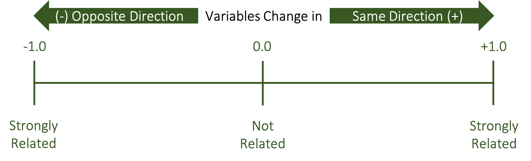
The correlation coefficient is our statistical measure of how related variables are to one another. A bivariate correlation (one that is between only 2 variables) is symbolized by a lower case and italicized r. The r value is indicative of how strong the linear relationship between between the two variables is. Since it is a linear measure, a change in one variable should be reflected as a proportional change in the other variable if they are related.
This is most often measured with the Pearson Product-Moment correlation coefficient (PPM). We will discuss some other correlation coefficients later in this course, but the Pearson is regularly used with normal, continuous or scale data. Correlation coefficients can range from -1 to +1, but we rarely indicate positive values with the plus symbol. Values of 0 indicate a lack of a relationship between the variables, while the strongest relationships are closer to 1, which can be positive or negative. It is important to note that the values can be on either side of 0 and we must think of this as a continuum of relatedness (shown in Figure 3.1 below). Values being positive or negative indicates the direction of the relationship. We will see examples of these in the form of scatterplots below, but can you think of an example of when two variables change in the same direction? Think about height and weight. Generally taller people will weigh more, so this would be an example of two variables that vary in the same direction, which makes this a positive relationship. It won’t be a perfect relationship since there are plenty of shorter people that may weigh large amounts and there may be taller people that don’t weigh that much. So, we could expect this relationship to be closer to 1 than it is to 0, but it won’t reach 1. What about an example in the opposite direction? Think about strength and sprint times. Stronger individuals can displace their bodies easier than weaker ones, so they are often faster. But we often quantify speed by timing someone as they run a specific distance. Unlike strength, faster people will express shorter sprint times or smaller values. So as strength goes up, sprint times may go down. These are moving in opposite directions, but they are still related. If this is a very strong relationship, the value would be close to 1, but it would be negative.
Scatterplots
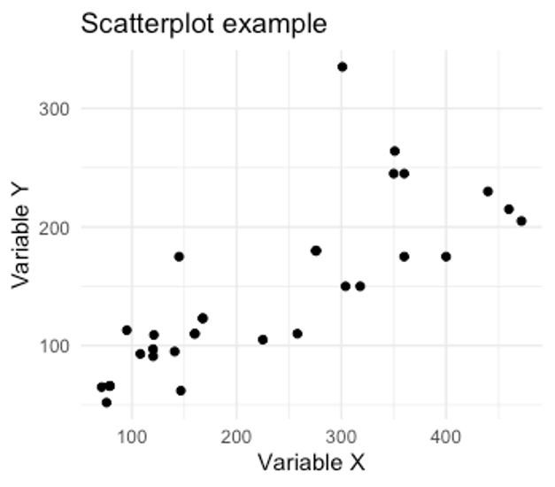
We use scatterplots as a graphical representation of the relationship. Here we see an example of a positive relationship between two variables. We know it is positive because values with larger y values generally also have larger x values. The opposite is also true where the smaller y values also have smaller x values. Since these are most often in the same direction, this is a positive relationship.
We will look more at these in a little bit, but how did we get here? How is the scatter plot created? It’s actually not that complicated if you consider each datapoint on the plot as a single subject or observation. We would then take the the x and y variables for that subject and plot them according to their values. For example, if we had a subject with an x value of 1 and a y value of 1 we would plot it accordingly. We can then move on to the next subject who has values of x=3 and y =4. Our 3rd subject has values of x = 5 and y = 5, so datapoint 3 is plotted at 5,5. We could repeat this for all the remaining data (not shown). This process is shown in Figure 3.3 below.
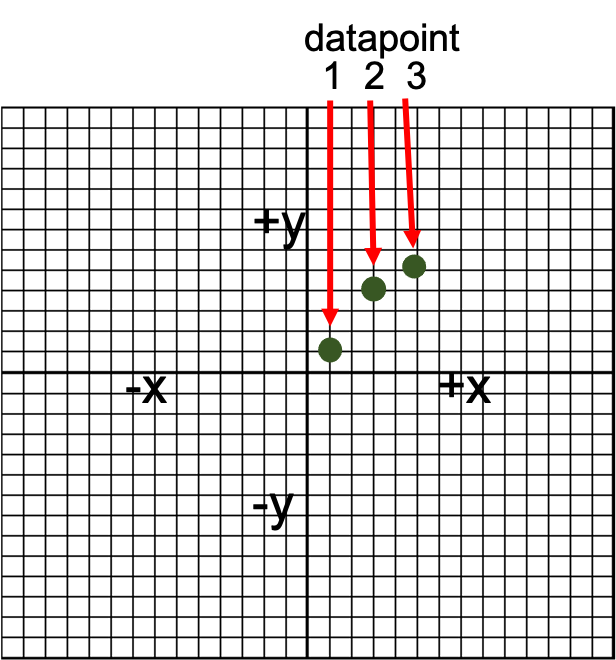
You should notice that we plotted the points on a larger grid that that of the example scatterplot in figure 3.2. You may recall doing this in some math courses a long time ago, but if both of your coordinate values are positive the plotted point will lie in the upper right quadrant. This is very commonly the case with much of our data, so many times you will only see this quadrant in figures. In theory, the other quadrants could also be plotted, but they’d be empty. When you have data that can vary on either side of 0, this may change.
Positive Correlation Scatterplot Example
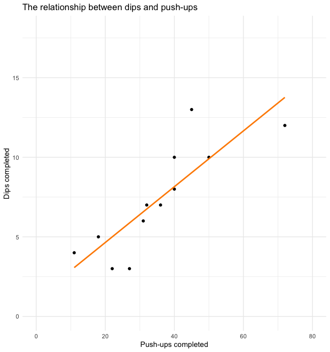
Below is another example of a positive correlation. Each dot on the screen represents datapoints of a single subject’s push-ups and dips completed. For both exercises the subject must be able to manipulate their own body weight. This is a somewhat similar quality in each exercise, so it makes sense that someone who can complete a large number of push-ups could also complete a larger number of dips. Notice that a trendline has also been included to give you a better idea of the overall trend of the relationship. In positive correlations the slope of this line should also be positive as seen here.
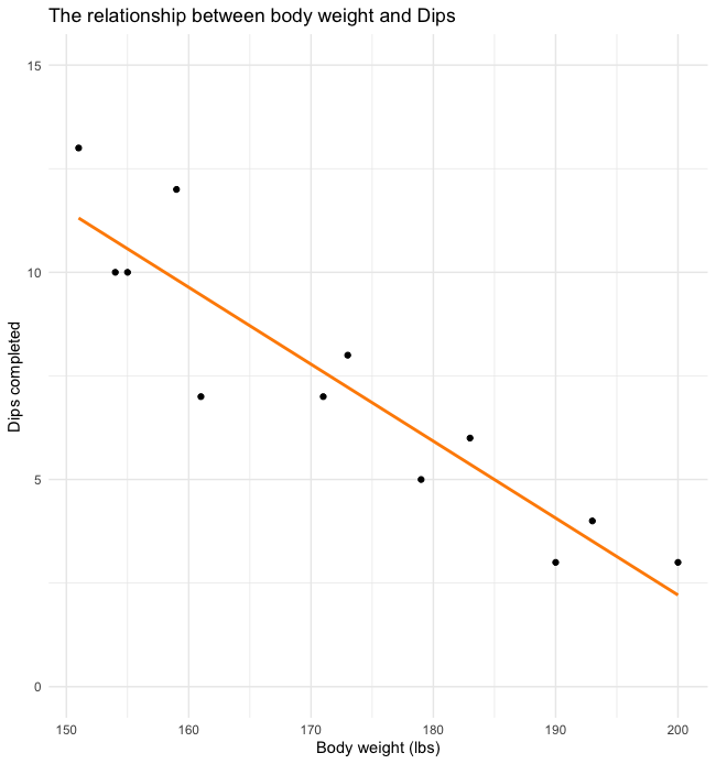
Negative Correlation Scatterplot Example
Below we see an example of a negative relationship. Again, we see dips plotted but now we are evaluating the relationship with body weight. We often see that lighter individuals are able to complete more body-weight exercises than heavier individuals. This makes sense as they have less work to do. This is of course relative to their amount of muscle mass (not shown), so this won’t be a perfect relationship. Since we see that higher values of dips are related to lower body weights, this is a negative relationship (the variables are moving in opposite directions). Notice that the trendline now has a negative slope as well.
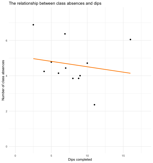
No Correlation Scatterplot Example
For the example we see what a scatterplot of what two unrelated variables looks like. The trendline has a small negative slope and it looks like the datapoints were just randomly placed. This should make sense as missing classes should not be related to the number of dips they can complete.
Visual Evaluation of Relationships
Scatterplots are a good way to visually evaluate the strength of the relationship between variables but, they shouldn't be the first method used. We will use correlation coefficients first and then create scatterplots to help fully describe the situation. As we'll see later in this chapter, a correlation coefficient can be influenced by outliers and variable groupings, so a visual inspection is always recommended.
Calculating and Interpreting r Values
In order for correlations to be evaluated statistically, some form of a coefficient must be created. As mentioned above, the PPM will be the most common method. You will likely never need to calculate the r value by hand in real life, but you could if you had to. The steps are included here just to demonstrate what goes into the functions we find in MS Excel and other programs that quickly calculate this for us. First our data must be arranged into columns and then squared to create two new columns. A 5th column must be created to get the product of X & Y. Finally the sum value of each of our 5 columns must be calculated. Now those sums can be inputted into this formula to find our r value. As long as we correctly follow our order of operations, we should come up with the same value as our statistical analysis programs.[5] As you see, calculation of PPM r values can be done by hand. But it generally isn't recommended for 2 main reasons. First is speed. This would take far longer than using a quick function to calculate it for you. Second, there are many opportunities where we might make a mistake. So, we will stick to our demonstrations that rely on technology. Again, if you would like to follow along using the same dataset, you may do so by following this link and downloading the dataset.
Calculating PPM coefficients in MS Excel
In MS Excel, a PPM correlation can be computed very quickly with the CORREL function. The Excel function format is displayed below and it only requires two arrays as input. The result is the PPM coefficient or r value.
=CORREL(array 1, array 2)
If we want to find the PPM coefficient for the relationship between the Score variable (found in column B) and Variable 2 (found in column C), the arrays will be the cells that contain all the variable data and excluding the variable headings. In this case, that includes rows 2 through 11. The correct function for this dataset should look like what is seen below.
=CORREL(B2:B11, C2:C11)
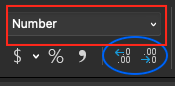
Our result should be 0.35498902 or 0.355 when rounded to 3 decimal places. Rounding to a specified number of decimal places can be accomplished quickly by first changing the format to "number" and then clicking the "increase decimal" or "decrease decimal" icons until the desired number is reached.
Rounding in this way is more desirable to rounding by hand in that it helps us to not make mistakes and keeps the true number in the background for use in calculations. For example, if we squared a raw value (1.23456789) and the same value rounded to two decimal places (1.23), we get 1.52415788 and 1.5129 respectively. The values are similar, but slightly different. Imagine compounding that difference with multiple calculations and multiple values. This difference could grow. If the value was rounded with Excel's increase/decrease decimal function, the calculations would end up the same. Or, said another way, rounding errors won't be included.
Creating a correlation matrix with MS Excel
A correlation matrix is basically a table depicting the correlation results of all variables used. This is only necessary when multiple correlations are run. The table will have variable headings in the top row and first column and these will be the variable names included in the analysis. Creating this by using Excel's CORREL function is possible, but it may require a lot of work depending on the number of variables included. The Data Analysis Toolpak offers a better solution.
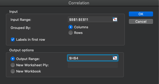
After clicking on the Data Analysis icon in the Data ribbon, navigate to the Correlation option. Next all the included data should be selected including the variable headings (but don't forget to check that they were included). Now select where the results should be displayed and click OK.
The results can be formatted and shown to a the specified number of decimal places you wish to see. Three decimal places were selected here. The individual r values can be found by selecting one variable column and one row column and then finding where they intersect. Using the same two variables used earlier (Score and Variable 2), the same value of 0.355 is observed. Notice that there are several perfect 1.0 correlations. This only happens when a variable is correlated with itself, which is not a useful calculation. These values are often deleted when publishing results.
| Score | Variable 2 | Variable 3 | Variable 4 | |
|---|---|---|---|---|
| Score | 1.000 | |||
| Variable 2 | 0.355 | 1.000 | ||
| Variable 3 | 0.039 | -0.355 | 1.000 | |
| Variable 4 | 0.049 | 0.411 | 0.158 | 1.000 |
p values
The PPM r value is a great way to describe how related variables are to one another. This is a measure of magnitude as we'll see below and in the chapter on effect sizes. What it does not tell us is how reliable the finding is. If this test were run again on another random dataset, would the result be the same? The estimation of that comes from p values which will be discussed below. MS Excel does not automatically provide p values, so most will find a correlation significance table that determines the p value based on the r value observed and the effect size. An example can be found here.[6]
Calculating PPM coefficients in JASP
Similar to previous solutions in JASP, we first need to import the data and then check to make sure our data types are correct. After quick inspection, we can observe that 3 of the 5 variables are incorrectly coded as ordinal when they are scale (seen below). These need to be corrected.
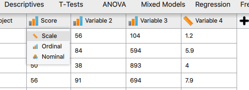
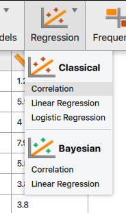
After correcting the variable types, a PPM correlation can be calculated by clicking on the drop-down arrow next to Regression and selecting Correlation.
Similar to previous tests, the next step is to highlight the desired variables and then move them over to the Variables box by clicking the arrow. If desired, all variables (except for the subject ID) could be added at the same time and a correlation matrix will be created. This is a huge advantage over MS Excel's base correlation function. MS Excel would take quite a bit more typing and formatting to do this if the Data Analysis Toolpak isn't used.
| Score | Variable 2 | Variable 3 | Variable 4 | ||||||||
|---|---|---|---|---|---|---|---|---|---|---|---|
| Score | Pearson's r | — | |||||||||
| p-value | — | ||||||||||
| Variable 2 | Pearson's r | 0.355 | — | ||||||||
| p-value | 0.314 | — | |||||||||
| Variable 3 | Pearson's r | 0.039 | -0.355 | — | |||||||
| p-value | 0.914 | 0.314 | — | ||||||||
| Variable 4 | Pearson's r | 0.049 | 0.411 | 0.158 | — | ||||||
| p-value | 0.893 | 0.238 | 0.664 | — | |||||||
As can be seen in Table 3.2 above, PPM r values are displayed in a matrix format along with accompanying p values. Note that the correlation values where a variable would be correlated with itself are removed and replaced with dash as these are not useful.
Interpreting r values and p Values
A very basic way to interpret r values was described and shown above in Figure 3.1, but there is a big difference between 0 and 1 and there are many descriptors that could be used along the way. Table 3.3 will help us interpret r values with more granularity. The first column displays ranges of r values and the second column provides an explanation of how to describe the relationship strength of variables that produced the r values. Table 3.3 only includes positive r values, but keep in mind that the relationship strength increases as the r value gets further away from zero and this is true on both sides of zero. So, the same descriptors will be used if the values are negative in the same ranges. If we consider our example from before that found an r value of 0.355 between our variables, that would fall into the moderately related range.
| r value | interpretation |
|---|---|
| 0.0-0.09 | Trivial |
| 0.1-0.29 | Small |
| 0.3-0.49 | Moderate |
| 0.5-0.69 | Large |
| 0.7-0.89 | Very Large |
| 0.9-0.99 | Nearly Perfect |
| 1 | Perfect |
Coefficient of Determination (r2)
Taking this a step further, we can create a proportion that will help us interpret how much of the variation in a specific variable might be attributed to the other variable. This is called the coefficient of determination or r2. It is found by squaring the r value. If we multiply the r2 value by 100, we can interpret it as a percentage of shared variance.
Consider an example where we want to evaluate the relationship between sprint speed and strength relative to one’s body mass. We do this in a sample of collegiate track athletes across all divisions of NCAA. We find that the variables are strongly related with an r value of 0.7. If we square that value, we are left with a 0.49 r2 or coefficient of determination. That value is a proportion, so we can multiply it by 100 to interpret it as 49%. This result means that 49% of the variation in sprint speed is shared with relative strength (at least in our sample). Said another way, 49% of the variation in sprint speed performance can be attributed to different levels of strength.
This sounds like we are saying that sprinters should get stronger and that is mostly correct, but a correlation does not evaluate cause and effect. So, it would be inappropriate to say that changes in speed are caused by changes in strength based on our example. It is possible that other underlying variables are involved that we are not measuring. This will be discussed more later, but you may have heard that “correlation does not imply causation” and this is what that phrase comes from. That being said, an r2 value of 0.49 is substantial since we can essentially predict half of the performance of one variable with the performance of the other.
| r value | interpretation | r2 | % of variation |
|---|---|---|---|
| 0.0-0.09 | Trivial | 0.00-0.0081 | 0-0.81% |
| 0.1-0.29 | Small | 0.01-0.0841 | 1-8.41% |
| 0.3-0.49 | Moderate | 0.09-0.2401 | 9-24.01% |
| 0.5-0.69 | Large | 0.25-0.4761 | 25-47.61% |
| 0.7-0.89 | Very Large | 0.49-0.7921 | 49-79.21% |
| 0.9-0.99 | Nearly Perfect | 0.81-0.9801 | 81-98.01% |
| 1 | Perfect | 1 | 100% |
Let's continue thinking about our example where a correlation between strength and speed produced an r value of 0.7. Based on this table we would interpret that as a “very large” relationship between these 2 variables. How did we arrive at that interpretation (especially if you weren't using Tables 3.3 and 3.4 above)? This comes back to the coefficient of determination or r2 value. If 0.7 is squared, that equals 0.49, which can be interpreted as 49%. If we can predict nearly 50% of the variance in one variable just by knowing another variable value, that is a big deal.
Let’s look at a value with a smaller r and r2 value. What if we had an r value of 0.1? We would interpret this as a small relationship because it can only account for 1% of the variance.
Now that you understand how to calculate and use the r2 value, you should be able to interpret the entire range of potential r values. Similar to Table 3.3, only positive values are shown here. So keep in mind that negative values are also possible and that the interpretation is still the same though, but the variables to move in opposite directions.
Prediction (Regression)

When variables are correlated, we can use one variable to predict the other. When the relationship strength is quite strong between the two, we can predict more of the behavior of the predicted variable than when the relationship strength is weak. This comes back to the r2 value, where we interpret how much of the variance in one variable is shared by the other. It may be easier to consider shared variance as predictability. For example, if 50% of the variance between 2 variables is shared, then 50% of one variable can be predicted with the other.
Thus far, we have only been discussing simple correlation which is also called bivariate correlation because it is between 2 variables only. It is also possible to determine how multiple variables correlate with another variable and this would be called multiple correlation. When variables are used to predict other variables, it is called regression. So, if multiple variables are used to predict another variable it would be called multiple regression. Correlation produces a single statistic like the r value, whereas regression uses the data points to produce an equation that can be graphed like the lines of best fit seen in many of the scatterplots above. With the equation produced by regression (multiple or single variable), one can plug in known values to predict another value. It may sound like magic, but it’s just math and you’ve probably done it before.
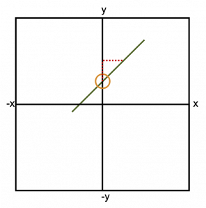
As mentioned previously, regression is used when we are hoping to predict a variable value from one or more other values. If we are using only one value to form that prediction, it is called “simple” linear regression. This prediction equation may look familiar to you if you remember the “y=mx+b” format from a previous math course. If we are going to draw a line with that format, we can use the x and y coordinates from different points on that line, the slope of the line (represented as m), and the y intercept (represented as b). The y intercept, where the line crosses the y axis is circled in Figure 3.11. We could also calculate the slope of the line if we remember to use the “rise over run” technique (shown as a dashed line). You likely had to solve for many of these components in previous math courses depending on which values were known.
The regression equation format is identical, but different names are used for the components of it. Here we are always solving for the y value. The y value in the regression equation is the dependent variable, or the variable that we are trying to predict. When we call something a dependent variable, that means that it is dependent on some other variable or variables. This means that our equation must also have at least one independent variable, and it does, represented by x. We will usually call this a predictor variable. Instead of the slope, we will use a coefficient that represents how important our predictor variable is. This predictor variable is multiplied by this coefficient. If the coefficient value is very small, the predictor variable probably doesn’t provide that much predictive value to the equation. Instead of a y intercept, we have a constant value that is added (or subtracted).
Geometrical equation
Regression equation
It's called multiple regression when multiple variables are used to predict another variable. It is a little more complicated, but not too much and it follows the same format as our previous equation. We are simply adding in our new predictor variables and the coefficients associated with them.
[asciimath]Ŷ=b_1x_1+b_2x_2+b_3x_3+b_4x_4+b_5x_5+c[/asciimath]
They are still being multiplied together and a single constant is still used. The subscripts here represent the number of predictor variables. If only 2 variables were used, 𝑏3𝑥3, b4x4, and b5x5 would not be included. If six variables were used, we would add 𝑏6𝑥6.
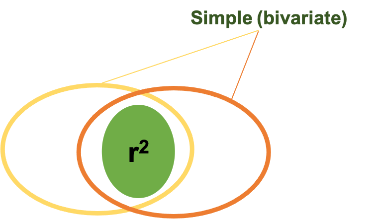
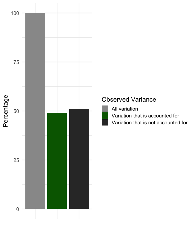
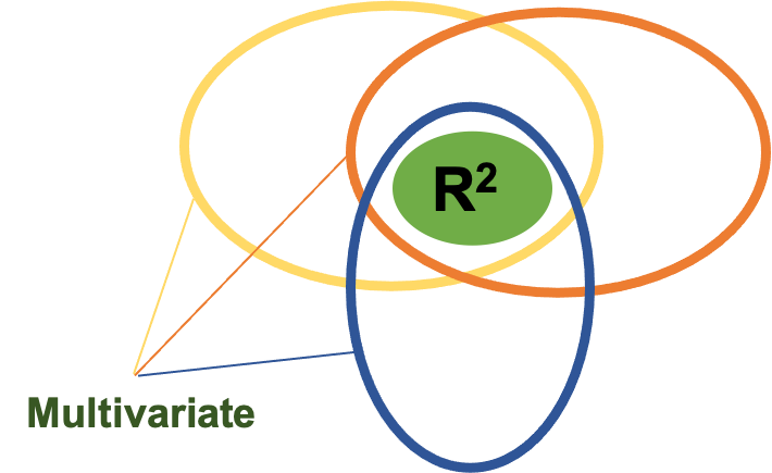
Let’s briefly look at this another way. If we were utilizing simple linear regression with only 2 variables (which are represented by the ovals above), we are mostly concerned with the area where they have shared variance. That is represented as the area of overlap in this figure. Remember the the coefficient of determination r2 helps us explain the amount of shared variance. But, if we are using multiple regression, we would have at least 3 variables, so another oval is added in and this can be observed in Figure 3.13 below. Now there are 2 predictor ovals and one oval representing the variable being predicted predicting. We are still concerned with the shared variance or overlap. Note that when we are using multiple regression or multiple correlation the R becomes capitalized to symbolize that. We still interpret the value the same way. So, if we had a multiple R2 value of 0.71, we could essentially say that we can predict 71% of the the variance in our dependent variable using our regression equation that uses the other 2 variables.
As you can see, multiple regression could potentially be a powerful tool. While we won’t go in depth on these in this course, you should know that there are some assumptions that need to be met in order to use multiple regression. One of those is sample size and samples need to be progressively larger with the higher number of predictor variables being used. So, we likely won’t see this technique with a small sample, and if you did there should be a smaller number of predictor variables.
Practical Applications
While it is great to talk about how to use regression equations from a theoretical perspective, it may be helpful for you to see some real-world examples. Here are two prediction equations that were created with the multiple regression technique.
VO2max (Jones et al., 1985)
[asciimath]VO_2max (L/min) = 0.025 ∗ "height" - 0.023 ∗ "age" – 0.542 ∗ "sex" + 0.019 ∗ "weight" + 0.15 ∗ "activity level" – 2.32 L/min[/asciimath]
Peak Power during vertical jump (Sayers, 1999)
[asciimath]"Peak power (W)" = 60.7 ∗ "jump height (cm)" + 45.3 ∗ "mass (kg)" - 2055[/asciimath]
In the first example we are using several variables to predict VO2max. How many predictor variables do you see? What is the constant? Could you label all the variables, their coefficients, and the constant? Thinking back to the equation structure, you should be able to and you should come up with something like Table 3.3 below.
| # of Predictor Variables | Predictor Variables | Coefficient | Constant |
|---|---|---|---|
| 5 | height | 0.025 | -2.32 L/min |
| age | -0.023 | ||
| sex | -0.542 | ||
| weight | 0.019 | ||
| activity level | 0.15 |
Based upon what we’ve seen previously, which of the variables is weighted the heaviest in the prediction equation? In other words, which variable is most important in predicting VO2max from this example? If you answered sex, you are correct. It has the largest coefficient, so it plays the largest role in the equation outcome. It should be noted that this is an older equation and now many prediction equations are created to be sex specific, so this may not always be the case. This means that there are separate prediction equations for males and females, and it also means that each variable may have a different amount of predictive value depending on sex.
Let’s take a look at the second example that estimates peak power in vertical jumping. How many variables are used in this prediction equation? Try to label them before the answer is revealed. Hopefully you came up with 2 and were able to label them along with the constant. Now consider from a practical perspective, which of these 2 equations is used more often by practitioners? Assume that the R2 value (which demonstrates how each equation predicts the dependent variable) is the same. Practitioners are more likely to use the simpler equation that has a smaller number of variables and is easier to calculate. So, while it is great to be able to predict more of the variance, it might be worthwhile to create simpler equations if the goal is to benefit the end user. Of course, this point may not matter much if we are using an app or computer program to perform the calculations for us.
Prediction Error
Unfortunately, there will always be some error when we make predictions. Unless we have a perfect correlation, this will be true. To be clear, we will never have a perfect correlation. Our prediction may not be very far off, it may be very close, but there will be a difference between the predicted value and the actual value. We can calculate this error by subtracting our predicted variable value from the actual value. Said another way, error is the inaccuracy in our prediction.
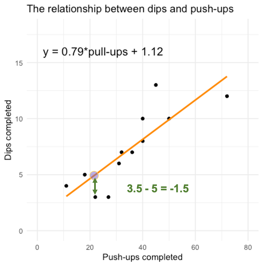
Coming back to our previous scatterplot demonstrating the relationship between dips and push-ups completed, we can calculate the amount of error in our prediction (plotted as an orange line in Figure 3.14 below) for each data point and those are called residual scores. Each residual score is simply the distance a datapoint is from the prediction or line. For example, for our 3rd data point, the prediction is 5 (don't forget we are predicting the y value with the x value). But how far away is that from the actual value? If the actual value is 3.5, the residual score or error can be found by subtracting predicted value (5) from the actual value (3.5) (3.5 – 5 = -1.5), so we get -1.5 for our residual score.
Obviously, that is one individual error, a metric that demonstrates the average error for all the scores would be more useful. The standard error of the estimate or SEE does just that. Fortunately for us, many of our analysis programs will calculate that statistic for us whenever we run a regression analysis.
Linear Regression Analysis
Computing linear regression is possible in many software programs including MS Excel and JASP. The data organization is very important in MS Excel. If they data are not organized properly, this will not be possible in MS Excel. JASP still offers the same intuitive variable selection based analysis. The data for this analysis was digitally created to mimic a 2001 study published in the Journal of American College of Cardiology on the validity of using age to predict one's heart rate maximum.[7] If you are unaware, subtracting one's age from 220 is a very common way to estimate their heart rate maximum. While this method is widely used, it had not been validated and the authors sought to create an equation that might more accurately represent the heart rate maximum in a sample that included males and females from 18 to 81 years old. The dataset that will be used in this example was digitally created to mimic that of the original study by completing a digitization process using one of the published scatterplots, but is not the actual data. The data can be downloaded from this link.
Linear Regression in MS Excel
The Data Analysis Toolpak will be necessary for completing regressions in MS Excel. In order for Excel (and Excel users) to complete this easily, the predictor variables or all of the x values need to be arranged in columns next to one another. This won't matter if you only have one predictor variable, but will if you are completing multiple regression. For example, if you have predictor variables in columns B, C, and D, they will all need to be highlighted together. If you later decide that you don't want to use the column C variable in the regression and only want to use columns B and D, you will receive an error that the "input range must be a contiguous reference." To fix this you will need to rearrange the dataset so that the columns B and D are right next to each other and can be highlighted together.
Let's see if our analysis produces similar findings to the Tanaka et al. (2001) study. Their model only used 1 predictor variable (age) to predict heart rate (HR) maximum, so we will also only use one predictor variable (age).
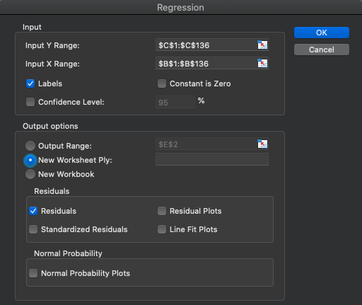
The first step is clicking on the Data Analysis icon in the Data ribbon and then selecting Regression. Now it's time to select the data. Here, it is very important to remember that we are predicting the y axis variable, which is Max_HR in this case. This means that the "Input Y Range" should be all of the Max_HR column including the variable heading in row 1. Make sure you check the "Labels" box. Next, select the x (predictor) data. In this case that will only be one column, Age, located in column B. The final required step is to tell Excel where the results should go and "New Worksheet Ply" will be selected by default. I have residuals also selected to demonstrate the difference between each datapoint's actual and predicted values. Now click "OK."
| Regression Statistics | |
|---|---|
| Multiple R | 0.883 |
| R Square | 0.781 |
| Adjusted R Square | 0.779 |
| Standard Error | 7.894 |
| Observations | 135 |
| df | SS | MS | F | Significance F | |
|---|---|---|---|---|---|
| Regression | 1 | 29470.307 | 29470.307 | 472.959 | 0.000 |
| Residual | 133 | 8287.293 | 62.310 | ||
| Total | 134 | 37757.6 |
| Coefficients | Standard Error | t Stat | P-value | |
|---|---|---|---|---|
| Intercept | 209.750 | 1.770 | 118.488 | 0.000 |
| Age | -0.801 | 0.037 | -21.748 | 0.000 |
The results are shown above. Note that these results were formatted so they are slightly different than the initial result produced. They were formatted as numbers to show 3 decimal places (please refer to Calculating PPM Coefficients in Excel above for instructions on how to accomplish this). This results in some very small numbers changing to 0.000 from something such as "1.2467E-45." Initially, when Excel produces very small numbers it will use the "## E-##" notation to indicate that there are a specified number of zeros before the initial value.
There are a lot of statistics here, so we'll take them one by one. In Table 3.6a, the Multiple R value is displayed first (0.883). This can be interpreted the same way as any a bivariate r value. Keep in mind that only 1 predictor variable was used, so this is actually the same value that you would get from the =correl() function. Similarly, the R Square value of 0.781 is just the square of 0.883 and it can be interpreted the same as r2 values discussed earlier. So far, these are actually the same exact values we've seen before because only 1 predictor variable was used. Both of these values would change and would be true multiple R and multiple R2 values if/when more than 1 predictor variable is used. Next, is the Adjusted R Square value. This adjustment is used to account for error in small sample studies. This study has a decently sized sample in with 135 observations (also shown in Table 3.6a), so there won't be too much difference between the R Square and Adjusted R Square values. If the sample were smaller, the difference between these two would be larger, with the adjusted value being much lower. The Adjusted R Square value should be interpreted the same as the r2 or R2 values. If the sample is sufficiently large, the R2 value should be used for interpretation. If it is a smaller sample study, the Adj. R2 value should be used instead (further information on this topic can be found in the section on Limitations below). All of these values indicate that age is a very good predictor of maximum HR as it can predict roughly 78% of the variance in Max_HR. The final value to be discussed in Table 3.6a is the Standard Error value of 7.894. This value is actually the standard deviation of the residuals. If you checked the box to have residuals displayed, you can calculate their standard deviation to produce the same value.This value means that each predicted value has a standard error of 7.894 beats per minute.
The main area to be discussed in Table 3.6b is the Significance value. This value tells us if the regression equation is statistically significant. Since this value is less than 0.05, this regression equation would be described as statistically significant. Statistical significance will be discussed in more depth in the upcoming chapters, but briefly, this means that there is very little chance we would be wrong in saying that we can predict maximum heart rate with age alone. Statistically, since the value is less than 0.000, we can say that there is less than a 0.0% chance that we are wrong. Or said the other way, there greater than 99.9% chance that we are correct in saying that.
Tale 3.6c gives us the information needed to write the regression equation. From this output, we will use the Intercept (or constant) coefficient value and the Age coefficient value. Recall that our formula will follow the y=bx+c format. The b in the equation will be replaced by the predictor variable (Age) coefficient, which is -0.801. The c or constant is the y intercept coefficient, which is 209.75. This leaves us with the equation below.
[asciimath]ŷ = -.801x + 209.75[/asciimath]
You can input this equation in a new column next to the actual Max_HR values to produce the predicted values. If you subtract the predicted values from the actual Max_HR values, you will create the residual values.
Let's take this one step further and do a multiple regression in MS Excel. Unfortunately, this dataset doesn't have any other variables other than the subject number. The subject number should not have any predictive value to add to this equation if they were randomly assigned, but we can check that by adding it in as a predictor variable. The steps to do this are the same as before, but now you will need to select both the Subject_number and Age columns when you select the Input X range. Everything else can remain the same.
In order to save space, the results will not be included here. What did you notice? The Multiple R and R Square values increased by approximately 0.12 (12%) indicating that the Subject_number variable added some predictive value to the equation. Why would this occur? Is it just random chance? Probably not, it may actually be indicative of the way the the numbers were assigned. Maybe many of the earlier values were younger individuals a quick glance at the data seems to support this hypothesis.
Linear Regression in JASP
After opening the dataset in JASP and ensuring that the correct data types are selected, navigate to the correlation tab and click on Linear Regression in the drop-down menu. In order to determine if our analysis produces similar findings to the Tanaka et al. (2001) study we must also use only 1 predictor variable (age) to predict heart rate (HR) maximum. Next move the Max_HR variable over into the Dependent Variable box since that is what we are attempting to predict. Next, move the predictor variable over into the Covariates box.
As you can see, the results are already populating the window to the right. You should notice that there is a null model H0 and an alternative model H1 in the results. The H0 model is used to demonstrate how the model we are testing H1 compares to a null model. So for our purposes, we will be most concerned with the H1 results.
| Model | R | R² | Adjusted R² | RMSE | |||||
|---|---|---|---|---|---|---|---|---|---|
| H₀ | 0.000 | 0.000 | 0.000 | 16.786 | |||||
| H₁ | 0.883 | 0.781 | 0.779 | 7.894 | |||||
In the first results table, we find 4 statistics that we need to interpret. Since we only included 1 predictor variable, R, R2 (and Adjusted R2) are actually the same as r and r2 respectively. When additional variables are added, this would become a true multiple regression, so R would be come a multiple correlation coefficient and R2 would in effect become a multiple correlation coefficient of determination. These can be interpreted the same as their simple correlation counterparts. Thus, an R2 value of 0.781 could be interpreted as 78% of the variance in HR_max is predicted by Age. The Adjusted R2 value is used when the sample size isn't large enough for regular regression models and this accounts for some of the error associated with smaller samples in regression models. This sample had 135 observations, which is a good size if only 1 predictor variable is used, so not much error should be accounted for. This can be observed as there isn't much difference between the R2 and Adjusted R2 values. If the sample were much smaller, the difference would be greater and the Adjsuted R2 would be much lower than the R2. You should use the Adjusted R2 value whenever your sample size isn't large enough for regression. Information on how to make this decision can be found below in the limitations section. The final value of interest here is the RMSE or root mean square error. This is the standard deviation of all the residual values. Recall that residuals are the difference between the actual values and the predicted values. This means that each prediction has a potential error of 7.894 beats per minute.
| Model | Sum of Squares | df | Mean Square | F | p | ||||||||
|---|---|---|---|---|---|---|---|---|---|---|---|---|---|
| H₁ | Regression | 29470.307 | 1 | 29470.307 | 472.959 | < .001</td> | |||||||
| Residual | 8287.293 | 133 | 62.310 | ||||||||||
| Total | 37757.600 | 134 | |||||||||||
Table 3.7b is where the Significance or p value for the regression model can be found. This value tells us if the regression equation is statistically significant. Since this value is less than 0.05, this regression equation would be described as statistically significant. Statistical significance will be discussed in more depth in the upcoming chapters, but briefly, this means that there is very little chance we would be wrong in saying that we can predict maximum heart rate with age alone. Statistically, since the value is less than 0.001, we can say that there is less than a 0.1% chance that we are wrong. Or said the other way, there greater than 99.9% chance that we are correct in saying that.
| Model | Unstandardized | Standard Error | Standardized | p | |||||||
|---|---|---|---|---|---|---|---|---|---|---|---|
| H₀ | (Intercept) | 174.200 | 1.445 | < .001</td> | |||||||
| H₁ | (Intercept) | 209.750 | 1.770 | < .001</td> | |||||||
| Age | -0.801 | 0.037 | -0.883 | < .001</td> | |||||||
Table 3.7c gives all the information needed to create the regression equation. Again, pay attention to the H1 model here. From this table, we will use the Intercept (or constant) coefficient value (209.750) and the Age coefficient (-.801) value. Recall that our formula will follow the y=bx+c format. The b in the equation will be replaced by the predictor variable (Age) coefficient. The c or constant is the y intercept coefficient. This produces the equation below.
[asciimath]ŷ = -.801x + 209.75[/asciimath]
Unfortunately, this dataset doesn't have any other variables other than the subject number. The subject number should not have any predictive value to add to this equation if they were randomly assigned, but we can check that by adding it in as a predictor variable, making this a multiple regression model. The steps to do this are the same as before, but now you simply add both the Subject_number and Age variables into the covariates box.
In order to save space, the results will not be included here. What did you notice? The Multiple R and R Square values increased by approximately 0.12 (12%) indicating that the Subject_number variable added some predictive value to the equation. Why would this occur? Is it just random chance? Probably not, it may actually be indicative of the way the the numbers were assigned. Maybe many of the earlier values were younger individuals a quick glance at the data seems to support this hypothesis.
Limitations
There are several limitations with using correlational methods. The most common issues will be discussed here. They include:
- A correlation does not indicate a causal relationship between variables.
- Groups within data can alter the relationship strength.
- Linear methods do not work well with nonlinear relationships.
- Samples with very small amounts of variability will not correlate well with other variables.
- Large samples are needed for regression with multiple predictors
Correlation and Causation
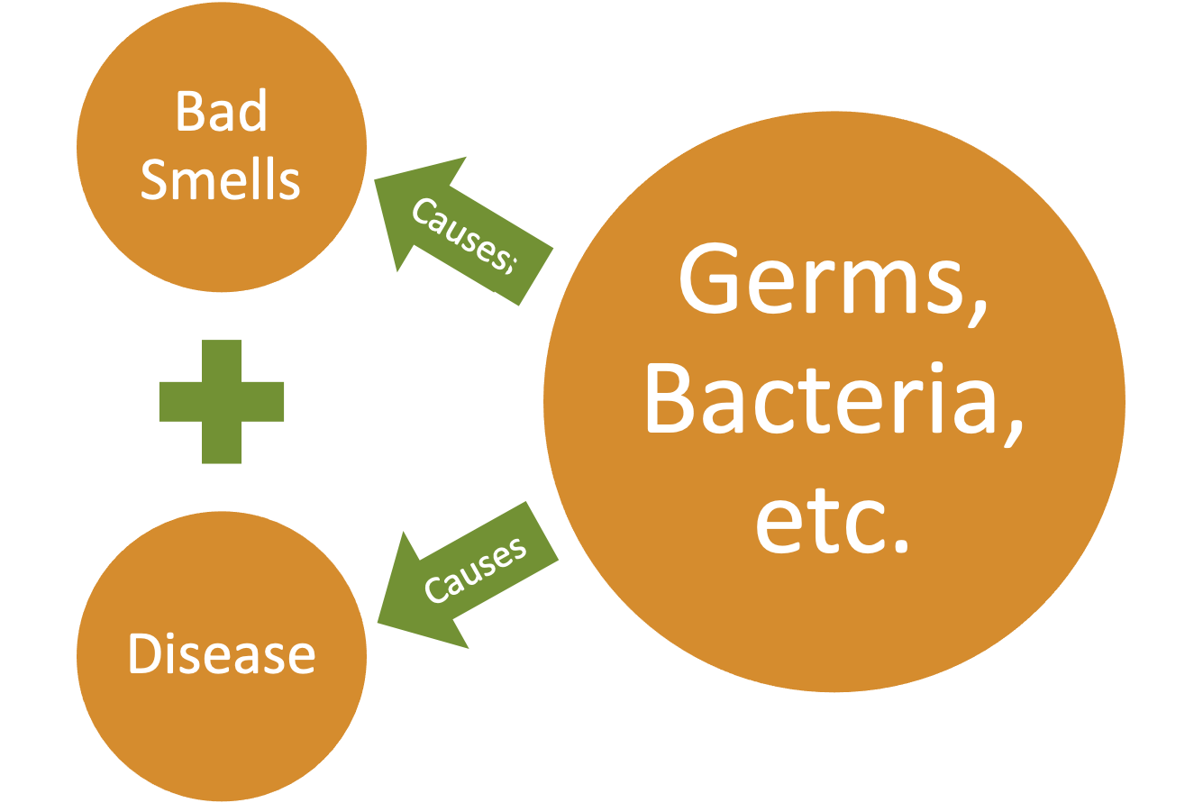
"Correlation does not imply causation."[8] It simply implies that the variables change in similar manners (but not always in the same directions). It may be the first step in establishing a cause-and-effect relationship, but this does not completely do that. Here is an example that has been effective at times but ineffective at other times historically. There is a correlation between things that smell bad and disease. This theory is called Miasma where many thought the ”bad air” led to disease.[9] Imagine living prior to the 20th century. If you avoided smelly areas where garbage and excrement were building up, you were probably healthier than those were forced to live near them. This is not a cause-and-effect relationship and it probably seems more obvious to us now, but we have more information than they did back then. This led to funny things like plague doctors wearing beaked masks filled with flower petals to cleanse the air.[10] As you likely guessed, this was ineffective at preventing many diseases such as Cholera and the Bubonic Plague. So, what is actually happening here? There was an unknown variable that was not being considered that was influencing the variables that they did know about. Here that variable is likely bacteria and many germs that were unknown to those who lived in this time. This example will be revisited later when discussing epidemiology.
Groups within correlated data
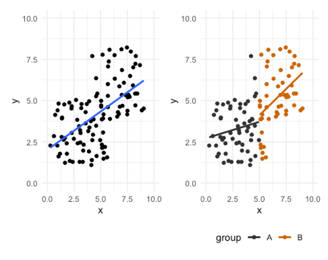
What if there are 2 groups included in this the same data that are altering how we view the results? First take a look at the scatterplot on the left in Figure 3.9 where there appears to be a strong positive relationship between x and y. Now take a look a the scatterplot on the right where the data is the same, but the groups are color coded. It still appears there is a large positive relationship in group B, but group A is smaller. Additionally, the fact that group A’s values are smaller inflates the trend and relationship strength compared to when the groups are viewed separately.
This may seem like a hypothetical crazy scenario, but it is seen somewhat regularly in kinesiology. When males and females are included in the same data set evaluating strength, there is often a strength difference in the groups, and this may inflate the r values. The same is true when we compare different fitness levels or sometimes different sports. Think about a study comparing endurance athletes and weightlifters. They may both be elite level, but their sports are very different and require vastly different qualities. When multiple groups are evaluated it is often a good idea to visualize them separately.
Linear methods and nonlinear relationships
Many correlations and regressions are linear models. This works well with linear relationships, but some relationships may not fit into that category.
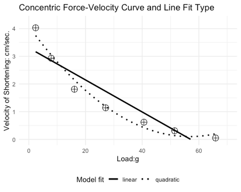
If you have taken a biomechanics or a strength and conditioning course, you likely know about the force velocity curve. Essentially, this curve describes the behavior in which one can produce a range of forces at given velocities. Concentrically, we cannot lift heavy objects very fast. If we want to move an object rapidly, it must be relatively light. This was demonstrated by AV Hill back in 1938.[11] You can see the individual data points as circles with plus signs in them. A linear bivariate correlation line of best fit is shown as the straight solid line. An exponential (quadratic) equation was used to create curvilinear line of best fit. Which do you think is a better representation of the data? The exponential equation appears to be a much better fit and also shows how a linear PPM could under estimate the strength of this relationship.
Data variability and relationship strength
Variability in data can also play a role in the ability to produce relationships with other variables. Variable data that has very low variability likely will not correlate well with other variable data.[12] Measurement and Evaluation in Human Performance. Human Kinetics. Champaign, IL. Keep in mind that correlation and regression are looking for shared variance between variables. It's difficult to find shared variance if one of the variables does not have much variation. Too much variation could also be a problem and this will be discussed later with reliability and validity.
Multiple regression and sample size
One factor to consider with multiple regression and the number of predictor variables used is the sample size you have. Your sample size restricts some of what you can do here. While multiple regression can be a great tool, it may not work well in all situations and those with small sample sizes is one of those.
You can estimate the sample size needed by multiplying your number of predictor variables by 8 and then adding 50.[13]
[asciimath]"sample size needed" = ("# of independent variables" * 8) + 50[/asciimath]
For example, if there are 3 predictor variables 74 subjects are needed (3*8+50=74). If this requirement is met, you can evaluate your results with the R2 value similar to the coefficient of determination. If you do not meet that requirement, you should utilize the adjusted R2 value that is more conservative.
- https://link.springer.com/search?dc.title=correlation&date-facet-mode=between&showAll=true ↵
- Harman, Everett A.1; Rosenstein, Michael T.2; Frykman, Peter N.5; Rosenstein, Richard M.3; Kraemer, William J.4 Estimation of Human Power Output from Vertical Jump, Journal of Strength and Conditioning Research: August 1991 - Volume 5 - Issue 3 - p 116-120. https://journals.lww.com/nsca-jscr/Abstract/1991/08000/Estimation_of_Human_Power_Output_from_Vertical.2.aspx ↵
- Sayers SP, Harackiewicz DV, Harman EA, Frykman PN, Rosenstein MT. Cross-validation of three jump power equations. Med Sci Sports Exerc. 1999 Apr;31(4):572-7. doi: 10.1097/00005768-199904000-00013. PMID: 10211854. ↵
- Johnson, Doug L.; Bahamonde, Rafael Power Output Estimate in University Athletes, Journal of Strength and Conditioning Research: August 1996 - Volume 10 - Issue 3 - p 161-166. https://journals.lww.com/nsca-jscr/Abstract/1996/08000/Power_Output_Estimate_in_University_Athletes_.6.aspx ↵
- Morrow, J., Mood, D., Disch, J., and Kang, M. 2016. Measurement and Evaluation in Human Performance. Human Kinetics. Champaign, IL. ↵
- https://www.real-statistics.com/statistics-tables/pearsons-correlation-table/ ↵
- Tanaka H, Monahan KD, Seals DR. Age-predicted maximal heart rate revisited. J Am Coll Cardiol. 2001 Jan;37(1):153-6. doi: 10.1016/s0735-1097(00)01054-8. PMID: 11153730. ↵
- John Aldrich. "Correlations Genuine and Spurious in Pearson and Yule." Statist. Sci. 10 (4) 364 - 376, November, 1995. https://doi.org/10.1214/ss/1177009870 ↵
- https://en.wikipedia.org/wiki/Miasma_theory ↵
- https://upload.wikimedia.org/wikipedia/commons/a/a4/Medico_peste.jpg ↵
- Hill A.V. 1938 . The heat of shortening and the dynamic constants of muscle . Proc. R. Soc. Lond. B Biol. Sci. 126 :136 –195 . https://doi.org/10.1098/rspb.1938.0050 ↵
- Morrow, J., Mood, D., Disch, J., and Kang, M. 2016. Measurement and Evaluation in Human Performance. Human Kinetics. Champaign, IL. ↵
- Green SB. How Many Subjects Does It Take To Do A Regression Analysis. Multivariate Behav Res. 1991 Jul 1;26(3):499-510. doi: 10.1207/s15327906mbr2603_7. PMID: 26776715. ↵
a statistical test for evaluating the strength of relationships between variables
MS Excel uses the term array to describe variable data that is often arranged in a single column. The array does not include the variable header often appearing in the first row.
