
9 Other Statistical Concerns
Chris Bailey, PhD, CSCS, RSCC
This chapter will introduce some specific issues we might run into on a somewhat regular basis in quantitative analysis. If we can spot them, we can avoid making mistakes because of them. Some of these issues will be introduced below along with examples. You may also be able to recall specific experiences in your own lives where you’ve observed these.
Chapter Learning Objectives
- Introduce several statistical and bias related concerns that may influence quantitative analysis
Selection Bias
This will be discussed again with sampling for surveys and questionnaires, but this issue can hurt us in any study where a sample is used to generalize some result to an entire population. We won’t often be able to test an entire population, so we should test a random sample in hopes that the results will be representative of the overall population. We should always question whether or not our sample is truly random and if it is a good representation of our population.
One of the best examples of doing this incorrectly comes from car insurance commercials and their marketing that often say customers saved some percentage or a certain amount of money by switching to their company. As a potential customer this may sound like a good deal, but think it through. They are not saying that their prices are some percentage less than their competitors at all. They are saying that their customers saved money when they switched. Why would someone switch companies? Because they saved money. What type of person would not switch companies? The one who doesn’t save any money or have any financial incentive to do so. But they are not asking that person. They are only asking their customers, who switched and more than likely had some financial incentive to do so. Since they are using a sample that does not represent the entire population, this is a selection bias issue. A more appropriate statement would be that “we had to drop our prices by x% in order to get customers.” However, I'm not sure that would be approved by a marketing department.
Let’s consider an example that is more relatable to kinesiology. Imagine you are testing a new piece of aerobic training equipment and you have a sample of 60 sedentary individuals. You randomly assign 30 to the experimental group and 30 to the control group. Both groups go through cardiovascular fitness testing pre and post protocol. The experimental group trains on the new device and the control group goes home and doesn’t change anything about their lifestyle. The experimental group improves their cardiovascular fitness level to a large extent and the control group remains the same as when they started. The study concludes that everyone interested in enhancing their cardiovascular fitness level should begin utilizing this piece of equipment.
Do you see any issues with this study or its conclusion? You should. Since the sample only included sedentary individuals, the results can only be generalized to other sedentary individuals. We don’t know anything about how this device would work with individuals of a higher fitness level. You should always be cautious of studies that show improvements on previously untrained individuals, because nearly every type of training will work on populations that don’t train regularly. Doing something is better than doing nothing.
Multiple Comparisons
We briefly discussed this topic before. The more statistical analyses (comparisons or correlations) we run, the more likely we are to find something by random chance. If we thought we found a difference when it was actually just a random chance occurrence, we would be making a type I error.
You may remember the example I gave before where I would be swinging a hammer at your cell phone while blindfolded. Since the table it was sitting on was decent sized, there was a low chance I would hit it initially but given more chances the statistical probability that I’d hit it would increase with each new swing.
We can reduce this risk in two main ways. First, we limit the number of statistical analyses we run. There are a lot of different ways we can test our data, but if it isn’t directly related to our specific question or hypothesis, we should avoid running more tests.
Sometimes we can’t avoid running many tests. For example, maybe we have 5 variables to test or maybe we collected data on 5 different occasions. We won’t be able to avoid running any less than 5 comparisons here, but the risk of type I error increases with each additional test. The 2nd option is to make the p values cutoffs for statistical significance more conservative. This means they would be smaller and therefore harder to achieve. There are many methods to do this, but we will highlight two very common ones. The first is a Bonferroni p value adjustment. This method divides your initial p value cutoff for statistical significance by the number of analyses run.[1] For example, if our initial p value cutoff was 0.05 and we ran 5 independent samples t tests, we would divide 0.05 by 5 and our new p value to achieve statistical significance would be 0.01. You can see how this decreases the likelihood of a type I error by making the initial p value for statistical significance smaller. Unfortunately, it also makes it harder to find something statistically significant. Another option is the Holm-Bonferroni sequential adjustment. The way it works is by dividing your initial p value cutoff by 2 after each statistically significant finding.[2] So if we follow our same example, our initial p value for statistical significance would be 0.05. Let’s say we find something statistically significant in our first t test. Now we must divide 0.05 by 2 and the next p value must be 0.025 or lower to be statistically significant. If we find something again, we would divide again. You can see how this one is less strict initially, but becomes more strict if you keep finding statistical significance.
Texas Sharpshooter Fallacy
I’m not sure why it specifically has to be a sharpshooter from Texas, but this one comes due to our preference to assign causes to random occurrences. This one gets its name from a person randomly shooting a gun at the side of the barn. Afterward they notice that there are a couple of areas that had larger groupings of bullets. So, they paint a target around those shots to make it look like they were fairly successful at shooting the target. If all the other shots are ignored, you might think this was a sharpshooter.[3]
This one is very prevalent with conspiracy theorists. They will point out some number of coincidences that support their point, while ignoring all the other incidences that do not. For example, you may have seen a headline that The Simpsons predicted some event 10+ years before it happened. If you check it, sure enough, they probably had an episode where something very similar to a current event happened. Does this mean that The Simpsons creators somehow know the future? What about if you search for a psychic on the internet and view their predictions that came true (most psychics will use this to demonstrate their credibility). They likely have some pretty crazy and successful predictions. How does this happen? Do they actually have the ability to predict the future? No. Absolutely not. They are are only showcasing the predictions that came true and ignoring the countless others that did not. Most make a ridiculous number of predictions each year so that a handful might actually happen. They then emphasize those and neglect to recognize that the incorrect predictions ever happened. If they make 100 predictions, 5 may come true due to chance alone if we are using our p value of 0.05, but in reality far less actually do. In the case of The Simpsons, they have been on the air since 1989 and have had over 700 individual episodes. Eventually, some of the crazy things that happen on the show will happen in real life just due to random chance. Another recent example was the Hotel Cecil documentary on Netflix where many conspiracy theories are investigated in connection with a tragic event that happened at the hotel. When you consider that the hotel is very large and has been open for nearly a century, a few tragedies will likely occur. If you then consider total number of people that stayed there and no tragedy occurred, the truth becomes a lot more boring.
So how does this work it’s way into statistical analysis? It happens when we run a lot of analyses without any direction, then find something due to random chance, and claim that our data proves its existence. Consider the physical activity, physiological, and sleep data collected via a smart watch. A single device can collect many variables when it uses all of its sensors. If we blindly look for correlations or inferences from all the variables it collects data on we will likely find something eventually from random chance alone. If that happens, we must design a new study and collect new data to test the new hypothesis. If we don’t and simply use the current dataset where we initially produced the statistically significant finding as proof, we are committing the Texas Sharpshooter Fallacy since we are creating our hypothesis after we know the results.
Conjunction Fallacy
A) Sara is a computer scientist
B) Sara is a computer scientist and is overweight
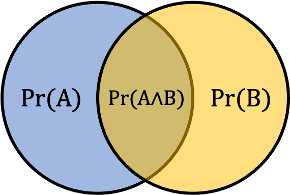
Consider the above scenario. This fallacy was originally explained by Amos Tversky and Daniel Kahneman and they explained that 80% will pick option 2.[4] This happens since many of the described lifestyle choices are correlated with being overweight and it is more specifically related to our scenario. But why not just a computer scientist alone? That’s actually the correct answer. Think about it this way. Let’s say the probability that she is a computer scientist is 0.3. Since we are adding an additional requirement about being overweight, the probability must be lower for option b. The group of computer scientist that are overweight are a subset of the overall computer scientists, so they represent a smaller number. The probability of A occurring will always be greater than or equal to the probability of A & B occurring since the second option is a subset of the first option. This can be observed in Figure 8.2 below where the probability of A occurring (Pr(A)) is represented by the entire area of the blue shaded circle, the probability of B (Pr(B)) is represented byt the entire area of the yellow shaded circle, and the probability of both occurring (Pr(A∧B)) is the smaller overlapping area in the middle.
[asciimath]Pr(A)>=Pr(A^^B)[/asciimath]
We often see this issue come up when we have prior knowledge about something that pushes us to make an assumption. The connection between poor diet choices, lack of exercise, and being overweight plays to our intuition and background knowledge in the subject. Even if we are very knowledgeable in a specific area, we must make sure it doesn’t influence our understanding of basic statistics.
Simpson's Paradox
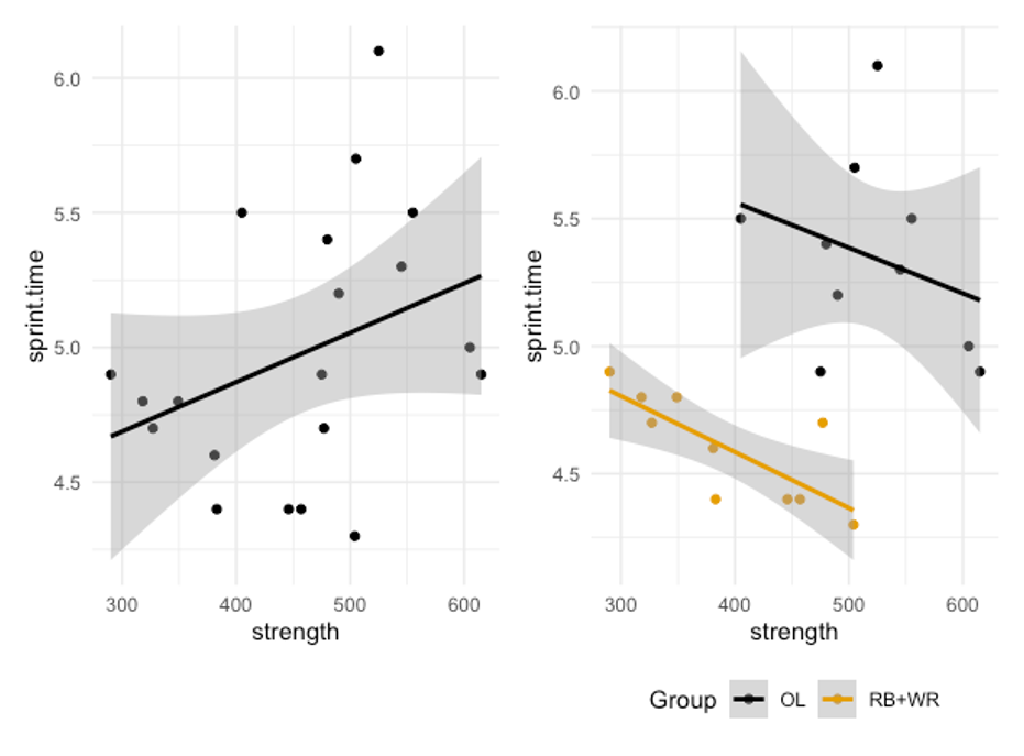
We’ve also seen this one before, but we didn’t name or define it. Simpson’s paradox occurs when we observe a trend in some combined data set, but that trend disappears or reverses when we divide the data up into the groups within it. We discussed it when including males and females in the same sample for a fitness related study. Figure 8.3 demonstrates another example. If we only look at the scatter plot on the left, it will appear that there is a positive correlation between strength (1 rep max back squat) and 40 yd sprint time. This would mean that as one gets stronger, their sprint time increases. But what happens when we look at the groups that make up this data set separately. This is the exact same data, but now the groups are indicated by color and separate trendlines are drawn. Here we can now see that we had a group of football offensive linemen and another group that included running backs and wide receivers. It’s clear that the linemen are not as fast, but they are stronger. What is more interesting is that the trend is now reversed in both groups, especially in the running backs and wide receivers. Now the trend is negative. When strength increases, sprint times go down, meaning that the stronger athletes are running at higher velocities.
So the moral here is that we should only combine our data when it makes sense to do so. While we could have a larger sample if we combined all positions into one group, we’d have a more realistic view of what is actually happening if we kept it position specific.
Misleading with Data Visualization
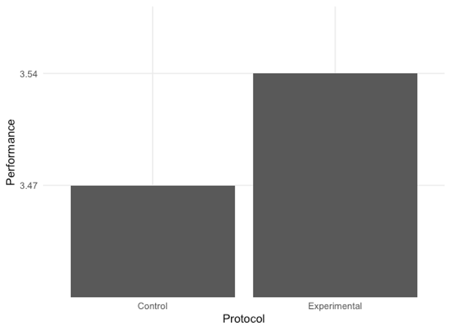
There are a lot of ways one can be misled by data visualization, whether or not it be intentional. Take a look at the example in Figure 8.4 below. It looks like the experimental protocol is twice as effective as the control/placebo. But is it? If we round the values for each 3.47 and 3.54, they are both 3.5. So why do they look so different? It’s because the y axis doesn’t start at zero. It is zoomed into the top part of the bars, so the difference is magnified. We can avoid this confusion by standardizing our axes, which usually means starting them at 0.
Another common way plots can mislead is by changing the dimensions of the plot. Making a plot taller and more narrow will make trendlines look more sharp. Widening them will flatten them out.
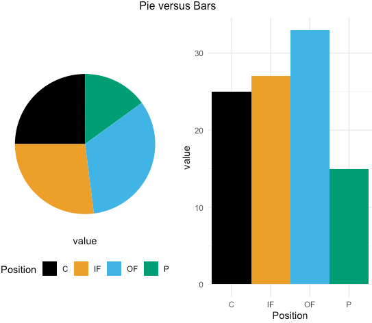
There are often times when plots misrepresent the data, but this is not the fault of the creator. Pie charts are one example of this. While they may seem simple, they are often very hard to understand. If you consider the pie chart in Figure 8.5, it may be easy to see that the black (catchers) slice below represents roughly 25% of the data. But what about the blue (outfielders) slice? It's much more difficult to determine. The black slice has the benefit of having each edge along a directly vertical and horizontal axis that most viewers are used to seeing. Try tilting your head (or the screen) slightly and see if it is still as easy. When you compare this to bar plots, it is much easier to determine each bar's value.[5] Another issue is that many people don't do well with fractions or proportions. Simply plotting the raw values may be more telling of what is actually going on with the data. There are many data scientists and data visualization experts that condemn the use of pie charts because of these issues.[6][7]
When data are visualized, it should be done so in a clear and simple manner to avoid misrepresentation. There are many complex and visually appealing options for visualizing data, but these often are not functional in the real world. Data visualizations are meant to simplify and speed up the decision making process, not hinder or confuse it. When they are used properly, they can be quite beneficial.
- Olive Jean Dunn (1961) Multiple Comparisons among Means, Journal of the American Statistical Association, 56:293, 52-64, DOI: 10.1080/01621459.1961.10482090 ↵
- Holm, Sture A simple sequentially rejective multiple test procedure. Scand. J. Statist. 6 (1979), no. 2, 65–70. ↵
- Bennett, Bo, "Texas sharpshooter fallacy", Logically Fallacious ↵
- Tversky, A., Kahneman, D. (1983). Exenssional Versus Intuitive Reasoning: The Conjunction Fallacy in Probability Judgment. Psychological Review, 90(4):293-315. ↵
- Bailey, C. (2019). Longitudinal Monitoring of Athletes: Statistical Issues and Best Practices. J Sci Sport Exerc.1:217-227. ↵
- Few, S. (2007). Save the pies for dessert. Visual business intelligence newsletter. ↵
- Schwabish, J. (2014). An economist's guide to visualizing data. J Econ Perspect, 28(1):209-234. ↵
