
1 Introduction to Quantitative Analysis
Chris Bailey, PhD, CSCS, RSCC
Chapter Learning Objectives
- Understand the justification for quantitative analysis
- Learn how data and the scientific process can be used to inform decisions
- Learn and differentiate between some of the commonly used terminology in quantitative analysis
- Introduce the functions of quantitative analysis
- Introduce some of the technology used in quantitative analysis
Why is quantitative analysis important? 
Let’s begin by answering the “who cares” question. When will you ever use any of this? As we will soon demonstrate, you likely already are, but it may not be the most objective method. Quantitative data are objective in nature, which is a benefit when we are trying to make decisions based on data without the influence of anything else. Much of what we will learn in quantitative analysis enables us to become more objective so that our individual experiences, traditions, and biases [1] cannot influence our decisions.
No matter what career path you are on, you will need to be able to justify your actions and decisions with data. Whether you are a sport performance professional, personal trainer, or physical therapist, you are likely tracking progression and using the data to influence your future plans for athletes, clients, or patients. Data from the individuals you work with may justify your current plan, or they could illustrate an area that needs to be adjusted to meet certain goals.
If we are not collecting data, we have to rely on our short memories and subjective feelings. These can be biased whether we realize it or not. For example as a physical therapist (PT), we want our rehabilitation plan to work, so we may only see and remember the positives and miss the negatives. If we had a set regimen of tests, we could look at it in a more objective way that is less likely to be influenced by our own biases.

Let’s look at an example of how you might use analysis on a regular basis. In this scenario, your cell phone is outdated, has a cracked screen, and takes terrible photos compared to currently available options. What factors would you consider when thinking about your new phone purchase?
Here are some ways you might approach your decision:
- Price $$$$
- Brand loyalty
- Read reviews
- Watch YouTube video reviews
- Check out your friend’s phone
First and most often foremost is price. What can you afford? You’ll need to research the different phones available and which are in your price range.
What about the type of phone you currently have? Does that play a role? Many cell phone users like to stick to the same operating system they are used to. For example, if you currently have an iPhone, you are probably more likely to stick with an iPhone for your next purchase as opposed to switching to an Android device. This is referred to as brand loyalty.
The next step might be to read reviews or watch video reviews on YouTube.
Finally, maybe you are jealous of the phone your friend just got. So you’ll just get the same one or the slightly newer version. Of course, you may come up with other factors that play a role in your decision-making process.
Each of these are ways of collecting data to influence your decision, even if you don’t realize you are collecting data. The decision-making process is likely a multi-factor process as we discussed. In kinesiology, we can answer questions in a similar way by creating methods of data collection to help us answer questions and make informed decisions.
A more kinesiology specific example
Let’s look at a more specific example in kinesiology, tracking physical activity...or lack thereof. What if we wanted to evaluate the physical inactivity of adults in the United States at the state level and examine if there are differences according to race or ethnicity? Fortunately, the United State Center for Disease Control (CDC) has compiled such data. According to the CDC, all states in the United States had more than 15% of adults that were considered physically inactive as of 2018[2].
Let's break this down a little further, because this statistic is actually worse than it sounds and the results differ depending on race/ethnicity. The CDC defines physical inactivity as not participating in any physical activity during the past month (via self-report and excluding work-related activities). The actual range of physically inactive adults was from 17.3 - 47.7% in all states. There were 22 states that had greater than 25% of their population classified as physically inactive. Interestingly, these results differ slightly when race or ethnicity is considered. This study classified their sample into 3 groups: Hispanic adults, non-Hispanic black adults, and non-Hispanic white adults. Of the 3, those that would be considered minorities in the United States had higher percentages of physical inactivity. Hispanic adults expressed physical inactivity of 30% or greater in 22 states plus Puerto Rico, and 23 states plus Washington D.C. expressed physical inactivity of 30% or higher in non-Hispanic black adults. If we compare that data to non-Hispanic white adults, only 5 states plus Puerto Rico expressed physical inactivity of 30% or higher.[3]
In this example, we just used some data to answer a question about the prevalence of physical inactivity in the United States. But, we shouldn't stop there. We should come up with some sort of practical application. A very simple one based on the data is that we should encourage more physical activity in the U.S. Said another way, we should discourage physical inactivity as the data suggests that there are many that are physically inactive. Looking a bit deeper at the results, we might suggest that health educators target their efforts in specific areas and populations since the results suggest that geographic and population disparities exist. This study did not evaluate why these disparities exist, but we should consider them in potential solutions.
While this may seem fairly straight forward, there are many other factors we need to consider in quantitative analysis. For example, do we know whether or not the data are valid and reliable? Do you know the difference between validity and reliability? It’s okay if you don’t. As we will see later, many people confuse these two on a regular basis. What issues do you see with the data collection? Many may take issue with the data being acquired via self-report. We will discuss surveys/questionnaires later in this book, but they are a great way to reach a very wide and large sample of a population. Obviously, more objective methods (e.g. an accelerometer or pedometer) would be better, but when we have a very large sample, potential error is less of a concern since a greater proportion of the population is being measured.
Using Data and the Scientific Process to Inform
As we have just seen, data collected on a specific topic is used as information to help us understand more about that topic. This is a part of the scientific process of acquiring knowledge, sometimes referred to as the scientific method, which you've likely heard of before. While the scientific method was popularized in the 20th century, it's development is often credited to Aristotle.[4][5]
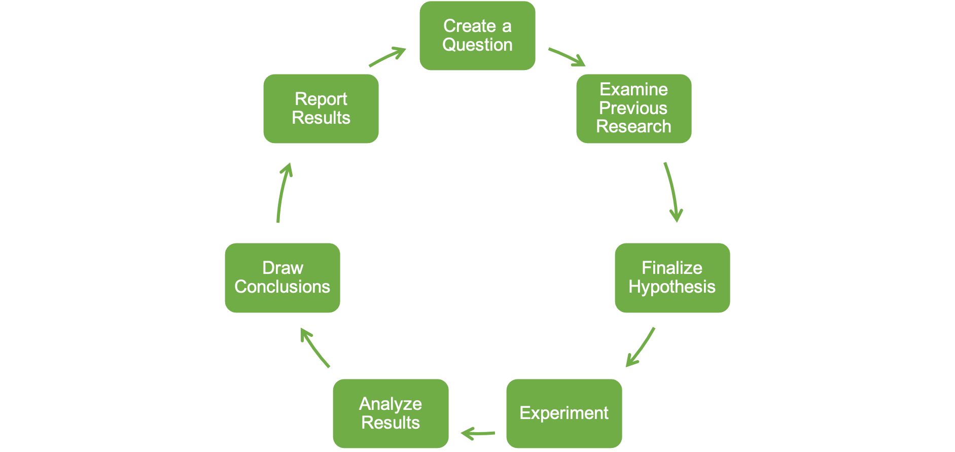
While the number of steps and their naming may differ depending on the source, they are often similar to Figure 1.1 shown above. First, one might wonder about a specific question based on an observation. Consider an example where Elise, an athletic trainer with a professional baseball team, notices that the majority of injuries and treatment times are highest each year during Spring Training[6]. Anecdotally, she observes that several of the injured players did not follow the off-season training program. She wonders if the sudden increase in workload plays a role. In this example, she is at the first step we described above.
Moving forward, she should examine previously published relevant research. In doing so, she notices there are quite a few studies in this area and many specifically look at the ratio of recent (acute) workloads to the accumulated (chronic) workloads and some have found higher risks of injury associated with higher levels of these ratios. [7][8]
Now that she has enough information, she can finalize a hypothesis. Elise then hypothesizes that elevated ratios will increase the risk of injuries, but that the increased risk may differ from previous research because it wasn't done on baseball players.
Now she is on to the experiment stage and she must design a way to test her hypothesis. So, she utilizes a smartphone application that helps athletes and coaches track their workloads during the off-season and during spring training. She also uses their injury data during Spring Training to see if those that incurred injuries during spring training had higher acute:chronic workload ratios compared to those that did not get injured. Spring Training is now over and she can now analyze the results. She finds that there is no statistical difference in acute:chronic workload ratios between the injured and non-injured groups.
Moving to the next stage she must draw conclusions based on the results found. The results did not support Elise's hypothesis, so she cannot say that a sudden increase in workload increases risk of injury. But as she is contemplating this, she realizes that she did not take different injury types into consideration. Her sample included all athletes that were injured during Spring Training, which includes both ligament (for example, ulnar collateral ligament sprain), muscular (for example, hamstring strain), and tendon (for example, patellar tendon strain) injuries. She now recognizes that injury type may play a role in the relationship between workload accumulation and injury risk.
Now it's time to report the results. This step may take different forms depending on your occupation. In Elise's case, this may be a written report or a presentation to the team's staff and front office executives. This could also be formally written up as a research paper and submitted for publication.
Hopefully you noticed that this step is also followed by an arrow that leads back to the first step. The scientific process is a cycle and we often finish the last step with more questions, which lead right back into more research. This was also the case with Elise's example. She can now repeat the study and examine if injury type is important to her previous research question.
This text will focus on working with and analyzing data, but many of the other stages are dependent on this data. Also, the data analysis stage is dependent upon those that happened before it. Can you spot the data used in the example above? It primarily used workloads and injury status. If the data we need to answer a question aren't available, we must find ways to collect it and that is what Elise did in the example above. There may be other times were the data are already available, but they aren't recorded in the same source (table or spreadsheet), which means they need to be combined. Many times, the data are not recorded in an immediately usable format, so we may need to reorganize it (often referred to as data wrangling). Once we have the data in a usable format, we can then move onto analysis. Overwhelmingly, this text will focus on the analysis stage and all of the different techniques that can be used when appropriate. But how the other stages are influenced by the analysis stage and how the other stages influence it will also be addressed.
Terminology in Quantitative Analysis
There are many terms that are frequently used in statistical and quantitative analysis that are often confused and used interchangeably, but should not be. Many of which we may have already used, so now is a good time to begin defining some of our frequently used terms so that we avoid some confusion. Of course, we will have important terminology later on and we will define it when we encounter it.
- Population: includes every single member of a specific group.
- If we were to measure the body mass index (BMI) of all of the U.S. population, we would need to collect both the height and body mass of roughly 332.4 million people[9].
- Parameter Variable of interest measured in the population.
- In the example above using the BMI of the entire U.S. population, the BMI would be a parameter.
- Sample: a subset of the population that should generally be representative of that population. Samples are often used when collecting data on the entire population is unrealistic.
- If we were to measure the BMI of only a sample of the U.S. population, we might randomly sample only 1% of the U.S. population (≈ 3.3 million people).
- Statistic Variable of interest measured in the sample.
- In the example above using the BMI in a sample of the U.S. population, the BMI would be a statistic.
- Validity: how well scores represent the variable they are supposed to; or how well the measurement measures what it is supposed to.
- A new device is created to evaluate your heart rate variability (HRV) via the camera sensors on your smart phone. To make sure it is actually measuring accurately, we might compare the new data to a well known and accepted standard way to measure HRV.
- Reliability: refers to the consistency of data. Often includes various types: test-retest (across time), between raters (interrater), within rater (intrarater), or internal consistency (across items).
- In order to evaluate the between trial reliability of the newly created HRV device described above, we might collect data at 2 or 3 different times throughout the early morning to see how similar they are (or aren't).
- Anecdotal: evidence that is collected by personal experiences and not in systematic manner. Most often considered of lower value in scientific occupations and may lead to error.
- Empirical: evidence that is collected and documented by systematic experimentation.
- Hypothesis: a research and scientific-based guess to answer a specific question or phenomenon.
- Evaluation: a statement about quality that generally is decided upon after comparing other observations.
- For example, we might compare jump performance results of one athlete to other athletes to say that he or she is a superior performer. Or we could use these results in a rehab setting to determine if our patient is progressing in their rehabilitation as they should, compared to data previous patients have produced at the same stage of recovery.
- Measurement: quantification of a specific quality being assessed.
- For example measuring vertical jump performance likely results in a measure of jump height or vertical power.
- Test: a tool used to measure a specific quality
- Following with the example above, we could use a jump and reach device, a switch mat, or a force plate to measure vertical jumping performance. Not all measurements in kinesiology are physical in nature, so these instruments may take other forms.
- Formative evaluation: Pretest, mid-test, or any evaluation prior to the final evaluation that helps to track changes in the quantity being measured.
- Summative evaluation: Final evaluation that helps to demonstrate achievement.
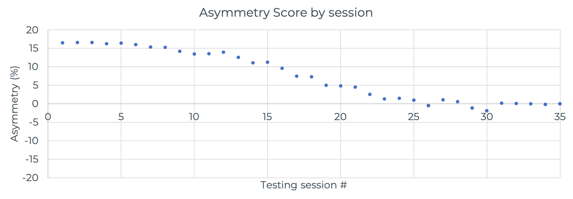
Examine the data plot above that shows a measurement of strength asymmetry as a percentage for an athlete returning from an ACL knee injury. Positive values indicate a left-side asymmetry and negative values indicate a right-side asymmetry. Can you guess which side was injured based on the initial data? This athlete had a right knee injury. Initially the athlete was roughly 17% stronger on the left side, which should have given you a clue to answer the previous question. Based on what we discussed in the previous 2 terms, would you say this data was created by formative or summative assessments?
Criterion-referencing: compares a performance to a specific preset requirement.
For example, passing a strength and conditioning, personal trainer, or other fitness related certification exam. Generally, these exams require test-takers to achieve a minimum score that represents mastery over the content. Some may even require that test takers achieve a specific score in many areas, not necessarily just the overall score. Either way, there may be a set score that represents the "criterion" necessary for certification, such as 70% or better. Some other criterion referenced standards based evaluation examples include: athletic training Board of Certification (BOC) exam, CPR exam, or a U.S. driver's learners permit exam (this may vary by state).
Norm-referencing: compares performance(s) to the sample that the performer tested with or with a similar population.
Examples of norm-referenced standards include the interpretation of SAT, ACT, GRE, and IQ test scores. All of these may express results relative to those that take the exam. For example a score of 100 on the IQ (intelligence quotient) test represents the average score based on a normal distribution. We'll learn about the normal distribution later, but this means that roughly 66.6% of test takers will score between 85 and 115. This is because all scores are transformed to make the current average score equal 100 with a standard deviation of 15[10]. This means that a test-takers score might change based on the intelligence of the others that also take the exam in a similar time period. This also means that comparing the IQ of someone who took the exam today to someone who took the test 10 or more years ago is meaningless as a score of 135 may show that you are in the 99th percentile of your current time period. Furthermore, IQs have been shown substantially rise with time [11]. So, you could argue that an IQ of 100 as tested in 2020 is superior to the IQ of 100 in 2000.
Functions of Quantitative Analysis
Overall, it is required of us as professionals (or future professionals) in the field of kinesiology to make informed decisions, which often means using quantitative data. We can break this down further into several functions of quantitative analysis. Morrow and colleagues (2016) [12] recognize the following functions of quantitative analysis in Human Performance:
- Placement
- Professionals may be able to group athletes, patients, or students following an evaluation of their abilities, which may help facilitate development. For example, an initial assessment may help a youth softball coach group athletes based on skill level and experience.
- Prediction
- The ability to predict future events may be the "Holy Grail" of many fields of research and business, but it requires large amounts of data that is often hard to come by (especially in sport performance). A very common example of this is the efforts and money spent on predicting injury in sports. Intuitively, the notion makes sense. If we can predict an injury, we should be able to prevent it. Currently, much of this research lies in the area of training loads and the rate at which an athlete increases them. [13][14][15]
- Achievement
- Many coaches and trainers set goals for their athletes and clients. Many physical therapists set goals for their patients. Many individuals set goals for themselves. Without doing this and measuring a specific quality, there will be no knowledge of improvement or progress.
- Motivation
- For many, scores on a specific test may provide motivation to perform better. This may be because they did not perform as well as they thought they should, they performed well and want to set another personal record, or they may be competing with other participants. As another example, consider a situation where you have been running a 5k every other week, but don't know your time when you finish. Would you train harder if you did? What if you knew your overall placement amongst those who ran?
- Programmatic Evaluation
- Similar to achievement, programs themselves should be evaluated. Imagine you are a strength coach and you want to demonstrate that you are doing a great job developing your athletes. If your team is very successful on the field, court, or pitch, this may not be too much more difficult than pointing to your win-loss record. But what if your are working with a team that is very young and not yet performing to their full potential. This is precisely where demonstrating improvement in key areas that are related to competition performance could demonstrate your value to those that pay your salary.
Technology in Quantitative Analysis
Data Storage and Analysis
There are many different types of technology that will be beneficial in analysis and several will be introduced in this text. Microsoft Excel and JASP will primarily be used here due to their availability and price tag (often $0), but there are many other software programs and technologies that may be useful in your future careers. Depending on the specific type of work you are doing, some programs may be better than others. Or, more than likely, you may end up using a combination of resources. Each resource has its own advantages and disadvantages. This text will make an effort to highlight those along with potential solutions for any issues.
As mentioned previously, attributes such as availability and cost are quite important for many when selecting statistical analysis software. Historically, SPSS from IBM has been the most widely used software, but that is changing. SPSS can do quite a lot, but carries a large price tag for those not affiliated with a university where they can get affordable access. Free and open source resources such as R are increasing in usage in published research as is Python in quantitative based job requirements. Meanwhile programs such as SPSS are declining in usage and desirability from potential employers. [17][18][19] There are many that still prefer the SPSS "point and click" style over learning coding syntax, so it will likely stick around. Many learn to use SPSS during their time as a student at a university that provides access. Once they graduate, however, they are confronted with the fact that they will need to pay for SPSS use which can be expensive (≅ $1,200/year as of 2021[20]). This pushes more users to options such as Excel or a coding-based solution like R and Python. JASP, a relatively new and free use product recently became available that has a similar user interface to SPSS, which many may prefer. For many of the reasons above, this text will focus on the usage of Excel and JASP. Each technique described in this text will include solutions in both programs,[21] so readers can follow the path they find most useful in their specific situations. Solution tutorials for Excel will be shown in green/teal boxes, while solutions in JASP will be shown in purple boxes (examples below).
Example MS Excel Solution Tutorial
All solutions in Excel will be in this color scheme and will have the word "Excel" somewhere in the title.
Example JASP Solution Tutorial
Data Collection
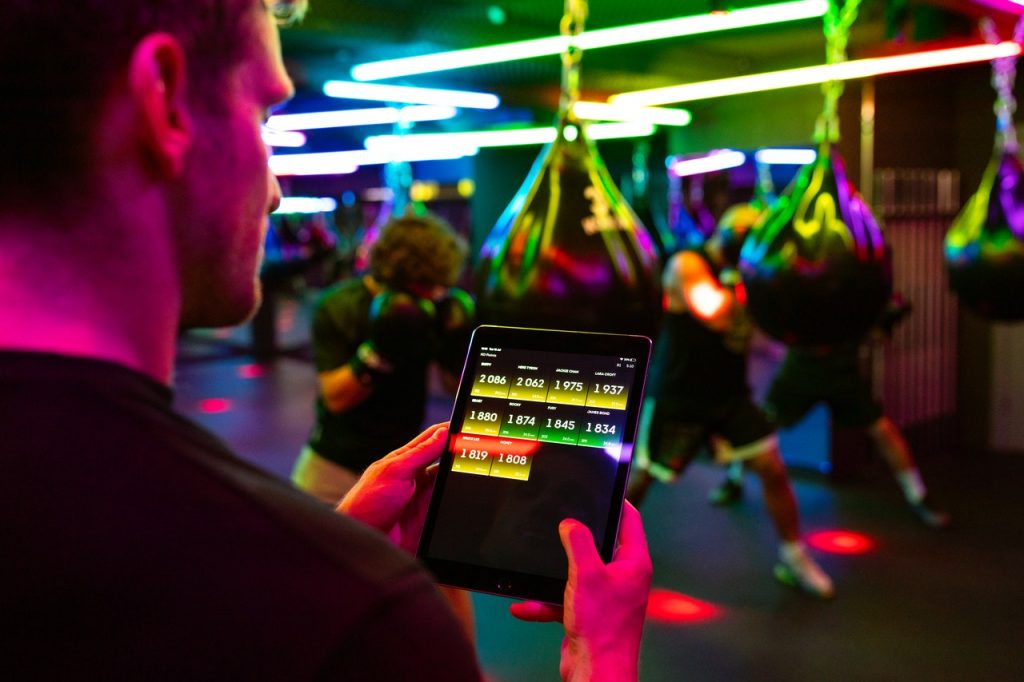
Along with data storage and analysis software, we might also be using technology in the data collection process. Take a look at the image below. Here we see an example of data collection happening in a boxing training session. Notice that the coach is viewing near real-time data on his tablet. How is this occurring? It’s not magic. In fact, many of you probably use this technological process daily. If you have a smart watch that is connected to your phone, it is continuously sending data via Bluetooth throughout the day. The same process is happening in the picture above. Each of the punching bags is instrumented with an accelerometer, which measures acceleration of the bag after it is hit, and is connected to the tablet via Bluetooth. This data is often automatically saved to a cloud storage account that can also be retrieved later. Many of our data collection instruments are now equipped with some form of telemetry (WiFi or Bluetooth) that can send the collected data directly to a storage site. Can you think of one besides your smart watch and the example on the screen?
Specifically concerning the field of kinesiology, the usage of technology and the digitization process of data has solved quite a few issues from the past. Previously, data had to be manually tabulated by hand and then transcribed into a computer for analysis. This could result in many errors when typing in the data that could negatively impact our results. Now, much of our data collection involves equipment that automatically collects the digital data for us and often saves it in the cloud. Many patient and athlete management systems utilize these methods to track progress and performance.
Actually, we could go back a couple of decades before this, when much of the analysis was also done by hand. Thankfully, we won’t have to worry about that. We can now utilize computers and software to run the analysis for us and we rarely have to recall any formulas.
Beyond directly collecting data, computers and technology can be used to collect data in other ways. Public data can be taken from websites and other sources digitally from a process known as ”web-scraping.” This can be done in MS Excel, but is more often done with coding languages such as R or Python that can more precisely pull and then reformat the data into a usable format. There are also many freely available and open databases that we can use for research purposes. Many sports organizations and leagues produce these. Many data and sport scientists are trained to retrieve and analyze much of these types data on a regular basis.
Data Tables and Spreadsheets
While data tables and spreadsheets are terms that are often used interchangeably, the are not the same thing. A data table is simply a way to organize data into rows and columns, where each intersection of a row and column is a cell and this may also be referred to as a data set. Many who use MS Excel, Google Sheets, or Apple's Numbers may refer to this as a spreadsheet, but this is technically incorrect as spreadsheets also allow for formatting and manipulation of the data in each cell. A simple spreadsheet can be used as a data table or it may include a data table. Spreadsheet software incorporates many of the analysis processes into the same spot, which can be a benefit depending on the complexity of your analyses. If you want to go further than some of the more basic analyses, you may not be able to complete the job with products such as MS Excel. This creates a potential issue for those who have stored their data in the standard .xlsx or .xls formats in MS Excel, as many other programs cannot import the data. Fortunately, MS Excel provides many options for saving your files as different extensions that are more usable in other programs. Currently, most common among these is the .csv file extension which stands for comma separated values. If you were to open this file in a text editor, you would literally see a list of all the data with each cell separated by a comma. Unfortunately, the .csv format will not save any of the equations one might use to manipulate data, any plots, or formatting. So it is a good idea to save the data tables created in Excel as a .csv file, but also to save any analysis files in the standard format (.xlsx).
Data Table Organization
No matter what software you use to store your data, it is always a good idea to standardize the organization. While you may like a specific format at one point in time, it's important to remember that in needs to make sense to everyone who views it and other programs may not recognize it if it's not organized in a traditional manner. That being said, there are some best practices to organizing our data. Within a data table or dataset, we have 3 main pieces: variables, observations, and values.
- Variables are a specific attribute being measured. These are generally set up as columns.
- Observations are all measures on specific entities (for example, a name or date). These are generally set up as rows.
- Values are the intersections of our variables and observations. You would consider this an individual cell in a spreadsheet. Each value is one specific measure of an attribute for a specific date or individual.
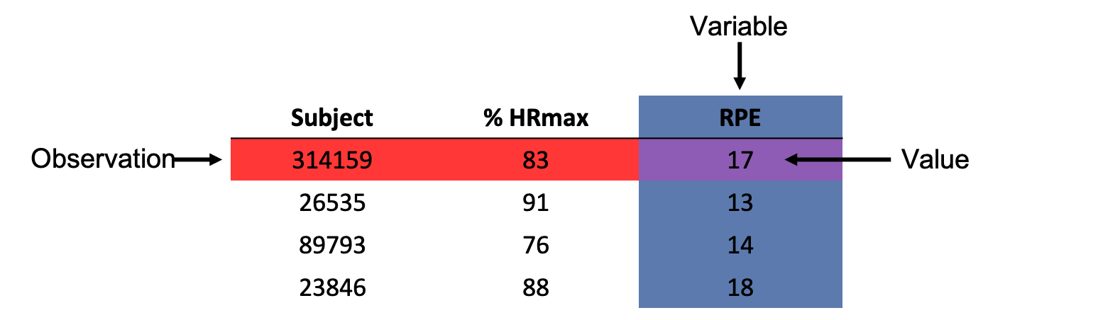
Consider the table below in Figure 1.4 that depicts some objective and subjective data on exercise intensity collected at exhaustion in a graded treadmill test. Notice that each column is a variable. So we have 3 variables, which include the subject ID, % HRmax, and RPE. We also have several observations shown as rows. Each subject has 1 ID number, 1 % HRmax value, and 1 RPE value. Speaking of values, a specific value for a given variable and observation can be found at their intersection. For example, if we want to know what subject 314159's RPE value is we must find where they intersect. The observation is shaded in red, the variable is shaded in blue, and the value (intersection) of 17 is shaded in purple for emphasis.
An Important Caveat for MS Excel/Spreadsheet Users
Consider a sample of 200 university students that were enrolled in a study measuring resting heart rates during finals week. How many rows should there be? If all 200 were tested once, we should have 200 rows. One caveat to that is if you are working in MS Excel or a similar spreadsheet application, the first row is often used to name your variables. So, row 1 wouldn’t contain any data yet. This would mean you would technically have 201 rows if you had 200 observations and your first row of data would be row 2. For other programs, variable names may be included separately and the type of data will also need to be selected. Data types will be discussed in the next chapter.
When logging data for use in an analysis program, it can be perfectly straightforward for many variables like weight or height (in cm). You just type in the value. But what about gender or class? Can you just type that in as a word? Most often you can’t. Many of the analysis programs do not know how to deal with strings or words. So you might code that as a number. For example, a value of 1 might refer to freshmen, 2 might refer to sophomore, and so on. This will be discussed this further later on when segmenting data into groups is desired.
Enabling the Data Analysis Toolpak in MS Excel
Excel can handle many of the same analysis that other statistical programs can, although it’s not always as easy as the other programs. But, it is much more available than those programs, so there are tradeoffs. In order to be able to run many of these types of analysis, you will need to enable the “Data Analysis Toolpak” as that is not automatically available. Please refer to the Microsoft support page in order to do this, which has step by step instructions for PCs and Macs.
Enable the Data Analysis Toolpak for MS Excel
Installing JASP
If you choose to utilize a true statistical analysis software, JASP is a good option. It is free and has easy solutions for nearly all types of analyses. JASP can be installed on PC, Mac, and Linux operating systems.
- Bias means that we lean more towards a specific notion and it is often thought of in a negative light. From a statistical perspective, the motivation for why we think a certain way does not matter. It can be negative or positive. All that matters is that our biases could result in beliefs that are not consistent with what the data actually tell us. For example, we might think very highly of a specific person we are testing and therefore give them a slightly better score than if we did not know that person at all. This type of bias may not be considered negative in motivation, but it is negative in that we are potentially misleading ourselves and others. Whether or not we like to admit it, we all have biases and relying on quantitative data to justify our decisions may help us to avoid them or avoid making decision because of them. ↵
- 2020. Adult Physical Inactivity Prevalence Maps by Race/Ethnicity. https://www.cdc.gov/physicalactivity/data/inactivity-prevalence-maps/index.html ↵
- If you would like to take a more granular look at this data, please visit https://www.cdc.gov/physicalactivity/data/inactivity-prevalence-maps/index.html. ↵
- Riccardo Pozzo (2004) The impact of Aristotelianism on modern philosophy. CUA Press. p. 41. ↵
- https://en.wikipedia.org/wiki/Scientific_method ↵
- https://en.wikipedia.org/wiki/Spring_training ↵
- Bowen L, Gross AS, Gimpel M, Bruce-Low S, Li FX. Spikes in acute:chronic workload ratio (ACWR) associated with a 5-7 times greater injury rate in English Premier League football players: a comprehensive 3-year study. Br J Sports Med. 2020 Jun;54(12):731-738. doi: 10.1136/bjsports-2018-099422. Epub 2019 Feb 21. PMID: 30792258; PMCID: PMC7285788. https://www.ncbi.nlm.nih.gov/pmc/articles/PMC7285788/ ↵
- Bowen L, Gross AS, Gimpel M, Li FX. Accumulated workloads and the acute:chronic workload ratio relate to injury risk in elite youth football players. Br J Sports Med. 2017 Mar;51(5):452-459. doi: 10.1136/bjsports-2015-095820. Epub 2016 Jul 22. PMID: 27450360; PMCID: PMC5460663. https://www.ncbi.nlm.nih.gov/pmc/articles/PMC5460663/ ↵
- Current US Population as checked in 2021. https://www.census.gov/popclock/ ↵
- https://en.wikipedia.org/wiki/Intelligence_quotient#Precursors_to_IQ_testing ↵
- Flynn Effect. https://en.wikipedia.org/wiki/Flynn_effect ↵
- Morrow, J., Mood, D., Disch, J., and Kang, M. 2016. Measurement and Evaluation in Human Performance. Human Kinetics. Champaign, IL. ↵
- Gabbett TJ. The training-injury prevention paradox: should athletes be training smarter and harder? Br J Sports Med. 2016 Mar;50(5):273-80. doi: 10.1136/bjsports-2015-095788. Epub 2016 Jan 12. PMID: 26758673; PMCID: PMC4789704. ↵
- Bourdon PC, Cardinale M, Murray A, Gastin P, Kellmann M, Varley MC, Gabbett TJ, Coutts AJ, Burgess DJ, Gregson W, Cable NT. Monitoring Athlete Training Loads: Consensus Statement. Int J Sports Physiol Perform. 2017 Apr;12(Suppl 2):S2161-S2170. doi: 10.1123/IJSPP.2017-0208. PMID: 28463642. ↵
- Eckard TG, Padua DA, Hearn DW, Pexa BS, Frank BS. The Relationship Between Training Load and Injury in Athletes: A Systematic Review. Sports Med. 2018 Aug;48(8):1929-1961. doi: 10.1007/s40279-018-0951-z. Erratum in: Sports Med. 2020 Jun;50(6):1223. PMID: 29943231. ↵
- Morrow et al. (2016) also include Diagnosis as a function of quantitative analysis, but that is not included here as most professionals in human performance and kinesiology do not possess the the authority to diagnose. They may be asked to perform a test and those result may help diagnose an issue, but diagnosis is generally reserved to those practicing medicine. ↵
- http://r4stats.com/2014/08/20/r-passes-spss-in-scholarly-use-stata-growing-rapidly/ ↵
- http://r4stats.com/2019/04/01/scholarly-datasci-popularity-2019/ ↵
- https://lindeloev.net/spss-is-dying/ ↵
- https://www.ibm.com/products/spss-statistics/pricing ↵
- When possible. There are some instances when MS Excel does not have the capability to run the same analyses as JASP. ↵
- Wickham, H. (2014). Tidy Data. Journal of Statistical Software. https://www.jstatsoft.org/article/view/v059i10/ ↵
how well scores represent the variable they are supposed to; or how well the measurement measures what it is supposed to.
refers to the consistency of data. Often includes various types: test-retest (across time), between raters (interrater), within rater (intrarater), or internal consistency (across items).
evidence that is collected by personal experiences and not in systematic manner. Most often considered of lower value in scientific occupations.
a research and scientific-based guess to answer a specific question or phenomenon
includes every single member of a specific group
Variable of interest measured in the population
a subset of the population that should generally be representative of that population. Samples are often used when collecting data on the entire population is unrealistic.
Variable of interest measured in the sample
evidence that is collected and documented by systematic experimentation
a statement about quality that generally is decided upon after comparing other observations.
quantification of a specific quality being assessed.
a tool used to measure a specific quality
Pretest, mid-test, or any evaluation prior to the final evaluation that helps to track changes in the quantity being measured.
Final evaluation that helps to demonstrate achievement.
compares a performance to a specific preset requirement.
compares performance(s) to the sample that the performer tested with or with a similar population.
