
7 Epidemiology
Chris Bailey, PhD, CSCS, RSCC

You have likely heard about a lot of statistics recently with the COVID-19 pandemic, and you’ve likely even heard some of those misrepresented due to confusion by many sources, including ourselves. Epidemiology is a broad field, so this will mainly serve as in introduction to it, while focusing on epidemiology research related to kinesiology, health, and physical activity.
Chapter Learning Objectives
- Define and understand epidemiology
- Examine epidemiology-based research examples
- Define and learn to quantify statistics related to epidemiology
Epidemiology
The purpose of epidemiology is to describe the frequency and distribution of many health factors such as morbidity and mortality and relating them to specific time periods, locations, and individuals. We will define morbidity and mortality below, but briefly, morbidity relates to those that have a condition and mortality relates to those that die because of the condition. Epidemiology helps identify many risk factors associated with the conditions in terms of morbidity and mortality . It also seeks to determine the causes of the conditions, their subsequent morbidity and mortality, as well as their prevention.
If you were a fan of Game of Thrones, you might be surprised to learn that John Snow is often considered the father of epidemiology. It’s true, but it’s probably not the same John Snow you are thinking of.
John Snow was a dentist and physician that pioneered the usage of anesthesia during many of his patients' procedures. Later in life he took on Cholera. He lived in London where there were several Cholera outbreaks. The dominant theory of its cause at the time was called “miasma” theory. This concluded that “bad air” was the cause of getting a disease. The world had not yet discovered the bacteria that actually caused Cholera at this time. The bacterial contamination occurred due to fecal matter infiltrating the water supply. While this is gross, London was one of the only really densely populated cities at the time and we didn’t yet know how to deal with that. So, you can see how the miasma theory may have worked in practice somewhat, because avoiding bad smells would have helped you avoid some of the issues related to this.
How does this get us to epidemiology? Take a look at the 1854 map of London in Figure 7.1 It was created by John Snow and shows the frequency of Cholera cases and their locations. Focus on Broad Street near the center of the map. You should see some upside-down bars at certain points of the street. Does this look familiar? It should, because it is essentially a histogram. Can you see the histograms drawn all across the map? If you look below the “D” in Broad Street, you should see a circle labeled “pump”. There are many of these labeled, but this was the worst one. With this you can see which water pumps were located near larger outbreak areas. This correlation led to the theory that something was infecting the water and you could see which specific pumps were spreading the infection. Later, Snow tracked the pipes from the most problematic pumps, and they led to a common source. Those pumps were eventually shut down and the outbreak subsided. This event is often considered the birthplace of epidemiology.[1]

Common Terminology used in Epidemiology
As with any field of research, there will be terms specific to that field that may not be clear to those outside of it. In epidemiology in particular, confusion with some of these terms and their usage in the public domain often leads to misinterpretation of results. Several of these examples will be described later in this chapter, but they need to be defined first. There are 6 terms listed, but it might be best to consider them in pairs as each pair has terms that are often confused for one another.
Morbidity: Statistic describing those having the particular condition
Mortality: Statistic describing the number of deaths associated with the particular condition
Morbidity and mortality are often confused for each other, but they are different in definition. Morbidity is a measure of those that have a particular condition. Mortality is a measure of those that actually die due to the condition.
Incidence: Statistic describing the number of NEW cases of morbidity and mortality
Prevalence: Statistic describing the number of TOTAL cases of morbidity and mortality
Incidence and prevalence build on the definitions of morbidity and mortality. Incidence is a measure of the new cases of morbidity or mortality associated with the condition. Prevalence is the total number of cases associated with the condition.
Absolute Risk: The risk of mortality or morbidity in a population that is exposed or not to a risk factor
Relative Risk: The ratio of risk between the exposed or unexposed populations
The final pair discussed here is absolute and relative risk. These are very often confused, and this confusion can be particularly problematic. A common example of this is when a news source misrepresents the relative risk as the absolute risk which often results in added fear about the condition. The absolute risk is the total probability that a disease could be contracted, or condition could occur. The relative risk is the ratio between exposed and unexposed populations. We will look at these differences further later in this chapter and will also learn to calculate them.
Types of Research in Epidemiology
There are many different models for research in epidemiology, but they largely fit into one of two categories, observational and experimental.[2]
Experimental Methods
Experimental research methods in epidemiology include randomized clinical trials and community trials. Randomized clinical trials occur when both the treatments and exposures are randomly assigned to individuals, whereas community trials randomly assign treatments and exposures to entire communities for comparison. When randomizing individuals, all subjects must start off in the same pool of subjects and have equal opportunity to be in any of the groups before all are randomly assigned to a group. Randomizing for community trials is similar, but the initial pool includes several communities and each of those has equal chance to be in any group or protocol prior to randomization.
Observational Methods
Observational designs include case series, cross-sectional, case-control, and cohort studies. A case-series examines data from cases that match the specific date and location of interest. Case-series and case-studies often happen when it is inconvenient or perhaps unethical to administer a specific treatment to someone, thus one must wait for an event to happen and then collect data. For example, imagine we are comparing the rehabilitative process of typical “Western” medicine to those of alternative medicine techniques after an ACL reconstruction. It would be unethical to recruit subjects and then tear all their ACLs for the study, so we’d have to wait for them to have an unfortunate event where they do that on their own and then ask them to participate. Similarly, most research shows that alternative medicine techniques are at best ineffective and in some cases may be harmful.[3] So, it could also be argued that it would be unethical to assign someone to this group. They must make that decision on their own and then data could be collected if they then volunteer for a study. Cross-sectional designs complete the entire analysis in one session, and it may compare many groups. We’ve looked at this type of analysis quite a bit already. For example, when we examine 3 groups for difference based upon some specific treatment variable, we would likely run an ANOVA and this is considered a cross-sectional design. We could compare the acute side effects or adverse reactions of 3 different vaccines, and this would be a cross-sectional design if we are collecting the data in one session. If we were to track those individuals and evaluate the long-term effectiveness or long-term side effects associated with each vaccine, that would be a longitudinal and cohort study. A case-control study compares known cases of a condition to matched controls that do not have the case. For example, throughout the rest of this chapter, we will be looking at the impact of high blood pressure and the incidence of strokes. In the theoretical data we work with, we will have those that do have a high blood pressure as well as those that do not. Those that do not are serving as controls. They must be “matched” in that they match all other characteristics of the other group. In this case, all of our subjects must have a genetic or family history of stroke (cerebrovascular accident (CVA)) in their background. This means that to be included as a matched control, they must not have high blood pressure, but must have a family history of CVA.
Statistical Examples in Epidemiology
In this section a theoretical example will continually be used. This analysis can easily be completed in MS Excel if the data are set up in a chi square contingency table format similar to what has been shown in previous chapters. This example will utilize theoretical data on people that all have a family history or a genetic risk factor for stroke (also referred to as cerebrovascular accident or CVA). This sample has 52 participants who are hypertensive or have high blood pressure and 48 who are normotensive or have normal blood pressure. The qualification to be hypertensive may change depending on the source, but this example will use a blood pressure of 130/80 as the cutoff.[4] Again, 100% of the subjects have a family history of strokes. Within each group (hypertensive or normotensive), some may have had a stroke (CVA) or may not have (no CVA). Within the hypertensive group, 23 have had a CVA and 29 have not. Within the normotensive group, 8 have had a CVA and 40 have not. This is displayed in Table 7.1 below. From this data what practical applications can we make? You may think you see a trend or some takeaway information, but we need to statistically evaluate it so that we have some justification for any claims. Throughout the remainder of this chapter, demonstrations of how to calculate absolute risk, relative risk, odd’s ratios, and attributable risk will be shown using this same data set. Please download it here if you would like to follow along in MS Excel.
| Outcome | ||
|---|---|---|
| CVA | No CVA | |
| Hypertensive | 23 | 29 |
| Normotensive | 8 | 40 |
Absolute Risk
From this data we can calculate the absolute risk for the total sample as well as the absolute risk for each group, hypertensive and normotensive. Before we jump in to calculating these, recall the setup for our chi square contingency tables. We have data in 4 quadrants. The first quadrant is named n1 and it has 23 subjects in it. To the right we have n2 with 29 subjects. The bottom left is n3 and n4 is to the right of it with 40.
[asciimath]"Absolute Risk (Overall)"=(n_1+n_3)/(n_1+n_2+n_3+n_4)[/asciimath]
In order to calculate the total absolute risk, we will add the subjects that have had strokes or the n1 and n3 quadrants and divide their sum by the total sample size. The total sample size can be found by adding all the quadrants together.
[asciimath]"Absolute Risk (Overall)"=(23+8)/(23+29+8+40)=31/100=0.31=31%[/asciimath]
This should give us 31 divided by 100 or 0.31. This can be represented as a percentage, so the total group has an absolute risk of 31%. We will discuss the interpretation of this value after calculating the absolute risk for both groups and the relative risk below.
Calculating the group specific absolute risks is similar, but only data that involves that specific row will be used. Thus, for the hypertensive group, only the first row that contains the n1 and n2 quadrants is used. Here we divide the number that has had a stroke found in n1 by the total number of hypertensive subjects or n1 + n2.
[asciimath]"Absolute Risk (Hypertensive)"=(n_1)/(n_1+n_2)[/asciimath]
[asciimath]"Absolute Risk (Hypertensive)"=23/(23+29)=23/52=0.44=44%[/asciimath]
This leaves 23/52 or 0.44. So the hypertensive group has an absolute risk of 44%.
The normotensive absolute risk can be found similarly, but only using normotensive data. Those who have had a stroke (n3 quadrant) are divided by the sum of the normotensive subjects 48. Resulting in 17%.
[asciimath]"Absolute Risk "("Normotensive")=n_3/(n_3+n_4)[/asciimath]
[asciimath]"Absolute Risk "("Normotensive")=8/(8+40)=8/40=0.17=17%[/asciimath]
Relative Risk
Remember that the relative risk is the ratio of exposed and unexposed populations, so in this case that will be the ratio of the risk of hypertensive and normotensive populations. In order to calculate the relative risk, we can use what we’ve already learned from the absolute risk of the hypertensive and normotensive groups. This is done by creating a ratio of the absolute risk in the hypertensive group to the absolute risk of the normotensive group. The formula below does look more complicated than that, but the numerator of the equation is actually the same formula from the hypertensive absolute risk formula above and the denominator is that of the normotensive absolute risk formula. As such, a couple of steps can actually be skipped if these have already been calculated.
[asciimath]"Relative Risk" = (n_1/(n_1+n_2))/(n_3/(n_3+n_4))[/asciimath]
[asciimath]"Relative Risk"=(23/(23+29))/(8/(8+40))=0.44/0.17=2.59[/asciimath]
This gives us a ratio of 0.44/0.17, which equates to 2.59. It is possible that you may not have already calculated the absolute risk of each group separately, so that formula appears first as the numerator for the hypertensive or exposed group and denominator for the normotensive or unexposed group.
Applications from the results
Producing the statistics is the first step, but interpreting the results is most often where the confusion comes in. Here are some conclusions that can be drawn from our example. Based on the entire sample, we can say that there is an absolute risk of 31% for CVA in those that have a family history of CVA. If we want to take blood pressure into account, we can say that the absolute risk for those in the sample with high blood pressure is 44%, while it is only 17% for those with normal blood pressure.
The relative risk for CVA in our sample was 2.59. So, we can say that having high blood pressure raises the risk of CVA by 2.59 times in a sample of those with a family history of stroke. We can’t say anything about those who do not have a family history of stroke, because no one representing that population was included in our sample. If we did, that would be a selection bias issue (which is discussed more in depth in Chapter 8). That being said, if this were a real study, you might read somewhere that high blood pressure raises the risk of a stroke by 259%. Probably not in the actual study, but likely in the reporting of it. This is statistically incorrect, confusing, and misleading. We will discuss why below.
Absolute versus Relative Risk
We should never describe the relative risk as a percentage because most will not understand it and will likely take it completely out of context. Instead, only describe it as a multiplier. In order to avoid misinterpretation and confusion we should also always report the absolute risk along with the relative risk as reporting only one inevitably leads to confusion.
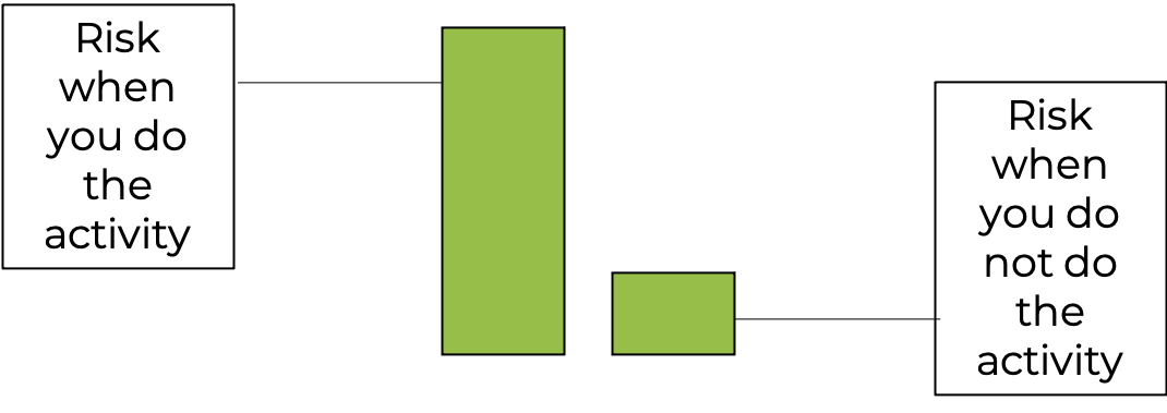
Consider this example. After a new study, a news release reports that you if you take part in this one single activity you will increase the risk of a specific disease by 75%. Take a look at the infographic in figure 7.2 above. It looks pretty promising right? The bar describing the risk when someone does the activity is 4 times as tall as the one when they do not do the activity. It seems pretty self-explanatory. If this is the only information provided, I might conclude that I don’t know what the activity is or even what the disease is, but I’m not doing that activity ever again. But let’s not jump the gun here. Let' take a deeper look.
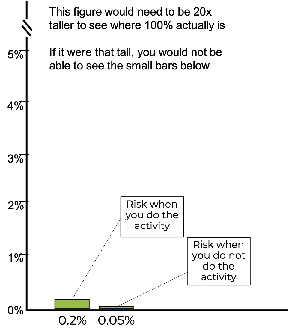
Misleading with plots will be discussed in the next chapter, but you may have picked up on a common trick used in Figure 7.2 where there was no y axis, so you couldn’t really judge the difference magnitude between the bars. Now the y axis has been included, so you can better judge the difference. What do you think now?
Yes, 0.2% is 75% greater than 0.05%, but adding 75% to a very small number is still a very small number. This type of statistical gymnastics is often seen with pharmaceutical and nutritional supplement companies attempting to market products. It may lower the risk of some condition compared to a control, but this needs to be considered in comparison to the overall absolute risk of the condition, which they often neglect to mention. In fact, if the y axis on this plot actually represented 100% of the potential risk, meaning that the axis went to 100, you would not even be able to see the 2 bars shown here and who’s data we’ve be discussing.
Odds Ratios
An odds ratio describes the relative risk and is used in studies examining prevalence. Before learning how to calculate odds ratios, we need to make sure we understand the difference between odds and probability. These are often confused for one another and misunderstood. Probability has been previously defined as the odds for occurrence. Probability can be calculated from something as the ratio of the thing happening to the the total amount of things that could happen in the scenario. Most often that means that the ratio is the thing happening to the sum of the thing happening and the thing not happening.
[asciimath]probability=("thing happens")/("thing happens + thing does not happen")[/asciimath]
Consider a common example, rolling dice, or more correctly, only one die. What is the probability that a 6 will be rolled? There are six possible numbers on a single die. Based on the formula, the probability should be 1:6 or 1/6 or 0.16. So, one could say there is a 16.6% chance that one die would roll a 6. If it was asked what is the probability that you would roll either a 6 or a 3 with the die? Now our chances increase because 2/6 = 0.33 or 33%.
[asciimath]"probability of rolling a 6"=1/6=0.166666=16.6%[/asciimath]
An odds ratio is different in its makeup. It is the ratio of the thing happening to the thing not happening. With an odds ratio, you are not replacing the value in the denominator. So ,the denominator should be smaller than in a probability calculation.
[asciimath]"odds ratio"= ("thing happens")/("thing does not happen")[/asciimath]
[asciimath]"odds of rolling a 6"=1:5=1/5=0.2[/asciimath]
In our first example, or odds ratio would be 1/5 or 0.20. You should see how these are similar statistics, but their calculation and results can be different. This difference in interpretation may become more important depending on if we are working with either large or small numbers.
When describing the chances for something to occur, we could use an odds ratio or probability. The decision about which to use may come down to how common or how rare the occurrence actually is. Another common scenario for describing odds or probability is flipping a coin. In terms of probability flipping a coin that lands on heads has a probability of 1/2, .5, or 50%. Our odds are 1:1. Landing on heads is a common occurrence and because of that, probability is likely your best bet here. Most will understand a 50% probability, but stating odds of 1 out of 1, may not be as clear. Some may confuse this as 100%. When working with rare occurrences you could use either one, but odds ratios are much more common. If we are describing our chances of winning a drawing with a million people, the probability would be 1 divided by 1,000,000 or 0.000001 or 0.0001%. That’s pretty difficult to say. Our odds ratio would be 1 out of 999,999. The likely reason that both probability and odds can be used here is that it is very difficult for most people to fathom very large or very small numbers.[5]
| Outcome | ||
|---|---|---|
| CVA | No CVA | |
| Hypertensive | 23 | 29 |
| Normotensive | 8 | 40 |
Sticking with the same example, we can now calculate the odds ratio. Table 7.1 has been reproduced here for ease of use. Recall that this data includes 100 participants who all have a family history of CVA. 52 of them are hypertensive and 48 of them are normotensive. This theoretical study is set up due to the correlation between hypertension and CVA. So, we can consider hypertension as a risk factor for CVA, along with a family history of a CVA. If you remember back to our contingency table setup when agreement was discussed in Chapter 6, quadrants n1 and n4 represented agreement and n2 and n3 represented disagreement. The same is true here. Quadrant n1 consists of those who are hypertensive and had a CVA. Quadrant n4 consists of those that are not hypertensive and have not had a CVA. So, both of those agree with the premise. Quadrants n2 and n3 are made up of subjects whose data do not agree with the premise.
The odds ratio can be calculated as the product of the data that agree with the hypothesis that there is some relationship between high blood pressure and CVA divided by the product of those that do not support this. So, it is n1 times n4 divided by n2 times n3. In our example that gives us an odds ratio of 920/232 or 3.97.
[asciimath]"Odds Ratio"=(n_1*n_4)/(n_2*n_3)[/asciimath]
[asciimath]"Odds Ratio"=(23*40)/(29*8)=920/232=3.97[/asciimath]
From this information we can say that participants with a family history of CVA and hypertension have an elevated risk of stroke by a multiplier of 3.97.
Attributable Risk
Attributable risk describes the morbidity and mortality that is tied to a specific risk factor. In the case of the CVA example, the risk factor is hypertension. The attributable risk can be found by subtracting the normotensive group’s absolute risk from the hypertensive group’s absolute risk and dividing the answer by the hypertensive group’s absolute risk. Again, the initial formula looks more complicated than that, but it steps can be skipped since solving for part of this formula was already completed.
[asciimath]"Attributable Risk"=((n_1/(n_1+n_2))-(n_3/(n_3+n_4)))/(n_1/(n_1+n_2))[/asciimath]
[asciimath]"Attributable Risk"=(0.44-0.17)/0.44=0.61=61%[/asciimath]
This gives us a value of 0.61 or 61%.
From this data, we can say that hypertension was a contributing factor in 61% of the strokes in this sample of participants that all had a family history of CVA. Said another way, the risk of stroke could be reduced by 61% if all were normotensive in the sample of those that have a family history of CVA.
Closing Remarks
While this has been a quick introduction to epidemiology and epidemiological statistics, it may serve as a jumping off point for those who wish to go further. At the very least, it should help with clearing up any statistical confusion and may even help with instilling a science-based mindset in which one can see through some of the misleading or misrepresented statistics observed or heard on a regular basis.
- Johnson, S. (2006). The Ghost Map: The Story of London's Most Terrifying Epidemic and How It Changed Science, Cities, and the Modern World. Penguin Group. New York, NY, USA. ↵
- Morrow, J., Mood, D., Disch, J., and Kang, M. (2016). Measurement and Evaluation in Human Performance. Human Kinetics. Champaign, IL. ↵
- Warner, M. (2019). The Magic Feather Effect: The Science of Alternative Medicine and the Surprising Power of Belief. Scribner. New York, NY, USA. ↵
- Whelton PK, Carey RM, Aronow, WS, Casey DE, Collins KJ, Himmelfarb CD, et al. 2017 ACC/AHA/AAPA/ABC/ACPM/AGS/APhA/ASH/ASPC/NMA/PCNA guideline for the prevention, detection, evaluation, and management of high blood pressure in adults: a report of the American College of Cardiology/American Heart Association Task Force on Clinical Practice Guidelinesexternal icon. J Am Coll Cardiol; 71(19):e127–e248. ↵
- Here's another example of our intuition misleading us with probabilities: https://www.youtube.com/watch?v=KtT_cgMzHx8 ↵
Statistic describing those having the particular condition
Statistic describing the number of deaths associated with the particular condition
Statistic describing the number of NEW cases of morbidity and mortality
Statistic describing the number of TOTAL number of cases of morbidity and mortality
The risk of mortality or morbidity in a population that is exposed or not to a risk factor
The ratio of risk between the exposed or unexposed populations
