
5 Graphics
Learning Objectives
- Design an effective page layout.
- Create a visual hierarchy.
- Integrate text and graphics.
- Use Microsoft Word efficiently.
Learn—Professional Design
How you visually present your words is almost as important as the words themselves. This is true for several reasons:
- Good design makes good information even more useful.
- Because of technology, we no longer communicate with just words.
- When you demonstrate good design, you let your readers know that you are a communication specialist.
Your words are important, but honestly, no one wants to read one more word of a set of instructions or a report than is absolutely necessary. Good design allows you to take large pieces of information and present them in manageable chunks, which allows your readers to find what they need and get there quickly.
Educated readers have expectations. Laboratory reports, for instance, follow a standard design format. If you don’t know and use that format, you will not meet your readers' expectations, and they will doubt the credibility of your work. So in short, design is more than just making it pretty.
Good design makes your words more effective.
Page Layout—Creating an Effective Design
We can divide the principles of page layout into three parts:
- Creating a visual hierarchy
- Chunking information
- Creating useful graphics
However, before we start talking about these principles, let’s discuss basic design vocabulary.
Design Terms
Serif font
Serifs are the small "feet" on the ends of letters in fonts such as Cambria, Times New Roman, and Georgia.
Sans serif font
Sans means without, and sans serif fonts do not have serifs. Sans serif fonts include Calibri, Ariel, and Corbel.
Left justified
When all of the text on a page is aligned on the left margin, the text is left justified.
Right justified
When all of the text on a page is aligned on the right margin, the text is right justified.
Right ragged
When the text on the page is not filled with white space to make it aligned but instead ends naturally, it is right ragged.
Left hanging
When you left justify your headings but indent all of your body text, you have a left-hanging format.
Bullet
Small solid black dots placed before items in a list are called bullets.
Headers
Standard information that appears outside of the margin at the top of each page of a document is called a header. Page numbers and chapter titles frequently appear in headers.
Footers
Standard information that appears outside the bottom margin of each page of a document is called a footer. Footers frequently contain page numbers or the author’s name.
Indent
The space created when you move the first line of a paragraph a half inch to the right is an indentation.
Font size
Fonts come in different sizes, typically measured in points (pt or pts) by most word processors. Points such as 9, 10, and 11 are common for body text in print documents.
Visual hierarchy
When you use font sizes and weights to indicate the hierarchy of information, you have created a visual hierarchy.
Level-one headings
The highest level of heading, it should be the largest heading size; 16-point font size is a good starting point on print documents.
Second-level headings
The second-highest level of heading; 14-point font size is a good starting point on print documents.
Third-level headings
The third level heading; use 12-point font size, bold, as a starting point on print documents.
The typographical suggestions above are just that—suggestions. There are many ways to format a document, but these are generally safe options. We will use these suggestions throughout the rest of this chapter.
Look at how the example memo below uses each of these different formatting styles.
A left-justified memo
To: Professional Writing Students
From: Dr. R
Date: September 15, 2020
Re: How to Write Memos
Some of you have had some questions about how to format and organize a memo, so in this memo, I will address your questions. We’ll start by talking about how to format a memo.
When we format memos, or any professional document, we want to follow some basic best practices. These practices weren’t adopted because they make a document look nice, or because a bunch of tech writers just decided they like doing it that way. Experts have adopted these practices because they make the information accessible to the reader by
- Breaking the information into manageable chunks
- Using headings to visually organize the different topics
- Organizing the information in a persuasive manner
Header information
No indent | left justified | right ragged | single spaced
First and second paragraphs
No indent | left justified | right ragged | single spaced | bullets
Bulleted Lists
Space after previous bullet | no indent | left justified | right-ragged | single spaced
|
Caution |
Notice I didn’t put a colon after "by”? Only put a colon after a complete sentence that introduces a list; otherwise, don’t use any punctuation. |
Best Practices for Designing a Short Document
When we design memos, emails, and short reports, we want to follow some basic best practices. These practices weren’t adopted because they make a document look nice or because a bunch of tech writers just decided they like doing it that way. Experts have adopted these practices because they make the information accessible to the reader by
- Breaking the information into manageable chunks
- Using headings to visually organize the different topics
- Organizing the information in a persuasive manner
When we read a document on a screen, the lighting makes the letters appear to shimmer. Consequently, the simple form of a sans-serif font is easier for someone to read.
Left justify, right ragged
When we say a piece of text is justified, we mean each line starts or stops in the same space. When we say ragged, we mean each line stops or starts in a different place. Because we read from left to right, justifying the left margin makes it easy for our eyes to go to the right place. However, if we also justify the right margin, the computer will randomly add filler spaces to each line. These spaces create inconsistent gaps between words that make it harder for us to read. Our eyes "trip” over those gaps like we would trip over a crack in the sidewalk. Some publishers prefer to fully justify the content of their books, which is why this book uses full justification.
Single space within paragraphs; add a space between paragraphs
Single spacing paragraphs allows us to visually show which information goes together, while the space between paragraphs lets us easily see where one ends and another begins. Do NOT indent the first line of a paragraph.
When we indent the first line of a paragraph, we create another of those stumbles for the readers' eyes.
Use headings to create a visual hierarchy
When we use headings, we create an outline of the entire document that allows our readers to skim and find what they need. Headings should be larger than the body text, so we can find them easily:
Level One Heading
16-point font
Level Two Heading
14-point font
Level Three Heading
12-point bold font
You don’t need to use headings for your introduction or your conclusion—just for paragraphs that cover specific topics.
Use a bulleted list to emphasize important information
If you are providing a list of something (ingredients, names, requirements, etc.), a bulleted list is a good way to do it. Bulleted lists are a powerful design tool, but be careful you don’t turn a document into one long list!
Introduce every list with a sentence
A list without context can confuse your reader, so always introduce the list with a sentence.
Use tables to consolidate information
I have placed the best practices into a table because the table lets me present the information concisely, and it keeps it organized.
Now let's talk about how to create a visual hierarchy.
Creating Visual Hierarchy
All information is not created equally. In any given document, regardless of its length, some information is more important than other information.
If we can visually separate the most important information from the least important information, we can help our readers prioritize effectively.
The most effective way to create a visual hierarchy is by using headings:
|
Visual Element |
Size |
Capitalization and Alignment |
|
Title |
18-point Calibri |
Capitalize all words except prepositions, articles, or coordinating conjunctions. |
|
Level one headings |
16-point Calibri |
Capitalize all words except prepositions, articles, or coordinating conjunctions. |
|
Level two headings |
14-point Calibri |
Capitalize all words except prepositions, articles, or coordinating conjunctions. |
|
Level three headings |
12-point Calibri, bold |
Capitalize all words except prepositions, articles, or coordinating conjunctions. |
|
Body text |
12-point Calibri |
Left justified, right ragged. |
Once we have created our visual hierarchy, we can use it to organize our information into manageable chunks.
Chunking Information
When we give our readers pages and pages of unbroken words, we make their job very difficult because we are ensuring that they have to read every word to find any meaning. We also make it difficult for them to remember what they read because we overload them with too much information at one time.
When we present information in smaller chunks, we give readers the opportunity to start and stop as they choose. This makes reading a less frustrating process, and it increases retention.
To chunk information effectively, follow these tips:
- Avoid using more than four levels of headings, when possible.
- Always use a sentence to introduce a bulleted list.
- Make headings parallel (use the same grammatical structure).
- Use lists for emphasis only. When the entire document becomes a list, it is more likely to become a distraction.
- Single space within chunks.
- Include a paragraph space before and after chunks of information.
- Include a paragraph space after headings.
- Left justify/right ragged.
- Use one-inch margins on all four sides.
- If a document is more than one page in length, include page numbers.
Look at the document below. Does it follow the principles we’ve discussed?
Original Memo
Sample Survey
Dear Faculty Member,
We will launch a program this semester to test a new kind of evaluation. Because you are getting this letter, you are one of the faculty who have been chosen for the trial evaluation.
When you receive the evaluation (a copy of it is attached), we want you to do a number of things. Please announce that the evaluation will be given and urge students to attend class that day. If some students are absent the day you give the evaluation, give those students an evaluation the next class period. For this trial evaluation, it is imperative that every student in the section complete a survey. Have someone else administer the survey—either a colleague or your department administrator. Be sure you are not present during the time the students are completing the survey. Have the person who gave the survey collect all of them and place them back in the envelope. This should be sealed in front of the students. The person who sealed the envelope should return it to 104 Jones Hall. Give the envelope to Mickey Smith. Sign the sheet to indicate that you have returned your trial survey.
A quick glance at this document tells us only two things: it is about a sample survey, and it is in the form of a letter. Neither piece of information tells the reader anything useful. Furthermore, because the majority of the information is contained in a single paragraph, readers must read every word to learn anything. By adding a visual hierarchy to this document, and making the embedded instructions accessible, we can greatly increase the usability of this document:
Revised Memo
Launch of New Survey
We will launch a program this semester to test a new kind of survey. You have been chosen to administer the trial survey. Please follow the instructions below:
How to Administer the Survey
After you receive the envelope containing copies of the trial survey, do the following:
- On the day before the survey, announce the date you will give the survey.
- Inform students that they must take the survey. Students absent the day you give the survey must take it the next class period.
- Choose someone to administer the survey—either a colleague or your department administrator
- On the day of the survey, leave the room so your representative can give the survey.
Before you leave, ask them to do the following:
- Pass out the surveys.
- When every student is done, collect all of them and place them back in the envelope.
- Seal the envelope in front of the students.
- Ask you to return to class.
- Return the envelope to 104 Jones Hall.
- Give the envelope to Mickey Smith and sign the sheet to indicate you returned the trial survey.
How to Get Help
If you have questions or need help, please contact me at example@example.com.
Why Is This Better?
This revised version is better for many reasons:
- The headings provide readers with information that allows them to determine exactly what they must do and when.
- The numbered steps inform the reader that the instructions must be completed in a specific order.
- The information is chunked into smaller sections instead of long paragraphs.
I guarantee that the second document will get better results than the first!
Integrating Text and Graphics
"Graphic" is the word we use to refer to any information that is visual rather than textual: drawings, photos, diagrams, tables, and charts. Some graphics, such as tables, do include words, but the words support the visual elements, not vice versa. Graphics are very important. In many cases, we can show more effectively than we can tell.
Which example more clearly explains what a pipette is?
Describe a pipette
With words
A pipette is a long, slender device for transferring liquids. One end is more bulbous than the other, and the other end has a small hole that fluids enter/exit when the bulb is squeezed.
A picture

Because some people learn by seeing and others by reading, it is best to use both words and graphics. However, we only want to use graphics that serve a purpose—to illustrate a necessary piece of equipment, show data trends, or provide specific visual details. Never throw in graphics, especially clip art, just because you can.
When creating graphics, follow these tips:
1.Only use graphics that serve a purpose.
If you are writing about how to place a muzzle on a dog, a photo of someone muzzling a dog would serve a purpose. A picture of a cute puppy would not.
2. Make the style of the graphic appropriate to the purpose of the document.
If you are writing an overview of a surgical procedure for patients, photos of the surgery would not be appropriate. These photos would be too graphic and would scare the readers. Line drawings would be better. Photos would be appropriate for surgical students.
3. Do not use clip art just because you can.
Random clip art is distracting and unprofessional. When possible, use high-quality images or illustrations in appropriate locations within a document.
4. Label and number all graphics.
Use an informative label that describes the graphic.
Labels for Figures
Labels for figures must be aligned with the left margin of the graphic and placed below. Labels for tables must be aligned with the margin of the table and placed above.

How to label an image
Integrating text and graphics effectively requires you to do more than just copy a graphic onto a page. You must follow the four basic principles of good design.
Four Principles of Good Design
These four principles should direct your design decisions:
- Contrast
- Repetition
- Alignment
- Proximity
Contrast
Contrast means difference, and effective graphics use contrast to draw attention to the most important element in the graphic. We can create contrast using color, size, or placement. In the photo below, the contrast between the white text on the black background draws eyes to the text; some people might not even notice the much darker text in the top half of the picture because it lacks contrast with the black background. A lack of contrast can make it difficult for readers to discern differences between elements, which means that the graphic loses its meaning.

How Can You Create Strong Contrast?
Use white fonts on dark backgrounds. Use dark fonts on light backgrounds. Use different font sizes.
Repetition
When you reuse the same or similar elements throughout a document, you create repetition, and this creates visual coherence. We can also create visual repetition through consistent use of fonts, colors, and graphic styles. For example, you might decide to use only black-and-white photos in a particular document.

How Can You Create Effective Repetition?
Alignment
Types of Alignment
You can use six types of alignment.
Horizontal
Either the left or right (or both) margins are equal. You can apply it across a single column or an entire page.
Vertical
Your text or design elements are lined up with the top and bottom margins on the page.
Edge
Your text and design elements are lined up with each other’s top, bottom, or side edges.
Center
Your elements are aligned along a central axis.
Visual/Optical
An element is misaligned because of a rounded element.
Breaking
Breaking the rule for effect; this can be applied to pages, columns, or text frames.
How Can You Create Alignment?
Proximity
When we use white space to connect or disconnect items on the page, we are using proximity. In other words, items that are close are related, and items that are far apart are not.
How Can You Create Proximity?
- Use less white space to show items are part of the same group.
- Use more white space to show items are part of different groups.
- Embrace white space; it prevents your design from looking crowded and helps direct the reader’s eye to key elements by contributing to your visual hierarchy.
- Create a visual hierarchy; group similar items together and create white space. Use contrast and fonts.
Graphics can be very powerful when properly utilized. When improperly used, they often serve as a distraction and can confuse readers.
Incorporating Images
Images should support the surrounding text and be sized so that the reader can discern what the image is and how it relates to the writing. When working with images, keep in mind the final medium for the document. If the document will be printed on a black-and-white printer, perhaps a dark-colored image won’t look as good on paper as it does on-screen.
Make Images Accessible
Not all readers can see the images in your writing the same way they can read words. Label images and use "alt text" so screen readers can describe the image for the visually impaired. Alt text is a description that a writer assigns to an image.
Each type of writing software has a different way to add alt text to an image. Most word processors allow you to add alt text from the menu that appears after right-clicking the image.
Alt text has the following benefits:
- Screen readers can describe images to the visually impaired.
- If there is a problem that prevents an image from displaying, its alt text can help the reader understand what is supposed to be in that space.
- Search engines can find documents with images more easily.
Tables, Charts, and Graphs
Tables, charts, and graphs can be very powerful when trying to relay data to the reader. However, to make your tables, charts, and graphs effective, you must
- Label axes.
- Use color effectively.
- Name the figure so it can be listed in a list of tables and figures.
- Provide a short, informative caption describing the data.
Student Attendance in the Professional Writing Lab
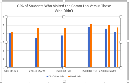
|
|
Didn’t Use Lab |
Used Lab |
|
2700.041 F21 |
4.1 |
4.2 |
|
2700.301 Spr21 |
3.5 |
4.7 |
|
2700.311 F20 |
3.8 |
4.7 |
|
2700.010 F19 |
4.8 |
5.1 |
|
2700.049 Spr19 |
4.6 |
5 |
|
Averages |
4.16 |
|
Assess—Professional Design
- Which of the following statements does NOT provide a reason why professional design is important?
a. Good design makes good information even more useful.
b. Because of technology, we no longer communicate with just words.
c. When you demonstrate good design, you let your readers know that you are a communication specialist.
d. It makes documents pretty. - This is an example of a serif font:
Times New Roman
a. True
b. False - What kind of justification does this paragraph use?
Educated readers have expectations. Laboratory reports, for instance, follow a standard design format. If you don’t know and use that format, you will not meet your readers' expectations, and they will doubt the credibility of your work. So in short, design is more than just “making it pretty.” Good design makes it more effective.
a. Left justified
b. Right justified
c. Fully justified
d. Centered - Centered justification is a good choice.
a. True
b. False - Which statement is most accurate?
a. Always use right-ragged left justification.
b. Only use left justification.
c. Only use right justification.
d. Only use full justification. - Always indent the first line of each paragraph.
a. True
b. False - Always use the direct approach when giving bad news.
a. True
b. False - Which statement best describes a visual hierarchy?
a. It includes photos.
b. It visually separates the most important information from the least important information using different sizes of headings, so we can help our readers prioritize effectively.
c. It makes all text the same size.
d. There is no such thing. - Select every statement that is true.
a. Never have more than four levels of headings.
b. Always use a sentence to introduce a bulleted list.
c. Make headings parallel.
d. Use lists for emphasis only. When the entire document becomes a list, the lists have become a distraction rather than a help.
e. Single space within chunks.
f. Space before and after chunks of information.
g. Space after headings.
h. Use right-ragged left justification.
i. Use one-inch margins on all four sides.
j. If a document is more than one page in length, use page numbers.
k. All of the above - The most effective way to create a visual hierarchy is by using headings.
a. True
b. False
Engage—Professional Design
For this discussion, we are going to continue working with the document from the “Style” discussion. Although you worked on the structure, the document still has issues with its design.
How to Write Concise, Accurate Sentences
Your Task
For this discussion, complete the following steps:
- Create an effective page design and layout.
- Create a visual hierarchy.
- Make the information accessible.
- Submit the revised document.
- Respond to three of your classmates' posts.
- Offer suggestions on the quality of their revision.
Apply—Professional Design
Before you begin, read the following scenario:
Your Task
For this assignment, you will write the second memo in the proposed series. You will be writing about professional structure. Your audience is your colleagues. Because this is an imaginary situation, use what you know from your own work and educational experience to analyze your audience. As you write your memo, follow these tips:
- Focus on how to create an effective page design, create a visual hierarchy, and make information accessible.
You are teaching your colleagues how to create a visual hierarchy and make information accessible, so tell them what they need to know and provide examples of how to do it.
You are NOT teaching computer skills, so you don’t need to tell them how to use Word. - Use your class readings to back up your recommendations.
Your colleagues need to know that you are the expert, so share what you’ve learned from your course.
You can quote from the course materials, but remember to use quotation marks. - Provide original examples.
You have already learned how to design a page, so use your own work as examples. - Follow the best practices for effectively structuring a professional document when writing your memo.
The document you send to your colleagues should not just tell how to design a page.
It should also provide an example of how to write an effective memo, so apply the principles you have learned.
Assignment Rubric
|
|
Superior |
Above Average |
Average |
Below Average |
Failing |
|
Content |
20 points Includes all of the required elements of the assignment. |
15 points Includes all of the required elements, though some are underdeveloped. |
10 points Includes most of the required elements. |
5 points Includes some of the required elements. |
0 points Does not include all of the required elements. |
|
Style |
20 points The writing is clear and concise and avoids unnecessary use of passive constructions. |
15 points The writing is clear and concise and generally avoids unnecessary use of passive constructions. |
10 points The writing is mostly clear and concise and mostly avoids unnecessary use of passive constructions. |
5 points The writing is occasionally clear and concise but does not avoid unnecessary use of passive constructions. |
0 points The style is inappropriate or unclear. |
|
Design |
20 points The document has a clear visual hierarchy and the writer uses appropriate methods of presentation such as lists and tables. |
15 points The document has a clear visual hierarchy and the writer uses some appropriate methods of presentation such as lists and tables. |
10 points The document has a basic visual hierarchy and the writer occasionally uses appropriate methods of presentation such as lists and tables. |
5 points The document’s visual hierarchy is weak and the writer doesn’t use appropriate methods of presentation such as lists and tables. |
0 points The document has no visual hierarchy. |
|
Structure |
20 points The organization of the document is clear and logical and makes strong use of topic sentences and transitions. |
15 points The organization of the document is generally clear and logical and makes some use of topic sentences and transitions. |
10 points The document has an organization and occasionally uses topic sentences and transitions. |
5 points The structure is weak and the writer rarely uses topic sentences or transitions. |
0 points The document has no structure. |
|
Correctness |
20 points The document has no errors. |
15 points The document has 2–3 errors. |
10 points The document has 4–5 errors. |
5 points The document has 6–7 errors. |
The document has 8 or more errors. |
